Wednesday.


Today was more action on the electronic front. Loved learning about pattern brushes and details on patterns. I have messed with both but so much was put forth relative to stuff I keep trying to troubleshoot...refinements around how patterns start in the shape, about scaling patterns within a shape etc. Just great. I am close to finishing my portrait to allow a day or so of pottering around with patterns and brushmaking. Jean and Nancy trade off demos...which is wonderful as each has their own skew, but both speak to either illustration or graphic design stuff. I was messing around with chalk on my room computer to see what they can do...winging it. The new generation of Painter is very cool and easier to use (I think the last iteration I used was Painter 6--so things have improved.

It was raining today...good reason to stay inside. Chris Spollen gave a nice and very "pursue your bliss" speech showing his illustration and now his constructions made of cans and then stripped into pseudo victorian photography based contexts. Nice.
Murray is zipping us through the eighties.

More later.

Stop talking and start doing.


This week we have Nancy Stahl and Jean Tuttle, two amazing illustrators who work digitally. We are working on portraits in three applications, Corel Painter, Adobe illustrator, and Adobe Photoshop. The image above is work in progress of PT Barnum. He will have some facepaint in illustrator and then will get some gradients and texture applied in the other two programs. Painter is something I was least excited about and now that I have had a little time noodling with some of the Painter brushes, I am  pleased to see that the fight with the application with the palettes and thinking you had to do to get an effect has been significantly modified and simplifed in the newer and newer iterations. I used to use it to create masks for photography (the old, "we only have one decent picture of the chairman and it needs to look different in the various publications we are creating" thing. The Hartford facility is top drawer with the big Epson scanner and three big Epson printers that are filled with ink. All you need to do is to provide the paper. 

Chris Spollen and Dan Pelavin are teaching the third year students so their interesting vision, their work and their sense of humor adds to the roll of the program. Of course, Betsy and Ted Lewin are here for the now settling in first years. They will be thumbnailing books this week.

I am just plain exhausted. I guess my brain has now registered that the work is done, the paper written, the defense given and this is the last chapter of this program. I have had enough...and really just want to poke on my portrait and not have people interrupting me work to ask me what I am doing (I am not inviting this as I am heads down, earphones in), or to talk about their work, their art...when the damned solution for many of these folks is to stop talking and start working. And working a lot. The work is the real teacher here...not the jawboning with like individuals but finding the quiet spot in work that feeds more work, more action, more thinking. The only way to learn here is to pack your imaginary bags and get on the road. The journey is just that...and though there may not be a clear path, there is a path that faith in yourself, automatic writing and drawing, and the permission to just go where it leads you...not staying rigid in your seat. Go with the flow...and see where it takes you. If the work is stale and the content not delightful, go to where you are happy. Then look back, look around, look foward and assess where you are and decide on the next step. I do not believe I will ever be able to see the top of the hill or the end of the path, but the next step emerges through work and observation which is was this program  has given me. Be confident even if it is only in the next step...because that next step is forward in some manner...and sequentially (with the path strewn with images) you will get there...though there is just another milestone step on the journey. The key to all of this is not talk. It's work. If the work isn't done, the small steps are not accomplished and the real learning has not occurred. My thinking is that if you are spending the money for an independent program, pay with the most precious thing you have, your time....and the rewards will be ten fold. If you don't do the work, you get the certificate on graduation day, but you miss the real benefits of the education.

So, stop talking and start doing.
And let me have a moment noodling on the computer....I think I have earned it.

Ammi Phillips, the Border Limner (1788-1865)


New England's austere people are portrayed with grace and humor by the Border Limner, Ammi Phillips


Known as: Folk and naïve (primitive) artist
Born: 1788, Colebrook, Connecticut, US
Died: 1865, Massachusetts
Ammi Phillips began his professional career around 1811. He travelled extensively in the New York - Massachusetts - Connecticut border area, and because of this, became known as "Border Limner".

He married Laura Brockway in 1813 and the couple moved to Troy, New York. At some point they moved to Rhinebeck where his wife died in 1830. He remarried shortly after.

Around 1829, he started painting in a new style. The works from this period were from his "Kent Period", named thus because that was the town in Connecticut where the paintings first surfaced. He probaly did the paintings in New York's Duchess Conty.

He returned to western Massachusetts in 1860 where he died five years later

I was delighted to learn about him from his elegant pink and neutral portrait of a young girl, "Harriet Leavens", we saw yesterday at Williams College's Clark Museum. Albeit, Mr. Phillips was born well over 80 years after the English writer, Jane Austen wrote her celebrated books, the spirit, the simplicity and the styling really reaches over that span of time to embrace her thinking, the styling and the imagery that in my imagination, I sew to her words.

``Miss Bingley,'' said he, ``has given me credit for more than can be. The wisest and the best of men, nay, the wisest and best of their actions, may be rendered ridiculous by a person whose first object in life is a joke.''

``Certainly,'' replied Elizabeth -- ``there are such people, but I hope I am not one of them. I hope I never ridicule what is wise or good. Follies and nonsense, whims and inconsistencies do divert me, I own, and I laugh at them whenever I can. -- But these, I suppose, are precisely what you are without.''

``Perhaps that is not possible for any one. But it has been the study of my life to avoid those weaknesses which often expose a strong understanding to ridicule.''

``Such as vanity and pride.''

``Yes, vanity is a weakness indeed. But pride -- where there is a real superiority of mind, pride will be always under good regulation.''

Elizabeth turned away to hide a smile.

``Your examination of Mr. Darcy is over, I presume,'' said Miss Bingley; -- ``and pray what is the result?''

``I am perfectly convinced by it that Mr. Darcy has no defect. He owns it himself without disguise.''

``No'' -- said Darcy, ``I have made no such pretension. I have faults enough, but they are not, I hope, of understanding. My temper I dare not vouch for. -- It is I believe too little yielding -- certainly too little for the convenience of the world. I cannot forget the follies and vices of others so soon as I ought, nor their offences against myself. My feelings are not puffed about with every attempt to move them. My temper would perhaps be called resentful. -- My good opinion once lost is lost for ever.''

``That is a failing indeed!'' -- cried Elizabeth. ``Implacable resentment is a shade in a character. But you have chosen your fault well. -- I really cannot laugh at it; you are safe from me.''

``There is, I believe, in every disposition a tendency to some particular evil, a natural defect, which not even the best education can overcome.''

``And your defect is a propensity to hate every body.''

``And yours,'' he replied with a smile, ``is wilfully to misunderstand them.''

However, Ammi Phillips is lumped into the folk art category (which I go to interpret as decorative illustration and decorative portraiture) and is in a way pooh poohed as its just a whisker away from primitives (read heaven..the work of the amazing Edward Hicks surfaces immediately).


I am particularly fond of Limner paintings (those portraits done by itinerant painters) as I grew up eating in my grandmother's dining room with two family limner paintings (Henry and Margaret Gibbs(1670) framing the door to the kitchen. Brother and sister paintings were two out of the three (a brother was in the Boston Museum of Fine Arts) and had been in the family the entire time somehow ending up in my grandmother's house in Charleston, West Virginia. These portraits, done by the Freake Limner, had been in my family until my grandmother's time. Upon my grandmother's  death, Margaret was bequeathed to join her brother, Robert already at the MFA in Boston. Henry was given to the Clay Center in Charleston WV. I am descended from Margaret, who was married to Nathaniel Appleton of Salem MA, a merchant. Margaret Appleton and her husband were painted by Copley. Margaret's portrait was given to Harvard University in 1855. Her husband, Nathaniel's portrait is still in the family--a shame they are not together as they are a wonderful pairing. I am a bit puzzled by the dates they cite for Margaret's birth/ death as her limner painting was well over 20 years prior to the stated birth unless this is the next generation (which is possible). The paintings by Phillips sets my mind to whirring over Austen's writing, while the Freake-Gibbs Limner calls the Scarlet Letter to mind...and of course, my beloved early american tombstones. I love how it all tails one into the other.

www.mfa.org says:

The collection of American paintings, over 1600 works, is considered by many to be among the best in the nation. The earliest paintings are anonymous portraits of Robert Gibbs and of Margaret Gibbs, both painted in Boston about 1670.

>Here's a bit more>>

Margaret Gibbs
1670
Freake-Gibbs painter
102.87 x 84.14 cm (40 1/2 x 33 1/8 in.)
Oil on canvas
Classification: Paintings
Accession number: 1995.800
Bequest of Elsie Q. Giltinan

Executed not long after Boston was settled, Margaret Gibbs is one of the finest of the few extant portraits painted by New England artists in the seventeenth century. The artist, who also painted portraits of Margaret's brothers-Robert, age four-and-a-half (MFA, 69.1227) and Henry, age one-and-a-half (Sunrise Museum, Charleston, West Virginia)-is unknown. However, it is thought that he created the likenesses of John Freake and Elizabeth Freake and their baby Mary (Worcester Art Museum) in 1674. He is thus known as the Freake-Gibbs painter and is considered one of the most skilled portraitists of the seventeenth-century colonies, possessing an exceptional sense of design and an admirable feeling for color. Probably trained in provincial England, he painted in a flat style derived from Elizabethan art that emphasized color and pattern.
Margaret Gibbs was the oldest child of Robert Gibbs, an English gentleman who had emigrated from England to Boston in 1658. Robert married Elizabeth Sheafe of Cambridge, Massachusetts, in 1660, and in the same year Elizabeth inherited considerable property from her grandfather. A successful merchant, Robert had their three children's portraits painted in 1670. The depictions of Margaret and her brothers in all their finery are evidence of the materialism and prosperity of the Gibbs family and the remarkable growth of the city of Boston.
In this portrayal of Margaret, the Freake-Gibbs painter has meticulously rendered the seven-year-old's lace, needlework, silver necklace, and red drawstrings and bows. Her sleeves have the single slash allowed by Puritan sumptuary laws. Such finery was only permitted by Massachusetts law if the man of the house possessed either a liberal education or sufficient annual income. Margaret's fan is an indicator of her gender, as children of both sexes were dressed similarly until the age of seven or eight and an attribute was needed to differentiate between images of boys and girls. The pattern on the floor is either black and white tile or, more likely, a wooden floor painted to simulate tiling. This pattern, the dark neutral background, and the inscription of the year and age of the sitter are indications of seventeenth-century Dutch influence on English and subsequently on American art. The period frame of the picture is made from American pine painted black, thus making it probable that it was crafted in New England.

This text was adapted from Davis, et al., MFA Highlights: American Painting (Boston, 2003) available at www.mfashop.com/mfa-publications.html.

Monsters in the Room


Gary Kelley and CF Payne were a wonderful team. Everyone reallly grew in their attitudes, vision and some just in the techniques presented during the week. It was a great boost for the second year students to have a chance to work on their thesis, stew on their thesis or change their ideas of the thesis under the tutelage of  two outstanding illustrators, outstanding for the work, but also outstanding in their inspiration and process. You do not get to have the level of chops those guys have without a strong dose of being able to see through the thicket to see what works and doesnt on their own pieces. For a second year student, the strong vision each illustrator presents affirms their own personal journey--encouraging the pursuit of an idea through multiple images sometimes touching on action, portrait, landscape and detail as Kelley points out in the lovely childrens books he creates. Personally, it was a week of " I think I can, I think I can"--yielding not a ton of ready to show work, put affirming just that--put the pencil down and start moving. With effort comes results.


It was a bit disappointing that both illustrators were very biased around media and not necessarily what the end illustration is/ and the content it renders. This seems to be something that is out there with the older group not letting go of the illustration venues (print, --can you say magazine and newspaper advertising has fallen off the edge of our little flat world--with many publications folding, or cutting budgets to just get by), and with that the way illustration is delivered and created. I throughly understand and can relate to the sensual and intellectual charge one gets with pen or pencil on paper and how an image can bloom and develop as you work through an image, editing, changing, developing with the  quiet mind seeing and changing the work as you go. It is that communion with the idea, that quiet contemplation that is often the kernel of why we go there--to experience that vibration with an idea that keeps us wandering into new images and  pictures and coming out as changed people. I agree that drawing is the key to our journeys as illustrators --it is the vehicle for idea development and variation. I agree that the use of layers of tracing paper is a very quick and excellent mode of refinement and thought. However, how the final image is generated either as a traditional job, or using traditional media and editing in the digital realm or whether it is entirely digital is irrelevant. What the end image is, the spirit and hand it expresses is what is important to me. Speaking as someone within eyeshot of their age range, I find their shunning of technology down to cellphones as either fear, no need  to have it or change existing work practices which is beyond old fogeyisms... but something that parallels the stubborness of typesetters in the mid to late eighties to evolve and change. As they did not, the job and necessity of the typesetter became consumed by graphic designers. To my surprise last week, one of the threats on the horizon for illustrators beyond that of digital work was that of those encroaching scalliwags, the designer who illustrates!.  Get with the program. Speaking as a scalliwag and survivor of the typographer's downfall, if the illustrators do not start embracing change, focusing on the end image, perhaps turn the "designers that illustrate" on its head and become "Illustrators that design"--there might be an amazing renaissance  for picturemakers. Nomenclature is thin soup--but in setting up these terminology and anti technology walls--they are doing just that, creating a fortress to hide inside of versus opening up to change and how it could affect them postitively. As you know, change can be great.

(Images shown here are from the collection of the Clark Museum in Williamstown, MA)

I got an F


I am getting somewhere with these Stooges....and was thrilled when I posted it to my facebook just to get a reaction that Pablo Lopato (impetus for this new twist) weighed in and said "Nice!". That means, keep going.

Gary Kelley talked about how he developed his books..the thinking, the research, the design that the illustrator engages in the process with the art director having a point of view and placing the type. Very interesting from the standpoint of the designer and from the look of the books...the engagement of the designer. Gary loves the relationship so it works for him. This is a dream situation for Gary as he views it not as the big CaChing! but more that this is another opportunity to do what he loves and develop a complete body of work, essentially, a portfolio to get his work out there. What I love about Gary is that illustration is magic for him. He loves to see the idea bloom into the image from the conception through to the final with every step a juicy morsel to be savored, stressed over and adored. I can so relate to his more art oriented approach--looking for colors and shapes--and allowing measured risks to happen as the color evolves and the design builds off the bones of the sketch. Remarkable and quite inspiring. Gary's two new books, one from Hyperion on Eleanor Roosevelt which pretties her up a bit, but is as compelling visually with the nicely designed images and spreads to the not for little people book on Paganini and his deal with the devil (mirroring his extrodinary book on Robert Johnson done with singular and stunning monoprints). Both worth buying even if its for grown ups.

Gary's vision, his joy in his work, the so called, simple paring down to color and shape is very motivating to me--his artistic ambition to constantly be amused, charmed, inspired, driven by the work of other artists and have it change and effect his work and direction is a gift upon the closure of this chapter to me. Somehow these last weeks are so poignant and so distilling to make the time fly but at the same time stand still when you hear the truths that are being imparted.

C F Payne loves what he does from the abstracting and stretching of the head to the making/doing of his work--but it is somehow less spiritual and brawnier than that of Gary Kelley. Chris is working on a "celebrity" book with Steve Martin--and it seems to be a happy marriage (we hope for this). Everyone worked on their own projects from portraits in either pastel and/or the multiplexed C Payne technique or on thesis work or in my case-- doing some intellectual stretching trying to simplify and abstract heads.

I had my thesis review today. It was Murray Tinkelman, Doug Andersen, Bill Thompson and to my delight, Bunny Carter. They wanted me to recount a bit of what the paper speaks to--and then to talk about my time at Hartford. Bunny was very nice and very positive about the work, where it could go and that the thing I will need to worry about/focus on are more bodies of work like this or like Memento Mori that will drive the style. Murray projected that in the right time (like the sixties) I would have been asked to join the Pushpin Studio (wow...!). Bunny projected that this work was going to get out there--and get published--and that the thing I will need to worry about when I have imitators, was to keep in front of it. Wow. Imagine. Do you think? And, she also said that she was proud of me as a women doing this...and from a goddess of illustration history and a keen observer of people, I am tearing up from that. Now, I just have to dog it to see where we go.

So, I have the F.
The Terminus F. I want to hug the world, hug myself and cry a little bit.

Week One, Day Four: Hartford Art School


Am slugging away on trying to get some motion around my portrait of Curly Joe Howard. I may park it for today and work on Moe. Larry might be toughest...and then come back to Curly Joe. Everyone is either working on portraits or their thesis work. Many people gasping on fumes--once again shocked into change, changing and discovery. This two week boot camp is a shock to our respective systems--and if you want, you can really realize a change, and begin to evolve. Some shrug and fight the direction and only take as much as they can. Others transform.

Murray took us through the marvelous highlights of the thirties in illustration. John Held Jr., and the ever amazing Mr. Leyndecker (note, need to look at him much closer), and the chameleon stylist, La Gotta. How can one resist the trilon and perisphere, Rockefeller Center, woven with women with bows and arrows or women with greyhounds or long necked birds.

Bunny Carter showed us her student's work(San Jose State) which is wonderful, inspired, witty and beautiful. She gave us a little family history...along with announcing that she is now at work on a book on Rockwell Kent. She had just come back from visiting the farm Kent lived on...being allowed to go into his studio which was just as he had left it, with the palettes in place, the blanket on his little nap couch. Imagine! And, think of how wonderful Bunny's book will be--not only the topic (you all know I adore Rockwell) but also in the way Bunny captures our imagination.

Its getting late...time to roll. Maybe a bit of Moe today.

Week One, Day Three: Big shapes, big colors


Chris Payne (left), Gary Kelley (right) demonstrated today. Chris showed us his amazing, multimedia build approach from a lovely sketch in prismacolor through the steps of Prisma on board; flesh colored acrylics (mixed with gesso vs white paint) in the head shape to create a form; then a dark tuscan red laid watercolor wash on top of that color. Clean brush picks out highlights with water --pulling them out of the watercolor. Then fix the entire thing. A mix of purple and green oil paint is applied to the background where clouds were pulled out of the color with a needed eraser. More prisma on the face, More
paint...and so on.We are going to be given a video as I didnt take notes. Chris draws with his paint...really a more draftsman's approach versus paint into paint. But the quick results are spectacular. He talks about templates (your tissue sketch and even templates he creates as guides in pulling the highlights). Lots of learning in the patter around his presentation. He also showed his slides and talked about his work which was interesting and important to see his growth and how he is evolving. I like where its going.

Gary Kelley also did a slide presentation of his work which I had seen before, but with this work--it is amazing and really pushes me to think. His presentation was really illuminating. Yes, I saw him in Syracuse--and maybe I was too balled up in my own insecurities to really see what was going on...but yesterday! WOW. Gary is contantly designing his composition, thinking about art, art history, palettes, form. He is inspired and motivated by shapes and colors--With that knowledge a switch flipped in this dim skulll that I do that too...and that maybe this abstraction thing might be a wonderful pursuit. With his demo, (a pastel (hard, neupastels on a natural colored stonehenge paper), he worked with a very simple design with his tissue sketches as reference. Then, without planning he dives in for the illustration party--and he builds up layer upon layer of pastel (not ground into the surface of the paper, but lightly applied, using his hand to smooth and blend. Gary looks at the edges and plans places where the "history" of the image can happen--that place where you can see how the color was built up..etc. He is working layer upon layer using a workable fix delicately and rarely. The image emerged from the paper with Gary designing and thinking about adjacenies, tangents, darks and lights...etc. This is the stuff a computer does not do...and the spiritual moment with the computer can happen (at least for me) but its hard to get in that cerebral zone where art/design and all the elements just happen.The final palette and coloration became unveils itself to Gary as it goes.... I love that mystical moment with your medium. This is the sweetspot of the job when its you, the paper, and breathing.

Gary showed some spectacular work he did for gratis for local theater companies (one that got a Gold Medal at SOI). He stressed the import for young illustrators in the field to do this sort of work for exposure. He was very direct about no art direction etc. (my intent with the Hangar) as its a gift etc. Nice to have a bit of confirmation in this process.

Both Gary and CF Payne use other art as reference and guidance. Chris says to copy other artists work from the esteemed cartoonist, Jack Davis (a great way to learn exaggeration) to his nose exploration when he copied everyone's noses from Holbein to Bob Peak--until he got it. Good lesson. Note...study this way. Gary uses the inspiration and lessons of palette, composition, styles and styling (not his words) from the inspirations sources of the day. He finds that that group of artists are always evolving and through time and work, his tastes have changed.


I am sorry this is short...but its all good here. The new class is getting slammed (all part of the first year bootcamp)--but all pretty cheery about it. No tears yet. And I get to work on Curly Joe  today. Worth the presentations and the goading to get with it from Chris and Gary.

Day Two, Week One: HAS

Its been a bit hectic as you can imagine...but I am now set up in Hartford thanks to the kind and gentle ministrations of Kitty and Robbie. They were both tremendous in their good humor,encouragement and just plain being there. Saturday, we got up around 4 to drive via a new, gps recommended route to Hartford. We arrived on time (around noon) to have a tour of the campus for perspective students. That was amazing and frankly, I would recommend anyone considering even this MFA program, take the tour as it paints a different institution than their website or even being in the program suggests. My take away was mini Syracuse without the rah rah, but higher quality. Hartford is comprised of bunch of schools with the Hart School (Music and Performance) and Art School being the top of the pyramid. So its really very arts driven--at a high level. Small classes. Beautiful facilities. Enough housing for everyone. Heavy duty rennovations going on. Nice gym, library, classrooms. Pretty sweet. And NICE is the watchword. Everyone is really nice, and helpful.

We started yesterday with the full bore: Murray doing the History of Illustration (somehow feels refreshed...it was great...) and I am in love with Howard Pyle and his line work. Dennis Nolan did his Zero Degrees of Separation slide show...essentially pointing up how teachers teach teachers all the way back to the established artist who began the process, Giotto. Very funny and very illuminating. CF Payne and Gary Kelley were stellar in their critics of the Thesis show...honestly saying things that had meaning...in a very kind and open manner that even if it were pointed, it pointed to change. Nice warm up for the thesis defense for many, I would imagine. They critiqued the second year work--again, encouraging and d

This directing in a nice exchange...with little stories peppered in. Wonderful. Great lead in for today where I am actually looking forward to working after Chris Payne will demonstrate his many layered technique.

I will be brief now as we went to the grocery store last night and really didnt settle in until a bit before eleven. Cannot do that often.

Gotta brush myself and go.

Life is beautiful


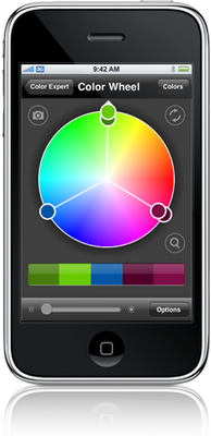
Couple of techie things I have discovered. First off, there is this cool new iphone app called Color Expert. Essentially, its a palette creator where you pick colors and them can morph them to either artistic or scientific interpretations of analogous, monochromatic, complementary, split complementary, or triadic combinations. Once you tweak those palettes either starting from scratch or starting from an established "I love this color///base color" then, you can get the cmyk, rgb or even pantone chips that correspond to this combination. You can save the palette to the iphone or send it to yourself, your team etc. to use in projects on the roster. So its a fun little thing that is a color toy which is highly amusing and shows some interesting combinations that ripping a pantone book might not accomplish. Lets see if it yields anything in the future. Color Expert describes itself this way:

Color Expert contains powerful tools to help artists and designers identify, translate, capture and showcase color. Designers know inspiration can come anywhere at anytime. Just look around. Some of the best ideas are waiting for you in the real world away from the studio. Now with Color Expert, you'll have the tools to capture the moment, the moment a color captures you. Look down. See the color of that Pomegranate in your cart? Go get it. It'd be perfect for the project you've been working on. Whip out Color Expert and it tells you that shade is PANTONE® solid coated PANTONE 220 C. The interactive color wheel then finds the perfect color schemes and palettes to match. Now, email that color scheme to your friends or clients. But, you might not want to tell them you're still in the check-out line. Whether designing, decorating or accessorizing, Color Expert is indispensable for anyone working with color. Anywhere. Anytime.

The other cool thing(s) are simple applications to create web pages. One is Squarespace the other is Wix. Squarespace is on my list. I am going to backout all of my web content from this and the other piddly blogs I have going and flow it through Squarespace which I can control on my own servers versus the google one. Don't get me wrong, this blogspot empire is wonderful, simple and it works....but I now have well over 1500 entries, so my investment and actually content is something I want to protect now that I am fully engaged in this enterprise. Plus, I may want to design it a bit (not much) just for kicks. You do n0t need to be web saavy nor a codewriter but just a content person...and its WYSIWYG. I can use existing photo gallery templates for my portfolio and really rethink the blog/website interface...where one could enhance the other versus operate as two separate entities. I like my website,but I cannot futz with it...and the way to keep it fresh is to touch it more often than I am doing. Plus, if I can drive people to my blog...the flow through to the website should be simple and fluid. Right now, its pretty clunky.

Wix is a similar tool except you can create widgets, slide shows, and more flashdriven animated presentations that maybe could dovetail with the Squarespace "meat and potato" approach. I have a problem of animation for animation sake...it becomes trite. But used tactically, as a widget or a popup slide show, this could be great. It's interface is very simple...and you can use it to promote your art/music. You can use a preexisting template or start with a blank piece of electronic paper....Take a look at both. You don't need to hire a codifier, or a web expert. Just will take a little time. Plus, the bait is ...its free to get started. So, build a site in both and see the difference. This sort of small paradigm shift is welcome. No longer do we need some middle man in between us and the web. We can go direct and not worry about someone else filtering our ideas and content. So...sooooo beautiful.

Jiri Harcuba gets the pale green (to reflect his use in clear glass) background. I am going to monkey with the type a bit to punch up the lettering a bit. Kitty needs to clean her room, read her book and do some other projects prior to having a guest for 10 days. Alex is sleeping at a friends house, with the promise of more work in the fields of garlic mustard (ripping it out by the roots). Rob's sister Gloria shows up today from the sunny west Coast for a week +/- of visiting, Grassroots and vacationing. Our friend Bruce is here Monday or so. Kitty's friend on Tuesday. And then, then...big things, big sounds, volunteering. No end to the fun.

I have a bit more packing and thinking and then I will be ready to go tomorrow a.m. We have a walk through and info session at noon for Kitty at Hartford and then with help, I will hang my work... and then, my friends, may the rumpus begin!

PS. My work will be featured in a story about digital art in the Artists Magazine soon (next month)? This is all thanks to Ursula Roma who wrote the article and kindly invited me to submit work for publication. Very exciting news indeed!

Breakfast with Juan (Gris)


What a great way to get up and greet the morning. Yes, with sunshine! but also with the happy Juan Gris, whose synthetic Cubism makes the world a better place.

I am surrounded by pets. The cats flank either side of this powerbook and the black shadow is lying on my feet. The cats are hungry and know if I succumb to their watching me, there will be extra food. Shadow is just protecting me...(I guess).

Today is lots of business dealings which will be great to get behind us prior to the next two weeks happening. Grassroots is beginning to perc. You can tell that the tribe is beginning to assemble from the hangerouters in front of Gimme! coffee and the stackouts of beer (lovingly referred to by the crowd at the Shure Save as "THE WALL OF BEER"). Wednesday is promising to have great music before the festival with Keith Frank on the Commons, Toivo at the Farmer's Market in Tburg and American Hellcat Drivers at Barangus. Rob has timed it all out with sequencing and drive time all figured in...so what with the volunteering, the hanging out with friends and the guests coming to visit, it should be a wild place here in Trumansburg while I am embracing peace and personal turmoil all on a 8.5"x 11" stack of tracing paper.

I feel that if the last two weeks of Hartford are any match to the last two weeks of Syracuse (which, I thought was going to be a waste of time and it turned out to be the great jettison into my working analog and getting back to my loves)--it should be good. We will be having a group crit a week from Sunday and a week from Saturday, a road trip to the Norman Rockwell Museum in Stockbridge, MA. Of course there is our show in the Silpe Gallery and our graduation dinner which the teens and I made favors (stacks of black pencils that said Hartford Art School Illustration MFA 2009 tied with red and white ribbons). I am giving some Luckystone prizes (small stuff...but meaningful to me as I feel we should encourage and support those in the program in small ways. I figure if I can model this behavior and continue to give those prizes after I leave, maybe others will be inspired to do the same). I set up the blog "Squint" for Hartford along with establishing the Facebook Group for the MFA program. I hope others will raise their hands and contibute versus assuming that this stuff just "happens". It saddens me that there are so many that just take and take...and wonder when it stops, why? I saddens me there is no commitment beyond the personal to expand to a commitment to the group. This putting oneself forward should be part of the growth...but you cannot make people reach out when the universe rotates around them. Harumph. Sorry about the rant...(I did clip a bunch out as it got too vitriolic and petty).

With the prizes, I am going to talk about taking trips/journeys and how some people plan and organize while others wing it. Both people come back from their journeys changed, inspired and hopefully open to continue to do this. Our collective shared journeys embrace a desire to go to places that are not commonplace for each one of us. We may physically be in the same place, but every student is on his or her path, some searching, some sharpening-but changing and being open to that change. I am giving out the personal maps for each traveller.... Nuf said. I need to script this thing.

Shady is growling in her throat. I gotta go to the door.

Synthetic (cubism, that is)


/>
I love this period of Mr. P. Picasso's work (admittedly, I like a lot of his periods)--that of synthetic cubism. These little jewels of decorative illustration are happy moments of color, shape, form, found objects and beautiful compositions. I just put these out there as a way to make the day a bit nicer despite the rain (which is making a lot go mouldy these days). There is a lot here to take as inspiration from the palette to the happy wallpaper patterns to the idea of these little domestic scenes that do no more than welcome to to have a cup of tea and contemplate what's next. No one is going to get riled up from this stuff.

Today, finish the Jiri portrait, pack and organize. The money grubbing teens are anxious to get outside to clip and prune more. I wonder if they can make this happen prior to the downpour we are scheduled to get.

Both of the cats are sneezing, a very disturbing sound and experience. MeiMei has the sniffles which adds to the auditory experience. I am happy they can stay here on the porch and nurse their maladies and let me leave them to their illness. Shady is snoring and moaning in her sleep. I am going to get her going to wake up the two under 20.

Need to think about the non Holiday, Holiday card. I am thinking a growing theme a la Craig Frazier. Plants, vines, trees, a natural approach. Maybe how man is represented? or could man and growing be fused? Also, a synthetic cubist image...it just comes down to what. This is going to be a crash and burn as soon as it hits. Feels like the holidays now anyway. Its in the fifties and I am wearing a wool shirt. Thats trouble in July.

Oy. More later.

dinner time.

It's late. Sorry I haven't had a chance to breathe. Its all coming together. Tomorrow, I get the paper to wrap my work. All the prizes are packed. All papers. I need to gather and compile art supplies and the computer stuff. Had a bit of fun making some woodgrain brushes in photoshop. But, there is the wacom, the memory stick, pens, ink, blue pencils, black pencils, erasers, tracing, new notebook, lined notebook, all the printouts of the schedules...the reference all printed out, the SF pix, Chads totem pole totems (flattened and ready to reassemble). Then there are the "which elements of the Quniform do I take?". The Quniform is like cuniform, only it's my garb, my Q-uniform.

A nice possible project came through the door having to do with local music and venues. It is still inception, but maybe some nice local portraits may happen. I think its design and illustration. Was working on a portrait of Jiri Harcuba (a Czech glass artist) for the ongoing series of small shows at the Museum of Glass ("The Masters of Studio Glass") and found the reference wanting. I went to Flickr and found an excellent image with nice features/nice gesture. I wrote the glass artist a note asking permission to use the image (Now, I am acting like a big girl!) and away we go. I am about half done. Its looking nice. Very spare...one color.

My Wood Duck image was accepted at Bagstabfor production. The image that got into the Society show got votes, but was shunned (too edgy? Liza Minella was dumped too). We will see if Little Richard makes it.

Kitty, Alex, Nigel and Mabin were all cutting and pulling, tearing and whacking weeds and wood. The backyard is getting in shape for the second half of the summer which goes from green to greybrown and leggy. Now, there is hope that leggy will be a bit more tailored and elegant. Nothing like 4 people between 15--19 all leaning into it together. Anything is possible. To that, Rick, the veggie stand man at the top of the hill wanted to know if Kitty and Alex wanted to do some farm work with him...and Kitty jumped on it, whipping out a pen with her cell number etc. Wow. Nothing like putting some cash in the bank, eh?

now


Yesterday I finished up putting the cherries in jars and did some cooking. Love the new adds to my mis en place--that being the stuff you keep on hand to cook-- and without these ingredients, it just doesnt happen (olive oil, garlic, leeks, onion, sea salt and pepper, lemon juice, lime juice, scallions, chicken stock). You get the idea. New adds, ginger, soy sauce, rice wine vinegar and worcester sauce. I bought black caps, zucchini, new leeks, and hot house tomatoes from Rick's stand at the top of the hill--which was great. Rick and the missus regaled me with tales of all the hard cider, peach brandy and booze that the two of them make on the side. Lots of winking and insights. Very funny. Localvores to the enth degree.

My illustration mis en place has a lot of do with software, ink, brush pens...etc. The pictures above are just sketches from my sketchbook.

Worked the better part of yesterday--building my files of reference etc. for CF Payne and Gary Kelley next week. Need to lean into the file building for the digital class the following week. I boxed up the 8 15"x 20"s. All my prizes are wrapped and in bags. Thesis papers are packed with my shoes to show. Started the pile of clothes and underwear that need to go. My bag of quarters for coffee and laundry is ready. Picture hanging hardware needs to happen. Need to check with Kitty on wheither she wants an interview at Hartford after her tour/ info session.

It's late and I need to roll the hometeam out of their respective racks.