Day Two, Week One: HAS

Its been a bit hectic as you can imagine...but I am now set up in Hartford thanks to the kind and gentle ministrations of Kitty and Robbie. They were both tremendous in their good humor,encouragement and just plain being there. Saturday, we got up around 4 to drive via a new, gps recommended route to Hartford. We arrived on time (around noon) to have a tour of the campus for perspective students. That was amazing and frankly, I would recommend anyone considering even this MFA program, take the tour as it paints a different institution than their website or even being in the program suggests. My take away was mini Syracuse without the rah rah, but higher quality. Hartford is comprised of bunch of schools with the Hart School (Music and Performance) and Art School being the top of the pyramid. So its really very arts driven--at a high level. Small classes. Beautiful facilities. Enough housing for everyone. Heavy duty rennovations going on. Nice gym, library, classrooms. Pretty sweet. And NICE is the watchword. Everyone is really nice, and helpful.

We started yesterday with the full bore: Murray doing the History of Illustration (somehow feels refreshed...it was great...) and I am in love with Howard Pyle and his line work. Dennis Nolan did his Zero Degrees of Separation slide show...essentially pointing up how teachers teach teachers all the way back to the established artist who began the process, Giotto. Very funny and very illuminating. CF Payne and Gary Kelley were stellar in their critics of the Thesis show...honestly saying things that had meaning...in a very kind and open manner that even if it were pointed, it pointed to change. Nice warm up for the thesis defense for many, I would imagine. They critiqued the second year work--again, encouraging and d

This directing in a nice exchange...with little stories peppered in. Wonderful. Great lead in for today where I am actually looking forward to working after Chris Payne will demonstrate his many layered technique.

I will be brief now as we went to the grocery store last night and really didnt settle in until a bit before eleven. Cannot do that often.

Gotta brush myself and go.

Alibris


images above courtesy of:
© S. Hnizdovsky, 1985
Reprinted with kind permission.
www.hnizdovsky.com

I was presented with a glistening stainless steel bowl brimming with a stockpot's quantity of translucent, ruby sour cherries. Kitty had climbed the trees with Alex on the ground, working with Peter to gather cherries for his projects and yet some for me and for Peggy. So, I pitted for a bit last night, and an hour or so this morning and now I have a stock pot of cherries in sugar and a bit of lime juice, mascerating prior to cooking up preserves which I will put in jars tomorrow. It was wonderful for Kitty and Alex to spend time with Peter making and picking, talking and learning about his world, and what he loves to do, collect, think about. Plus, the pizza was divine as well. Lucky ducks!

The woodcuts are from the current illustration boyfriend, Jacques Hznidovsky. They are bookplates (truly a design, type and illustration project of the past) integrating type and his lovely illustration to powerful results. There is an "englishness" to his approach to these personal tributes that I really love in the integration of type and illustration, the simple framesthat are the glue between the two.Lovely. As bookplates were a pleasure for bibliophiles and necessities for the wealthy patrons in the past, when books were treasured, and libraraies contained in rooms devoted to reading, learning and the sheer physicality of books, what is that moment now? A Kindle with an electronic book? No need for real estate, for book tables and book lights. I even have the 100 classics on my iPhone to browse at will, waiting for kids or in the cracking corners of time we have during the day. And, surprisingly, I like it that I can read in bed with the lights off...with something as small as my hand. But the smell of the ink, new glue and the lovely hand of rich paper is lost. The viseral, the tangible are gone leaving us unadorned content that only our imaginations can embellish. The sensuality of the printed page and speaking as a designer, the wonder of seeing a print piece develop and bloom on press is missing. However, with change comes a new appreciation. I am waiting.

Speaking of books and words, Carol TInkelman forwarded the advance copy of Lisa Cyr's article on the Hartford Art School in the June issue of Communication Arts Magazine (the illustration issue I have my Fort Worth image in). I am briefly noted (and am flattered to no end) and would love to share the article with you>>

There is more work to be done this weekend to get prepped for next Saturday's trip to Hartford. I need to finish my Barnum sketch, gather and output the reference for Gary and Chris Payne, create brushes and type for the Barnum stuff (scrap pile) and pack, wrap the pictures and get my wits clear. Then there is the prep for the guest who Rob will have along with the prep for Erich while I am gone. Holiday weekend, pffft.

More later.

Stocking up


Leo and Diane Dillon

Well, thanks to Joe Ciardello and others, I ordered up a stack of Arches 140 Hot Press and a fist of tubes of watercolor (per the palette recommended by the ever amazing painter, Dennis Nolan). I was stunned and drooling after I had a chance to hold Ciardello's beautiful illustrations--with the paper being luscious and had great hand...a great surface that takes the ink. I also loved his hand ripped/deckled edges that I think could be part of my illustration... taking the hand drawn thing further making it toothier. I had to get some...no choice. I also got some watercolor frisket as well as I adore the little graphic characters that the Dillons use...and the graphic illustration from the Illustration House (at left) that really got me charged up to try this approach. I love the simplicity and whimsey of this image and how all the parts are really working. Breathlessly inspiring.

Doug Andersen nipped at my heels suggesting scratchboard and watercolors, hand tinting prints etc and you know, I am going to take the challenge along with scratchboard (and a technique that Chad Grohman is going to explain to me having to do with a fake woodcut approach). I also dialed up a holiday card with various inserts for this year versus stacks of prints for everyone. Probably prints for clients...but not the entire list as the supplies are not cheap and I want to say hi to a lot of people. So, the list gets parsed--the Hi list and the print/gift list. More letters the better...but with a little thinking around them. Plus, the postage is pricy on the big prints...so change is in order. And, appropriate too given the state of the state of the state.

Speaking of inspiring--this image is a knockout from the Dillons. I love how Will Bradley it is...the line work, the sheer texture of the plants below (along with the demon who is hidden), and then the simple figures who draw your eye. I am very taken with this, the color, the composition, and the linear forest (remember this Q.) used to build the image and set an environment for the story. Lots to see here.

Rob was so kind while we were in Fort Lauderdale, pulling off the street and allowing me to scramble around the car to take snapshots of the wonderful plants and palms that spring up in every patch of dirt in front of everything. So, I have great resources along with my new used books from Alibris on Indian Painting. Am getting charged up again.

Gotta go, work awaits.

HAS:Day Three

"If I had my life to live, I'd live over a delicatessen."

"How would you keep them down on the farm once they've seen the farm?"

Two opening quips from Arnold Roth who led our meetings today. These quotes were attributed to Abe Burrows, commedy writer. He led us in a merry chase quoting all sorts of funny people, introducing us to Humbug, the magazine, Poor Arnold's Almanac, and some terrific english images (Princess Di and Camilla Parker Bowles for examples). He had a wide ranging career from replacing PG Wodehouse with an english publication to spreads in the New Yorker. He pretty much has had free rein throughout his career (57 years of freelance) with his work, opinions and approaches even down to a cute story of how he pushed back Hugh Heffner about details in his History of Sex series he did for Playboy.

We then had a great presentation by Daniel Abraham on copyright based law, why it is important, roughly how to do it, and what the levels of registration represents--wheither legal bills and fees or just fess for the illustrations covered. It made me very paranoid, but Mr. Abraham saliently suggested that these forms and submissions should happen on a regular basis--maybe having the quarterly tax day also be registration day...?

The afternoon was a crit of a selection of all of our images from the photohoot yesterday afternoon. It was wonderful the imagery we had all produced. There were hoots and catcalls from the audience along with captions for each one. The work was pretty amazing and refreshing in the simplicity of the light, the incamera composition and the approach each group took with their models.

When we were out getting lunch, we bought some holiday presents at Pylones, a store I saw in London with tons of color and decorative films laid on everything from toasters and sippy cups, to yoyos, whisks, and brushes, pens and trivets, wallets and key chains. Color galore. Very fun and exciting. I bought things for clients and others...inspiring for all of us who illustrate.

I showed the sketch work I am doing to my thesis advisor who recommended I keep going. Would I consider trying scratchboard? Tinting with watercolor? Tinting with other paint? Work with some figures. It was all good and moving. Positive feedback about the work from him, my mentor and others who were interested in looking at the deck. Now all I have to do is keep going.

More Lorraine Fox illustrations


Hi. I found this cache of Lorraine Fox illustrations from Flickr from an individual called, JelloKitty, who scans in old cookbooks for the visuals and humor they have. These are the chapter section pages (there are quite a few). I love the pink and the way Lorraine handle line, texture and her drawings. They evoke a time in a very stylish and current way.

Am working away on more Trees of Life/Knowledge. Working on the snake. After reading a bit of interpretations of the Garden of Eden story--here are some things that jump out. One, the apple is a fabrication. The story talks about the fruit of the tree of knowledge. So how did the apple happen? Did the Greeks and Romans make that happen? Does this stem from the Renaissance? Hmmm.

Now the serpent was more crafty than any other wild animal that the Lord God had made. He said to the woman, ‘Did God say, “You shall not eat from any tree in the garden”?’ 2The woman said to the serpent, ‘We may eat of the fruit of the trees in the garden; 3but God said, “You shall not eat of the fruit of the tree that is in the middle of the garden, nor shall you touch it, or you shall die.” ’ Genesis Chapter 3, verses 1-3

The Book of Jubilees, Wiki describes as:

The Book of Jubilees (ספר היובלים), sometimes called the Lesser Genesis (Leptogenesis), is an ancient Jewish religious work, considered one of the Pseudepigrapha[1] by most Protestant, Roman Catholic, and Eastern Orthodox Christians. It was well known to Early Christian writers in the East and the West, as well as by the Rabbis. Later it was so thoroughly suppressed that no complete Hebrew, Greek or Latin version has survived. It is considered canonical for the Ethiopian Orthodox Church, where it is known as the Book of Division (Ge'ez: Mets'hafe Kufale). In the modern scholarly view, it reworks material found in the Biblical books of Genesis and Exodus in the light of concerns of some 2nd century BC Jews.
The Book of Jubilees claims to present "the history of the division of the days of the Law, of the events of the years, the year-weeks, and the jubilees of the world" as secretly revealed to Moses (in addition to the Torah or "Law") while Moses was on Mount Sinai for forty days and forty nights. The chronology given in Jubilees is based on multiples of seven; the jubilees are periods of 49 years, seven 'year-weeks', into which all of time has been divided. According to the author of Jubilees, all proper customs that mankind should follow are determined by God's decree.

The Book of Jubilees is more mythological in their stories and detail Adam's life, and the children of Adam as well. According to this book (Chapter 3), the animals spoke to Adam and Eve prior to their fall. Afterwards, they were silenced. God also got into the tailoring business post knowledge, making fur garments/coats for Adam and Eve. Do you think they were leopard skin?

Virginia Lee Burton


I picked up a book at the local used bookstore yesterday. It was irresistible as it was a book with narrative on a woman illustrator known for her children's books which are timeless. After a few hours, I have put down the book--inspired by the work and life of Virginia Lee Burton, and challenged by what her illustrations can push my own work to be.

First the book:
Virginia Lee Burton: A Life in Art by Barbara Elleman

Amazon's Review sums it up from the School Library Journal:
The creator of Mike Mulligan and His Steam Shovel (1939) and The Little House (1942, both Houghton) played many roles during her too-brief life: dancer, artist, exacting designer and teacher, craftswoman, illustrator, shepherdess, wife, mother, and ebullient hostess. This appreciative biography portrays a gifted artist balancing a successful professional career with family responsibilities at a time when most women chose one over the other. Elleman examines Burton's early work and investigates the genesis of each of her seven picture books, from Choo Choo (1937) to the epic, carefully researched Life Story (1962, both Houghton). She shows how Burton's perfectionism shaped her art, which is characterized by organic movement, rooted in the rhythms of nature, and has "survival through change" as its constant theme. A generous selection of family photos and full-color art from Burton's published and unpublished work, laid out in a handsome, open page design, accompanies the text. Research notes, an index, and an extensive bibliography are appended. This welcome tribute to a beloved artist should be a first purchase.
Margaret A. Chang, Massachusetts College of Liberal Arts, North Adams
Copyright 2002 Reed Business Information, Inc.

What I discovered was a story of a woman, happy in her life, happy in her family, surrounded by nature and children who merged her work in with her life and managed through her hard work to create lasting children's books, pursue teaching and establish a colony of decorative designers/ craftsmen with the Folly Cove Designers. Virginia Lee Burton was the writer / illustrator of the famed Mike Mulligan and His Steam Shovel, Choo Choo, The Little House, Calico the Wonder Horse to name a few.She immersed herself in the research often getting into steam shovels and pulling along her small sons Aris and Mike (the boy the Mike Mulligan book was written for). The boys and friends were more than companions. Virginia would read them her stories (often with cocoa and cookies as the draw) and see how they reacted--bored, alert, twitchy? and would amend her tales according to what the children would directly or indirectly tell her.

She was always challenging herself. The story of how Calico the Wonder Horse evolved is a fine example of that. Her son, Mike, was engaged in comic books and radio dramas and Virginia wanted him to come back to books. So, she developed the Calico book to be set in a graphic novel format, poking fun at the comics and radio (which she listened to and read to fully understand what the appeal was)--making her horse a girl etc. Some of the illustrations from Calico are such a kick in my pants as she is using these decorative shapes to imply energy, to set the subject apart from the frame.

For me, though I bow to the beauty of The Little House, her black and white work is singular. Her work on the Robin Hood illustrations>is the best example of how she pushes and pulls the black and white to bounce one off the other...and how she uses a standard frame shape and device to link her pictures together. She fully understands negative and positive and really unleashes it in this work as well as the obvious outflow into the work of the Folly Cove Designers.

Wikipedia describes the Folly Cove Designers as:

The Folly Cove Designers grew out of a design course taught by Virginia Lee Burton. She lived in Folly Cove, the most northerly part of Lanesville, Gloucester, Massachusetts. She was able to express the local consensus that the world was a beautiful place, and the elements of beauty surround us in nature.

Her block printing thesis grew out of the home industries/arts and crafts movements of the past. The artist/designer of products for home use is separated from the product by machine age technology (and now globalization). Fine art for home use is within our own power. To this end her design course taught an ability to see the design in nature, a set of good design rules (dark and light, sizing, repetition, reflection, etc.), and the craftsmanship of carving the linoleum, and then printing fabric for home use.

On completion of the course the graduate was permitted to submit a design to the jury(selected Designers rotated this responsibility starting in 1943) of the Folly Cove Designers. If it was accepted as displaying the design qualities as taught in the course, then they could carve the design in linoleum and print it for sale as a Folly Cove Design.

The design course started in 1938. In 1940 they had their first public exhibition-in the Demetrios studio. The following year they decided to go public, they called themselves the Folly Cove Designers. Every year they had an opening to present the new designs, and everyone enjoyed the coffee and nisu (Finnish coffee bread). They established a relationship to wholesale their work to the America House of New York which had been established in 1940 by the American Craftsman Cooperative Council. In 1944 they hired Dorothy Norton as an executive secretary to run the business end of the successful young enterprise. In 1945, Lord and Taylor bought non-exclusive rights to five designs which pushed the reputation of the group, and began some national publicity and diverse commissions for their work.

The Home Industries shop in Rockport, Massachusetts, owned by the Tolfords, sold the Designer's work to the public starting in 1943. It wasn't until 1948 that the Designers opened "The Barn" in Folly Cove as their own summer retail outlet. In the late 1950's they extended the season to ten months. Virginia Lee Burton Demetrios died in 1969. The following year the group disbanded, ending a period of unique creativity and cooperation. Some Designers were with the group for only a season and others continued with the group for decades. In 1970 the sample books, display hangings and other artifacts from the Folly Cove Designer's Barn were given to the Cape Ann Historical Association in Gloucester, Massachusetts who are now the primary source for information about the Folly Cove Designers.

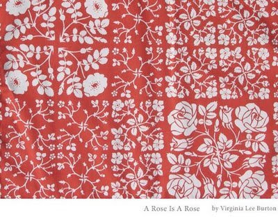
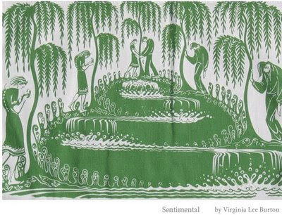
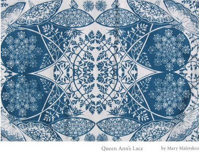
The work is wonderful. As fresh as the day it was first printed--and highly collectable. In it's heyday, they were the rage in New York--sold through the America House and Macy's. The prints were printed from hand carved linoleum blocks and printed on linen one at a time. It was suggested they automate to increase production and availability, and it was turned down as it wasn't right for the group. Take a look at the revival page (linked above) and see if you aren't taken with it.

More later. I need to process this more.

Colonial wonderfulness


Holiday illustrations today during this cold, grey day. The big hosta lilies are all opening up to give us a fragrant weekend as soon as this grey week is done.

Am doing a little research on colonial grave markers/ tombstones--something I have loved from way way back. Now, another reason to go there with this Memento Mori project. I love the way the wings are drawn, the crazy and beautiful typographic affects, and the simplicity of the skulls. I am going to go down this road a little in my notebooks. The ever wonderful Edward Gorey is very derivative of this work...and so to go to the source gives me permission to ramp it up a little beyond the limited stuff for the Day of the Dead. Gravematters.com is a tremendous resource.

Am outputting images for the SPCA show. Possibilities to show dogs/pets at the SPCA proper. Could be another opportunity to get the work out there.

More later...(dreaming of willow trees and urns and skulls)>>