Not necessarily going to seed

Allium Gigantium going to seed by the pumpphouse, Q. Cassetti, 2011We heard the Chicken Tractor at Felicias last night to our delight. So much so, we are going to hear them again tonight at the Rongo. It was a bright and breezy summer night last night with the crowd being at the Ithaca Festival, so the Atomic Lounge was not insanely crushing…and the music was brilliant and fun. Kitty was the dancing princess at the contra dance at the Bethel Grove Community Center. Alex was doing the festival, movies and then more bro time. So all were engaged…albeit not as a tribe. But, everyone is growing up and need their own groups, their own communities to flourish and identify with. I know this…thanks to being a member of my own community of artists, musicians, localvores and the fine IthaTrumansburgers.

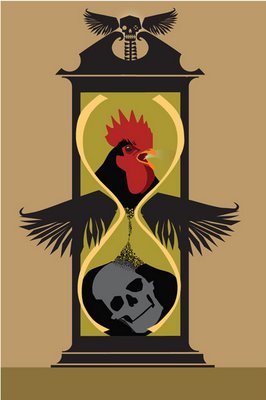
I am working on a new body of work that I am not going too public on as it is a warm up for a project that hopefully start soon. Alex was asking my why I needed to do this warm up, this sharpening up— and I likened my process to that of a musician doing the scales, or singers doing trills—I love getting my eye “in” and sharpening my sensitivity to the work through practice works. I guess it comes from the calligraphic work with the esteemed professor, Arnold Bank.

    “Calligraphy is the autographics of alphabetics… . Calligraphy is simply the art of writing,or of sketching and drawing transferred to the use of letter design, on the beautiful blank of a fine sheet of paper… . Now in doing it, it has to be clear and it has to be beautiful.”
    Arnold Bank (1908-1986)

I might have mentioned this before, but Arnold Bank was my first real art/ design teacher. Quite honestly, there have only been two significant teachers in my visual career—those being Arnold Bank and Murray Tinkelman. Arnold Bank was a self taught calligrapher who had studied at the Arts Students League—perfecting his thinking and teaching. His course was a disciplined self study to learn a letterform from drawing the forms with different pens from a pair of flair pens taped together to simulate the thick/thin to ink and pens. From music pens to metal brushes to flat brushes. We worked from big to small producing a poster/placard, a poem and then a small book to explore text sizes. This work to learn a “hand” led the student to fully understand and build fluidity in the letterforms, leading, spacing and design in the most granular way. There were pen warm ups that needed to be done prior to picking up the pen to start the work….and these warmups are the source of inspiration for these pre illustration, illustrations…to get the eye in, to tune the design sensitivity, and think about the black and white, designing the negative and positive as the pen hits the paper. I really havent given it much thought, but I do not think other illustrators do warmups…but for me, it is imperative to do the warmups along with thumbnails as it is the physical and spirit aligning….in preparation for the trance that can happen with the work.

Forgive me for not sharing right now, it just is important that it stays with me. So, I will share photos and other things for while until I am ready. You will get snippets of my concerts, my friends, whats growing…the color, forms and shapes in my world.

Must go. I have Kitty and 4 friends, Bruce, Rob and soon Alex who will be anxious to eat. Now, what to cook?

I got an F


I am getting somewhere with these Stooges....and was thrilled when I posted it to my facebook just to get a reaction that Pablo Lopato (impetus for this new twist) weighed in and said "Nice!". That means, keep going.

Gary Kelley talked about how he developed his books..the thinking, the research, the design that the illustrator engages in the process with the art director having a point of view and placing the type. Very interesting from the standpoint of the designer and from the look of the books...the engagement of the designer. Gary loves the relationship so it works for him. This is a dream situation for Gary as he views it not as the big CaChing! but more that this is another opportunity to do what he loves and develop a complete body of work, essentially, a portfolio to get his work out there. What I love about Gary is that illustration is magic for him. He loves to see the idea bloom into the image from the conception through to the final with every step a juicy morsel to be savored, stressed over and adored. I can so relate to his more art oriented approach--looking for colors and shapes--and allowing measured risks to happen as the color evolves and the design builds off the bones of the sketch. Remarkable and quite inspiring. Gary's two new books, one from Hyperion on Eleanor Roosevelt which pretties her up a bit, but is as compelling visually with the nicely designed images and spreads to the not for little people book on Paganini and his deal with the devil (mirroring his extrodinary book on Robert Johnson done with singular and stunning monoprints). Both worth buying even if its for grown ups.

Gary's vision, his joy in his work, the so called, simple paring down to color and shape is very motivating to me--his artistic ambition to constantly be amused, charmed, inspired, driven by the work of other artists and have it change and effect his work and direction is a gift upon the closure of this chapter to me. Somehow these last weeks are so poignant and so distilling to make the time fly but at the same time stand still when you hear the truths that are being imparted.

C F Payne loves what he does from the abstracting and stretching of the head to the making/doing of his work--but it is somehow less spiritual and brawnier than that of Gary Kelley. Chris is working on a "celebrity" book with Steve Martin--and it seems to be a happy marriage (we hope for this). Everyone worked on their own projects from portraits in either pastel and/or the multiplexed C Payne technique or on thesis work or in my case-- doing some intellectual stretching trying to simplify and abstract heads.

I had my thesis review today. It was Murray Tinkelman, Doug Andersen, Bill Thompson and to my delight, Bunny Carter. They wanted me to recount a bit of what the paper speaks to--and then to talk about my time at Hartford. Bunny was very nice and very positive about the work, where it could go and that the thing I will need to worry about/focus on are more bodies of work like this or like Memento Mori that will drive the style. Murray projected that in the right time (like the sixties) I would have been asked to join the Pushpin Studio (wow...!). Bunny projected that this work was going to get out there--and get published--and that the thing I will need to worry about when I have imitators, was to keep in front of it. Wow. Imagine. Do you think? And, she also said that she was proud of me as a women doing this...and from a goddess of illustration history and a keen observer of people, I am tearing up from that. Now, I just have to dog it to see where we go.

So, I have the F.
The Terminus F. I want to hug the world, hug myself and cry a little bit.

Day Two, Week One: HAS

Its been a bit hectic as you can imagine...but I am now set up in Hartford thanks to the kind and gentle ministrations of Kitty and Robbie. They were both tremendous in their good humor,encouragement and just plain being there. Saturday, we got up around 4 to drive via a new, gps recommended route to Hartford. We arrived on time (around noon) to have a tour of the campus for perspective students. That was amazing and frankly, I would recommend anyone considering even this MFA program, take the tour as it paints a different institution than their website or even being in the program suggests. My take away was mini Syracuse without the rah rah, but higher quality. Hartford is comprised of bunch of schools with the Hart School (Music and Performance) and Art School being the top of the pyramid. So its really very arts driven--at a high level. Small classes. Beautiful facilities. Enough housing for everyone. Heavy duty rennovations going on. Nice gym, library, classrooms. Pretty sweet. And NICE is the watchword. Everyone is really nice, and helpful.

We started yesterday with the full bore: Murray doing the History of Illustration (somehow feels refreshed...it was great...) and I am in love with Howard Pyle and his line work. Dennis Nolan did his Zero Degrees of Separation slide show...essentially pointing up how teachers teach teachers all the way back to the established artist who began the process, Giotto. Very funny and very illuminating. CF Payne and Gary Kelley were stellar in their critics of the Thesis show...honestly saying things that had meaning...in a very kind and open manner that even if it were pointed, it pointed to change. Nice warm up for the thesis defense for many, I would imagine. They critiqued the second year work--again, encouraging and d

This directing in a nice exchange...with little stories peppered in. Wonderful. Great lead in for today where I am actually looking forward to working after Chris Payne will demonstrate his many layered technique.

I will be brief now as we went to the grocery store last night and really didnt settle in until a bit before eleven. Cannot do that often.

Gotta brush myself and go.

Back on track


Finished up the first round on the paper and got to Murray and Doug. Murray called yesterday around noon very positive about the content, the work and the actual paper. He was very complimentary and kind...which makes me proud. Also, a bit hesitant as it now has to be better in the final. I guess I will hear from Doug at some point. After that, I will hire an editor and then refine. The work needs to be refined (some redrawn). And, there is one valentine on the desk that is to go into the final. Time to polish and finish. This is why there has been a lull in my writing my daily drivel to you....too much going on in this arena and work(!). Bizeee...

Speaking of Murray, his work and words are featured this week on Leif Peng's very interesting and expansive blog, Today's Inspiration. I highly recommend Murray's entries as it portrays what illustration studios were and how talent was brought along and emerged from this system. When I started as a designer at Corning Glass Works, we had an illustration studio in town that did line drawings and gouache paintings of Corningware, Pyrex and the consumer products for their catalogs and sell sheets. These poor devils had illustration jobs, but not the more glamourous jobs the Cooper Studio and even Pushpin had for their artists. But there was work for renderers, inkers, painters even in Corning, New York. Now the concept of an illustration studio seems inconcievable except in the case of illustration based companies such as Hallmark and American Greeting Cards. I also recommend the entries on Murray for a peek into the risks he took as a brash, young man with tremendous talent and occasionally not the most perfect timing. I love the illustrations from the baseball player and the wacky machine (the early version of the man machines he did for U&lc), the armidillo, the wonderful wolverine and the wealth of whimsical pen and ink work he did. It is a real shot in the arm for me...a gift to keep going and to not pick fights...Murray is an inspiration with his work, his persona, his gift as an educator and mentor and a friend. And, bless Carol for letting him do what he had to do to become this person we know and adore.

Zina Saunders, wonderful illustrator, insightful writer and all round high energy person noted the Peng entry on her page on the Drawger site. She also included an illustration she has done in a woodcut style that is fabulous. This artist never stops.... Wonderful work, wonderful writing and very interesting and wonderful comments on her page. Take a look.

I am hot on little people drawings. I loved Murray's baseball player for the spirit of the little man the simple face, the feeling. I was looking (and I admit, reading Roald Dahl's Matilda) at Quentin Blake's illustrations and was prompted to take all of the examples (BFG, Esiotrot, The Witches)off the bookshelf to see his work. Blake also has a very cute and amusing website that presents illustration content in a very happy, nontraditional way (categorically) and uses an almost "cloudlike" table of contents with flash animation to enliven and make the site sparkle as much as Blake does. His writing and storytelling is wonderful. And, Blake shares pictures of his studio, his house, his life that adds to the humanizing the legend. Love his pencil neck children along with the imperious, ogre like grown ups often with bad facial hair and warts. Now that I am looking at little people--I am going to have to plunge in. I have a birthday card to design for a client...and illustration definitely is in order.

Now that the valentine piece is coming along, time to design some heart patterns for end pages and section transitions. I am mulling over whether I do a perfect bound publication with Lulu or whether it is wire-o from Lulu. Though the perfect bound is pretty, the requirement of the paper is no printing on the backs. I think that wire-o might suit that better. Plus, they have a few nice color options that could be good. Need to order fu dog buttons (and a few more as there is no limit to the numbers of images to include in the order) and a postcard or two. Nothing over the top. Also need to get some sample output done on canvas and on maple plywood. The wood could be great with black printing on it...24" x 36" panels. But big canvas ones could be good....I should get a sample of each and see which works.

The image at the top is from my work on Avian Flu. I have been a bit wired (read neurotic) about the new Swine Flu (which is now PC to refer to as H1N1). Swine is better than avian for me because at least the vaccines are not incubated in pigs...just eggs. Plus, if you knew the annual flu statistics that we all do not even miss a beat on, 30,000 people die annually from the the "regular" flu. But, the full on pandemic is not someone wants to go through--and I have taken it to a mental image of a Bruegal-esque moment of death and destruction, catherine wheels and fog, a barren landscape of sorrow. Bird headed doctors (the plague masks were bird beaks that had a scented cloth in the beak to stave off the stench of the dying), carts of corpses rattling down Camp Street. Nothing is impossible in the world that grips me at three in the morning (won't life be great once menepause is over?) What is in this head transcends a school closing and please wash your hands and cover your mouth precautions. I am happy though that the family of man...globally, are behaving consciously and responsibly to maybe make this a quiet emergency versus a global trauma. There may be some pig pictures coming to the fore....

New web concepts we need to talk about later: Issuu, Squarespace
New vendors: Justbuttons

And I have a new wonderful surprise I am not spilling until I try them.... I am THRILLED to be so witty!

More later, my friends.

Wednesday: caffeinated.


All pooped. Have been going to Kitty's dress rehearsals (with camera) until 9 for the past few nights. Tonight is the opener and so flowers are in order (we never do this...but for this one, we are), and I need to go buy tickets to tonights presentation. I don't think I will go to all 3 performances. Maybe tonight and Saturday? Need to get the food together for Cast Party and reconfirm the gathering tomorrow night.

Got an old book on the PushPin Studios with the hope to see the scope of the entire studio and to see more Barry Zeid (who is often cited by Murray). The Push Pin Graphic by Seymour Chwast with Steven Heller and Martin Venezky editing, and intro from Milton Glaser. Wow. This is a monumental inspiration for me. Its a style a day...reflecting Murray's quote from Today's Inspiration:

"I enjoy variety and I try to use style in the same way a typographer uses type faces," said Tinkelman in a 1970 interview in American Artist magazine. "The style is not dictated by whim, nor by the art director, but by the problem the job presents."

The work of Push Pin Studios confirms this feeling hands down.

Where ever these illustrator were in their lives, in their experiences, it oozed out of their work. Milton and Shirley Glaser found wonderful cut paper illustrations in Europe and bought them--and by sheer new application>presented them as illustrations. There were works on crummy newsprint with the bleed through as part of the final. There are ink paintings, line drawings, images that reflect the history of art. There are visual puns, and visual poetry. This Studio was monumental in it's reach at the time...and now, it is reaching out to me. I see great possibilities as I turn the pages to this fine book. They truly blend their love of type and typography with that of line and decorative illustration...so nothing goes untouched. Another revelation is how huge Push Pin Studios grew. I forgot Alcorn and Reynolds Ruffin's work. Glaser is so huge...its hard to remember that every single guy that was part of the studio was huge. More later

Notes on SF: Travel as part of the educational process


The San Francisco trip was my last ISDP trip with my graduate degree in illustration. I am somewhat bittersweet about the journey and the multiple paths it has taken. I have seen, experienced and engaged in so much with such a range of people that this study has been a blessing and gift for me. The travel is key to the program as it reinforces whatever path you are at the time. The exposure to such a wide range of speakers combined with the self teaching that the travel provides to each individual is jarring and revealing in the mystery of what one learns. Sometimes it’s a direct hit, an immediate “Yes!”. Sometimes the lessons are more prolonged--happening over time--providing support as the bumps emerge or the questions remain unanswered. But for a week, you walk in other people’s shoes; you see what they are doing, how they do it, and what their hopes, goals and aspirations are at that moment. These presentations are another measure for an illustrator to say, “hey, this is where I am” or “I could do something like that” creating options that may not have presented themselves otherwise.

With Hartford’s program, it’s even richer as it has Murray and Carol Tinkelman. They provide their combined experiences as an illustration and education team--along with deep friendships with many of the speakers that one gets carried along with the current of these relationships. Just a small example is that Carol encourages us to contact those speakers who we responded to and write a quick thank you note. I did this with Don Ivan Punchatz and have had some nice conversations with him post trip. He is another guide that I have acquired on this path to learn and grow--another branch in the progress, another person to talk and lean on. The amazing collegiality of these professionals is generous, kind and they all seem to want to reach out, to teach, to inform.

Our trips inspire others. It was so wonderful to hear Courtney Granner and Robert Hunt, in two separate instances, make a point of telling Murray Tinkelman that they too, were taking their students on the road to learn, listen and see illustration in
different cities with different orientations and markets. You could hear the pride and excitement in their voices as they embrace this other way to teach and learn. It is to the Tinkelman’s credit that this universe continues to expand organically--giving and taking, learning and teaching, adding and building the community of illustrators and image makers. It is a sweet cycle that I am honored to have been included in. It will continue as will the conversations, relationships, ideas and personal evolution now that new groups are integrating this into their learning.

I have a brilliant mentor.

Had a great chat with Murray. I sent him a handful of the sketches I was working on looking for pointed input and editorial. He was wonderful. More decorative illustration milestone conventions for me to integrate into my thinking while I work. I started talking color and Murray said that the black and white hangs together and I could leave it at that. We then talked about color just to see where he sat on it..I mentioned the hot/cool thinking that many of my real live illustration friends use (particularly those that were trained as real illustrators)--the whole red/blue, orange/turquoise, hot/cold thinking as a way to think of coloring an image. I thought that maybe Murray would expound on this convention...and instead, I got something bigger. A big handle to individually assess my work as I am going. What I needed to do is broadly think about the balance of the picture--and that balance needed to be either 80%/20%, 75%/25%-- something more than 50/50 from the color (warm/cool), the contast balance (dark/light), the balance of the family of shapes (sharp/soft, ambiguous/defined))--It is, as Murray said, a checklist of how to review the work-- I love this thing. His input on the bees, the birds, the details, definition of the heads--all good. More to do, more bugs to draw.
Onward to the month of love.

beginning portrait


I shot pix of my daughter, K. She was very patient as she knows that this is something I have wanted to do...and humored me with being as still as can be, and moving her long limbs into lovely graceful poses. I got started with the portrait I am doing of her and liked this just as is...so here is just as is...I may pull a print and save a layer as I go. This is for my lighting project for Hartford. THere may be a few of these to review. A good opportunity to do something I have wanted to do! I think this will be fun and will give me a portrait to boot for the end of this process.

making sense of life

“Writing is making sense of life. You work your whole life and perhaps you've made sense of one small area.”
Nadine Gordimer

Murray
was quoting Dorothy Parker last week--about her vision of writing (the process) and writing (the finished piece) which was intriguing for me to think about two things. Read a bit about what writers say about their work, their craft, their vision, their final opus. And then, see how it applies to illustration, graphic design, and how I speak to myself and to my world. Additionally, the quote he cited (which I dogged today and could not find) was all about the final work being important but how some of us wallow and thrill in the actual making/doing to get there. For me, it is the entire package--not just the thumbnailing to admire and then the final frozen moment of wonder when the illustration is done, and we can all admire it. I love the sharpening of the blue pencil, the loading my sailor brush pen with glorious, glorious Borealis black ink, the patting of the paper, the tracing and filling, the scanning and the correcting. The whole process is very happy, very relaxing and a form of meditation for me. It is me, talking to me...listening to the radiators hissing, Shady Grove scratching and enjoying the day as it is. Then, the pleasure is in the final work after the tweaking and cleaning, changing and modifying. So, I get a double dip. And, surprisingly, not everyone laps up every part of the illustration process. So artists create, plow through the making and enjoy the final piece. I cannot even begin to try to live in those shoes. The whole thing for me is so luscious and lovely, I cannot even begin to imagine the loss of pleasure in the doing just for a wonderful end piece.

What a wonderful thing Murray gave to us in citing that sharp witted Dorothy Parker and making me think. Another reason why he is so adoreable.

getting ready for Baldwinsville


Hand drawn peacock. Tail was flipped. Modified neck in the computer to correct the drawing. Did the Chad> res it up bigtime, select the image, save as workpath> export to illustrator> open in illustrator and then, where the hang up is--anything that knocks out of the single shape, needs to be reknocked out as paths as the counter/ or the white space within the shape will fill if you change the colors around. Another thought is that in photoshop, you can make a bunch of different selections either with color range (the big blunt tool) or by drawing paths, for different colorways etc. and save each one of those out (a la different screens for each color in screenprinting) as a workpath and bring into photoshop. My little brain is ticking away on this technique...it opens up new possibilities with hand drawn images while getting them in a scaleable place.

I am starting to look at oriental carpets and china design as well as Indian paintings. I started paginating the book...really not a problem in the beginning as God did some big stuff for the first 7 days. Then, when Adam and the Troublesome one, Eve, come on the scene, the sense of time melts away. However, in the Book of Jubilee, everything is essentially, time, date, length of time...Whoever put this gem in place Looooved numbers.

"These four great works God created on the third day. And on the fourth day He created the sun and the moon and the stars, and set them in the firmament of the heaven, to give light upon all the earth, and to rule over the day and the night, and divide the light from the darkness."

"And in the first week of the first jubilee, [1-7 A.M.] Adam and his wife were in the garden of Eden for seven years tilling and keeping it, and we gave him work and we instructed him to do everything that is suitable for tillage. And he tilled (the garden), and was naked and knew it not, and was not ashamed, and he protected the garden from the birds and beasts and cattle, and gathered its fruit, and eat, and put aside the residue for himself and for his wife [and put aside that which was being kept].And after the completion of the seven years, which he had completed there, seven years exactly, [8 A.M.] and in the second month, on the seventeenth day (of the month), the serpent came and approached the woman, and the serpent said to the woman, 'Hath God commanded you, saying, Ye shall not eat of every tree of the garden?'"


This stuff is so specific, I have to believe law was written from this book. To see more on the books of the Pseudepigrapha and the Apocrypha of the Old Testament>> I have always loved the odd extras that the Apocrypha put out there, and now to think there is more extra odd stuff with the Pseudepigrapha,  I am thrilled. Not exactly the trite, night night reading I really want to do, but boy howdy, perfect for sitting in the doctor's office or the airport for that little bit of focus before you have to unfocus again. I think there is plenty to work with (and edit, to my thinking) for this thesis project.

I was having illustration fun on ebay, typing in illustrators names and seeing what popped up. Mary Blair, I discovered, not only has a ton of books that are real movers on the site, also designed and illustrated printed hankerchiefs. The Provensens are there in force --books and prints. Jan Balet has prints. And our very own mentor mio, Mr. Tinkelman has a books up for sale>> Punky the Mouse, Aesops Fables and the Rodeo book to name a few. So, for amusement, type in an illustrator you know or want to see work of, and see what happens. Its very fun.

Off to Baldwinsville (north of Syracuse) for the Cross Country Invitational. A is grumpy these days, shrugged into his new royal blue sweats like a monk with attitude. I hope a bit of running with help him to snap out of it. K. has a little infection and needs to take some pills to bring her around. We have an invitation guest list to generate today for the big party we are throwing dovetailing with the second weekend of the Ithaca Art Trail. Need to do some thinking around what we are going to offer to eat and drink. I'm thinking something totally old fashioned and totally do aheadable and delicious>:> Chex mix! or maybe Cheesy Ranch Chex Mix! I def know I will be buying some tubs of stuff from the Regional, making salsa and cutting crudites. Baby Gloria and Cousin Lisa (might) will be here from SoCal, and Bruce will be here from Maryland. I need to think about who they would like to meet. Members of the band, Toivo, sweetly came up to us at the Pourhouse and told us how pleased they were to do the gig. We are blessed to live in such a wonderful place. Should be fun.

Need to think holiday card for the office. Cannot let this become the shoemakers children. I do have quite a few holiday trees floating around....and if Simple cards can do a 4 panel/ 4 color, we can fill it up with illustration to beat the band. Now, I am getting some wind on this one. Next Week, or else!

Gotta go. Time progresses.

reworkin', oh girl!


Changed the lips and nose of the above Eve image per great input from Murray. We went through all of the current sketches on the garden of eden with Murray giving me very valuable insights, amendments and ideas. I have my work cut out for me just in the amendments...but its all great and I am feeling that I am beginning to get into a bit more of a groove. Murray was talking about illustration conventions--and I wish I knew them... Is there a book out there. I need to not kick myself as I am, at this time, a 28 year graphic designer and a 3 year old illustrator which would make me a college junior on a good day. We talked about sources of inspiration: Barry Zeid, Rousseau, Matisse, Arnold Blanch, the Pushpin geniuses with highlights around Milton Glaser, Seymour Cwast, John Alcorn. Murray got into Roussseau's influence on Paul Davis, well known for his Three Penny Opera poster. A prompt again to look at Paul Davis' work and look at what I found on Detour, the Moleskine City Notebook Experience>>

One of Paul Davis' sketchbooks. Wow. I can mimic that....I may already do that but maybe not to this level. Wow. Need to start painting in my notebook. I need to get messier. As usual, it was wonderful with Murray and I look forward to more input from him. Also sent links to my thesis advisor, Doug Andersen, who had some great insights and prods to get a storyboard going...and to work with some figures. Murray said the same. Okay. I will get some of the amendments going, finish the Vin assignment and then get going on that.

Cornell card to complete today. Lots for the medical company. Lots of phone calls. I wish SOI would post their application for the annual show (still not on the web)--am itchy to get that done and out. Got Family Knife (band that is a subset from Plastic Nebraska without Gabe) to do. Finished the Five at Two party invitation out and to PSPrinting. Thinking about Art Trail a lot.

A. has a cross country event this p.m. I should get their tee shirt designed to take with me. Hope it doesnt rain. It looks like rain now...urg.

Gotta go.

jewels from ebay


Name: Doris Lee
Artist's Date: 1905-1983
Title: Blossom Time (Woodstock)
Medium: serigraph/trimmed margins
Signature Placement: Estate Stamp Verso
Size: 18x24

Name: Doris Lee
Artist's Date: 1905-1983
Title: Bird & Vine
Medium: serigrah
Signature Placement: LR
Size: 17.5x12.5
Reserved: No

Name: Doris Lee
Artist's Date: 1905-1983
Title: Reflections
Date of piece: n. d.
Medium: lithograph
Signature Placement: LR
Size: 21x17
Reserved: No
Condition: good

Name: Doris Lee
Artist's Date: 1905-1983
Title: Poster for Memorial Show at WAAM
Date of piece: 1984
Medium: commercial Lithograph
Signature Placement: Unsigned
Size: 28 x 16-1/2

Name: Doris Lee
Artist's Date: 1905-1983
Title: Fruits & Vegetables
Medium: lithograph
Signature Placement: Unsigned
Size: 17.5x23.5
Reserved: No

Name: Doris Lee
Artist's Date: 1905-1983
Title: Christmas Fruit
Medium: serigraph
Signature Placement: LR
Size: 24.25x30
Reserved: No

Name: Doris Lee
Artist's Date: 1905-1983
Title: River Bathers
Medium: lithograph
Signature Placement: LR
Size: 11x16
Reserved: No

Well, dang. We were talking about Doris Lee and her husband Arnold Blanch so I went to my favorite mall, bookstore and gallery and googled her. There is an auction of prints and originals that I gleaned these images from and wanted to share with you>> I can editorialize forever on this work--her primitive forms, simple color and the twisty twirly line work that gives it a sense of humor and charm. I love how shapey it all is. My next Garden is going to be inspired from these, these very images. This work speaks to me.

Bizzy Buzz Buzz


The bees (above) were photographed at the lovely farm wedding we attended a few weekends past. I was charmed with the hive surrounded by queen anne's lace and grasses along with the actual bees--flying towards their home, ignoring us and happy to amongst themselves. I am a bee lover from way back...I love the way they look, the simplicity of keeping bees, and the symbolic aspect of bees. Napoleon represented himself with a bee as did royals. The bee is used by the mormons as a representative of their productivity and community with one of Brigham Young's houses called the Beehive. A member of the Freemasons in Mill Valley wrote a wonderful paper on bees and what they mean here>> Dig this:
"...the emblem of the bee hive is found in an Irish expose called The Early Masonic Catechisms printed in 1724:

"A bee has in all Ages and Nations been the Grand Hierogliphick of Masonry, because it excells all other living Creatures in the Contrivance and Commodiousness of its Habitation or combe; … nay Masonry or Building seems to be of the very Essence or Nature of the Bee, for her Building not the ordinary Way of all other living Creatures, is the Generative Cause which produces the Young ones. (you know I suppose that Bees are of Neither Sex.)

For this Reason the Kings of France both Pagans and Christians, always Eminent Free-Masons, carried three Bees for their Arms.

What Modern Masons call a Lodge was for the above Reasons by Antiquity call'd a HIVE of Free-Masons, and for the same Reasons when a Dissention happens in a Lodge the going off and forming another Lodge is to this Day call'd SWARMING. (wording and spelling of 1724)" (Roberts, The Craft and Its Symbols, p. 73)

I was at our local Farmers Market and found the Bee man, Mr. Waid from Interlaken who had big beeswax pillar candles and bee pollen for sale. Of course, I had to buy it...and spent some time talking bees with him. He and his wife told me that they rent their bees to farmers for $70. Mr. Waid puts them in his truck (?moving the hive?) and takes them gently down the road. Unloads them and allows them to help pollinate the farmer's field and then, brings them back to his place. Then they exolled the virtues and values of bee pollen when you ingest it...preventing or mollifying allergens in the air. Local pollen and honey> Local bees> Local environment that we are part of . Nice understandable cycle that makes sense to me. Anything to reduce the need for seldane or any of the other magic drugs that are almost necessary on the shoulder seasons.

So, bees are deep, cool and beautiful. Hold that thought for some pictures.

I am very pleased to have gotten 12 pieces out to the Society of Illustrators LA show yesterday. It takes a bit of time to get the files all right and tight. I had a nice chat with Alice from SILA who was helpful in explaining work arounds in getting the files to them for the show. Its a bit hinky with their new tool, but the thought and intent is good. It will be better, I am sure, next year. But hey you guys, if you are entering, the last day is September 19th....and we should know who is in, and who isn't by Thanksgiving! SOI NYC is coming up too, so the SILA prep will get you ready for the New York show.

Murray pulled me out of the mud yesterday...pointing, nudging and guiding. He was talking about the topic of Adam and Eve/Garden of Eden saying that this here was something to get my teeth into. He thought the monkeys needed a rest. He suggested I look at Today's Inspiration for the new writing and images of Jan Balet.


Jan Balet from Today's Inspiration

Also to read up on Doris Lee, her husband Arnold Blanch, Milton Avery and others who really set the stage for some of the storybookartists such as the Provensens. There is a lovely exhibit of Doris Lee's work at the D. Wigmore Fine Art site>> Okay, Murray--I am beginning to see it...

Doris Lee (1905-1983)
Woman in a Garden
20 x 29 7/8 inches, gouache and watercolor on board, signed lower right

I got off the phone feeling the rock off my shoulders and fired up to learn about these artists and two, to get going on some pictures to do with the Garden Story. I am shifting gears and will present this as a slick cover for a children's religious magazine..or myths and legends thing. Murray suggested (as I will chase this for my thesis) that this become a children's book. As usual, I was negative, but after a night's sleep and a bit of thinking...this is probably a good idea. I think I do not worry about making is super sweet...just in doing a bang up job. Maybe R. can help me with the simplifying of the story. This is great. Simply great. I can draw this stuff for a year, no problem.

We also talked about drawing and the computer. My thinking is that the computer freezes an illustrator because making perfect curves and flat shapes has a draw for an artist as the appeal for perfect is alluring. I have been sucked in by this. However in losing the drawn line, the quirkiness of the hand of the illustrator, the errors and wobbles, the life is gone from the drawing and becomes perfect shapes, logotypes without a soul. I think if I can come up with a working method paralleling the Ron Mazellen approach, where the computer helps to refine, becomes a method of hastening the mid steps and becoming invisable in the final product this shold be my goal. I know in the vector approach I started at Syracuse, there is the intent to have the work look like screenprints and actually reduced the process down to working in vectors and the pathfinder tools to hasten the process along. Only flat color (like screen prints) reduced palette (the now thinking) and shape reduction...breaking it out like circus posters or prints...that the imprint of the computer was diminished. Now the challenge is to do the same with the hand drawn image. I think there are some tricks here....

Gotta go. Like I said the other day, there may be a trip to Aurora today! I'll take my picture machine! More later.