As pleased as Punch!


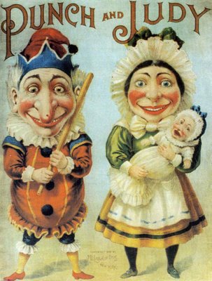
There he is, Punch. Mr. Meany--always portrayed with his stick that he uses quite vehemently on the other person (generally Judy or their baby(!)or the crocodile(!!)) with his big nose, big chin, motley clothes and his little scary voice (which I find out is part of his signature...it is called the Swazzle--as wiki sez:

In the British "Punch and Judy" show Punch wears a jester's motley and is a hunchback whose hooked nose almost meets his curved jutting chin. He carries a stick, as large as himself, which he freely uses upon all the other characters in the show. He speaks in a distinctive squawking voice, produced by a contrivance known as a swazzle or swatchel which the Professor holds in his mouth, transmitting his gleeful cackle— "That's the way to do it". So important is Mr. Punch's signature sound that it is a matter of some controversy within Punch and Judy circles as to whether a 'non-swazzled' show can be considered a true Punch and Judy Show.

I love this Swazzle thing. Really could be a great name for a lot of things. A whole twist to the character, a sound, a signature beyond the beating of the other characters. The Professor is the name of the single puppeteer who performs these little plays...always of two characters. I was musing on the history (there's quite a bit) of Punch and Judy  to Rob. Surprisingly, we both had the same opinion of them (albeit, I always go for the look as primary) as they are anachonistic and the shows which both of us saw in our childhoods...the children of today do not even see. It was horrifying to go to a show, not understand what this little puppet who hit people and spoke in this bizarre manner and try to figure out what your parents had in mind in taking you to this performance. Was there some message I was too stupid to understand? Was this something to expect as my parents wanted to hit me with a stick? Why were people laughing? It was puzzling and scary the way the clowns are..only somehow Punch and Judy were more academic (translated, more tasteful and somehow, good for you).


I like it that Punch is a derivative character from the Commedia del'Arte, Punchinella...who also has a wonderful nose (and mask)...not quite a clown...but maybe close enough?

Late today

It's been a hundred miles per hour day-- with all sorts of editing and changing, finishing projects, saving file types, emailing etc. Am excited by the layers of tissues and tracing paper I plan on scanning and constructing in photoshop for the next three valentines (floral heart, pigeon, and the new Punch and Judy valentine. With the layers of printing, scanning and redrawing-- these images are becoming better designed and tighter illustrations with rework and redrawing.

Tomorrow more rework, new images and new thumbnails.

Monday morning


Work in progress above. Will be slugging in some Will Bradley inspired trees and a little Central Park copse with a bridge and maybe an apartment building. Or depending on the sketching, maybe just the trees and a dovecote with no city reference. Still on the fence about this, but want to move it forward. Definitely need to get rid of the border. Have been looking at successionist stuff...and was thrilled to get a kick in the booty from that. Plans afoot to do a calligraphic valentine or two, an octopus valentine, a punch and judy valentine (what a cute couple) and a mystical valentine (inspired by heart lines in palmistry). Posada has some love letter covers that have prompted me to go to him for other inspirations like cupid, love letters, winged women (with butterfly wings et. ) There is lots of room to move here...and i should do a figure or two to push it... (fear there, but hey). Also want to do a smallbody (8?) of work on Clowns. Rob said NO...that with my luck they would hit...and i would become known for clowns and he would have to tolerate it despite the fact he hates clowns. Will do some research. I love the idea...I could push the primative thing along with Yellow Blue and Red (black and grey) as a limited palette....could hit the simple/woodcut inspired thing...

Kids are out of school this week. R is shopping for a car. Our used red stationwagon died suddenly last week (200,000+ miles) so there is a bit of a rush to get something new to drive. So, he is shopping. It hurts how much cars cost...but this is part of my old fogery. So, will be part of the week for that. Wednesday we will look at a college as well as Friday and Saturday. Sunday R has to travel, so I have ilustration and maybe a bit of fun with the kiddies. American Illustration due friday...and 3x3 is short ly behind. Need to enter those shows this week too. Need to get to work...

Happy Valentines Day


I love holidays like Thanksgiving and Valentines Day as they are food holidays..but holidays with open ended messages. Thanks and Love. Wow. How can you miss with that? Plus, for me, they force me out of my corner, out of the retail headset and to think about those big messages and how they relate to my own life and living. I give thanks that I have so much to love from the people in my life, to the things I do (down to the granular day to days) to the experiences (mundane to extrordinary) and feel that this is truly a gift--these loves are what define me as a person and as the little spirit that inhabits this earth for the short time we do. The loves and how they link, how they network begin to define my warp and weft, define all that is positive and meaningful in the hours, days and years we are given to live.

I guess living in a small town has made me understand this. I cannot think of anyone in my small paradise of Trumansburg, that I do not like, let alone love. This network of people care about me back...and it grows. With this, comes strength as friends, cohorts and neighbors that when we have to lean into the difficult, we do it together with each other in our corner. I love the kids that my kids go to school with. And the attention and fun chats we have are often reflected back in the most wonderful and gratifying way. It is easy to set up walls of how on e should live, who one should be friends with, the "right way" of everything from setting the table to speaking to someone more influential or wealthy. Once those walls are up and the rules are prescribed, the risk of failing within this in environment is palpable and measured. There is no room for this giving of love and looking at the world through the lens of friendship, community and family--only against the environment of right and wrong. I vote for being open and socially goal free. I vote for caring and letting relationships evolve--of giving to each other in ideas and work, of caring and spirit, of time and effort. And if you do, even just a little bit--the gifts that come back can be tenfold. So the only risk is not giving yourself the permission to love.

I am lucky in my loves.

Royal Snake: Ethelind


Wind knocked a huge tree down...snapped it in half. And if that wasn't drama enough, we lost our electricity for about 6 hrs to boot. Worked until one-ish last night on Hartford Art School Work...and am slugging away on the valentines to get some reaction in SF. Talked to Murray about type and why I was striking out. One, from my vantage point, the type needs to be designed and integrated into the work. Not PLOPPED ON. Two, the type cannot be the generic "good taste basic classics" that I live in...but need a bit more whimsy, wacky, a bit more illustration than say, Univers. And so, I am looking at all my Egyptian and other more illustrative fonts prior to springing for Latin...which MT recommended and I am ready to buy. Valentines day tomorrow. and I have a dozen more to do prior to making the selection.

A wonderful warm day in February


I am combing through a lot of images in this mode. They are from the enormous body of work Posada did exclusively in the Chapbook area for the printer/publisher, A. Vanegas Arrovo. Love em. They def. give you a bit of confidence that everything doesn't have to be perfect all the time. But, the sheer tedium that Posada endured coming up with "Love Letters" every year, new and different for I am sure more than a decade. Or kids stuff, or Magical Clowns (what is not to love here)--really depicts the day to day tedium that this man endured. So, he earned his chops...and worked within the system. I was fascinated to find out that many of the second color plates of his engravings (many of these primary images had new type added and were reconfigured for new uses) were disfigured or destroyed so that the initial impressions of these images/plates became instantly more valuable. Given that these chapbooks were essentially novelties, or "trash"--no one collected, hoarded or saved these less than precious documents...so that the ones with complete veracity are amazing.

Working on my valentines. Changing color and beginning to do the most frightening thing, adding type. I know, I know...I am a graphic designer so type should be a piece of cake. The trauma is that I do not take the images I put type on very seriously...so its a yawn to see what happens. Now, I am fully invested...and I have to do this very risky thing...add type (and stir?). Oy. My world is frought with neurosis.

K and I went to Corning to have our teeth worked on. We had a lovely girl chat on the way down, and the most wonderful girly girl audio tape on the way back. It was wonderful. K had novacaine, so she was thrilled with what her mouth would and wouldnt do. A. was sick with coughs, phlem and malaise. Poor boy. Sleep helped and by dinner he was healthily pink, laughing and quoting rappers....versus Senor Catatonic who moved in for the last 24 hours.

Sleep beckons. I have a new valentine for you tomorrow!
You all are my valentine. Will you be mine?

First Monday in February


Monday Monday. Went to the gym--did a little bit of this, a little bit of that--and its all getting easier and things dont hurt as much. Working on a portrait for the Museum of Glass (show signage/ show identifier) for a leading studio glass artist. Its back and forth...darks and lights, midtones and highlights--building and building, taking away and building back. Its a mantra, a study, a meditation. Hope I get some mileage on this and get it done today (or at least close).

Reading and studying the Mexican publishers/engravers. Am intrigued by the chapbooks and chapbook covers they did. Posada did well over 300 of them on all topics from music to love letters, to childrens topics etc. And the same ideas rolled around year after year for him to depict. I guess these publishing houses/engravers were the great patrons of mexican illustration in the second half of the 1800s clear through until the thirties..so the taste and expression was formed by what sold publications. The schmaltzy use of flowers and birds have me on the edge of my seat, itching to give it a try. A day later and the beehive I shared with you is not quite there. However, thanks to the chat I had with Murray, I have plenty of amending and changing to do while I ponder the next steps. Plus, I have my Manhattan valentine (a pigeon with a love letter that says I love NY/NY skyline or central park bridge in bkgd.).

Snow is melting here leaving sheer ice behind. It should be on the warmer side this week, so everyone will get nuts thinking that Spring is here. Instead it is the traditional, mid winter fake out. I was remembering a spring break where it was in the 70s and the flowers were blooming...and then back to snow. But, that might have been the April break instead of February. We plan on a short jaunt to the east coast to start the college viewing next week. We have some in the Boston neighborhood, New Hampshire, Vermont. So, we will be busy, but at least we will have started this process too.

Jet Pens


Just an aside I was meaning to mention. I discovered a wonderful site that specializes in one of my all time favorite things. Yes, office supplies. And, to make it even better (how, you ask, could it be ANY better?)--they are JAPANESE office supplies. They have brush pens (thin to thick, disposable to not), puffy pens, white ink pens, ink in lovely silver boxes. They have a wide selection of pencil cases and my all time "must own to give aways"--sushi erasers. So, though you aren't bored or even pretending to be bored, you may want to go to Jet Pens and check them out!

quick


Off to see Lucia de Lammermoor at the movie theater. Taking the kids and the grandparents. Should be done by 4. Then back here for a bit and then to the Ithaca Festival Paint off.

Just got back. They had sold out of the Opera...(two theaters worth!) so no opera for us. Stopped at Ludgate Farms and bought maple syrup, vegetable bouillon cubes, quinua, and the new Michael Pallin book on "plant based foods"--We toured the Cornell campus driving through the Plantations, Beebee lake , Forest Home and down through the Lombard Street of Ithaca by the cemetary. It is melting here...40 degrees--so the Cornell students were in shorts and flip flops anticipating spring.

Talked to Murray yesterday about the valentines I have on Facebook (sketches...many of them). Murray took each and every one of them seriously and critiqued them giving me good insight on what to change, what not to change and maybe they were good enough for prime time. I approached one of these illustrations (a current revisit on the beehive) and drew it as a piece to flop and then drew details and background textures as separate parts that I stripped in with photoshop. It was quite interesting as the design has gotten tighter and bolder with this approach. And the designs come together much more quickly. This technique is a refinement on the approach I have been taking which is great. Faster, smoother process, more confidence in the work in general. I am reversing illustrations while I do them as well as I have found many illustrations that are too much black on a white field, become lace on black...and very appropos the topic.


The thinking around doing valentines for my thesis is to explore a variety of different "hands" or approaches to valentines, trying out techniques, use of color etc. in an area that is so broad there is plenty of room to move (from the content). Is it marketable? Well, the first are cards. But you can take it to merchandising and paper goods, to glass designs (perfect for a flipped design for Steuben for example), for a book on love poetry, to using them as package labels or even wine labels (or in the case of honey, honey labels or mead labels). So, this is more of a polyglot way to market the illustrations--but def a possibility. Even themes from this work could roll into CD designs for music/ American music? or even cookbooks...anything having to do with love. It goes beyond the valentines and speaks to affection and fondness. That is a 365 day a year type of opportunity.

Speaking of love...don't you love our President O. whaling on the nay sayers? I am so thrilled that this man does have a temper and will push back. All of this DC crap has got to stop. President O. has a full enough plate from the Bushies, that maybe the naysayers should shut up and sit down or even more wonderful, maybe try and help...versus the same status quo. Haven't we all had enough of people in power?

IF: [sweet] Time


With thee conversing I forget all time,
All seasons and their change, all please alike.
Sweet is the breath of morn, her rising sweet,
With charm of earliest birds; pleasant the sun
When first on this delightful land he spreads
His orient beams, on herb, tree, fruit, and flower,
Glistring with dew; fragrant the fertile earth
After soft showers; and sweet the coming on
Of grateful evening mild, then silent night
With this her solemn bird and this fair moon,
And these the gems of heav’n, her starry train:
But neither breath of morn when she ascends
With charm of earliest birds, nor rising sun
On this delightful land,

John Milton (1608–1674)
British poet. Paradise Lost (l. Bk. IV, l. 639–652)

--a confection for you on a cold, snowy, winter day--
close to Valentines Day!

Packaged Queen


I am in love with all things apiary. I have been for quite a while--and have been thinking about the bees, their lives and how they build their hives, the job they do with pollination, their clannishness as a swarm, and now their sudden departure. I am so in love with bees, I am looking into getting a hive with Kitty and seeing if we can do this sort of thing. There are some wonderful sites--with the starter set from Bee Commerce to "packaged bees"and Queens (love it that queens have a price list...>). Virgin Queens or Breeder Queens? or packaged Queens? Just the language is rich and funny. Here is a beekeepers blog>>Maybe that lovely man from the Tburg farmers market can advise? Remember him? He told me about how he rents his bees for around $70 a day to pollinate people's fields. He packages them up and drives them carefully over to the new field...and takes them home at night. Plus, he must get more than the money with what the bees bring home at night..Look at this>we have a fingerlakes bee keeping club! More to learn.

I am also going to get Digimarc for the studio. Digimarc is the copyright service that is part of the pulldown in Photoshop under filters. They have several levels of service and will give me a bit more peace of mind surrounding the ownership thing that is snowballing with the Orphan Rights Act being out there, looming on the horizon--and also just the cherrypickers who take from websites for their own websites etc. This is what Digimarc says:

COMMUNICATE OWNERSHIP
Content (images, audio, and video) often circulates anonymously, without the ability to communicate who owns it or how contact them to obtain the right to use it. Digital watermarking provides a persistent digital identity for all forms of media content and enables copyright holders to reliably communicate their ownership while also providing links to related details and purchase information. This helps to promote licensing and protect copyrighted content from unauthorized use or becoming an "orphaned work."

Digimarc embeds code into the image/illustration versus the fugly circle C and a name over the image which is repulsive and seems so amateur hour. There are shows to enter soon...and having this tool in tandem with that is probably a good idea.

Chad is coming this Saturday with his children to do the Ithaca Paint Off. Jime will be there too. I don't/didn't want to do it as I don't really paint. If they had an Ink Off...I might have had a crack at it. But as the tribe is gathering for this, I was musing that this would be the opportunity next year to get all the local illustrators I know from Rochester/Syracuse, down to below Sayre/ Binghampton to participate--and I could have an early dinner here for them prior to the even. Combine networking with fundraising--and let people show off a bit. Need to think a bit more on this.

I am choking a bit with the illustration--getting a bit caught up in the time it is taking to finish things...but still in a positive motion. Got a very encouraging note via Facebook with people I should contact specifically as it relates to the portrait work I have done (Corning Museum of Glass and the Burkas) as this person thought this work has traction. Am a bit panic-y about that and will talk it through with the mentor in SF. Gotta get to work...times a wasting.

Chops


I've been thinking about chops. Not lamb chops or pork chops but the wonderful new word that means you have the licks, the chops--to do something. Essentially, you have honed skills that you have earned by working at your craft. This is what I am working on as an illustrator. With chops comes the confidence that you can do anything put forward as you have been there, done that..or at least been there kinda sorta, done that kinda sorta...but a track record and the headset to do anything. Plus, in having this experience and trust in your own work, comes an ability to put a line down and know how to think and plan as the work progresses to rescue the piece or morph it to another place. It's knowing how to get into the trance from which the work evolves and changes.

We used to say "you need to put in the time" which for me as a young designer drove me batty as I had the skills and time...and it was never enough for those I worked with. However, looking backwards at this impatience, I think the age>experience combination was to a degree just a way of pushing me back...a way of not having to manage me because chops come from being bumped around, being directed as much as having the head/hand skills to take the work someplace. There are plenty of really talented designers and illustrators that definitely have the chops but do not have the ability to see the environment they are competing in, or see where they fit on the spectrum of illustration and reality. So, time does factor into chops or chopdom...but from a hand and skill standpoint--sometimes that is inate.

I was talking to R. about my thesis. The Garden project made me afraid because of my lacking chops in this world of decorative illustration. I just didn't know where to start. Sure, I sketched and traced. Sure, I researched and developed reference. Sure, I knew what and how I wanted to do this--and everything didnt work, everything froze. However, like the Memento Mori work, the valentines are flowing. Unlike the Memento Mori work and the Syracuse vector work--these valentines are being corrected, changed, colored, critiqued, aspects redrawn, reconsidered. So, from essentially spot illustrations with both the Syracuse work and the Memento Mori work, these pieces are getting context, being considered as illustrations with a frame, a world they live in--and this fear is beginning to ebb a bit. From this work, I am getting my legs in the heavy line work (above is the starting point on an Eden inspired valentine), to thin line work, to something in between. I am thinking about cut paper (something in the past I havent tried in a serious picture making versus sketch making way) and other aspects of approaches. This current body of work is giving me life to consider the Garden of Eden presented in a less threatening way. These valentines are the right diving board from which this work will morph to the Genesis work. And the valentines morphed from the daily picture making that the Memento Mori project was. Memento Mori was just an ink approach to daily illustrations on the topic of death, memory and remembrance. It was a new image a day...never revising, never refining. It was one shot...and on to the next. There is nothing wrong with this approach, but frankly, I should revisit those images and refine 12 of them to take the sketches to illustrations. More was better for the time. Now taking the more and condensing it down, and finishing them really takes it from a random thought, to a deliberate expression.

Hey now. Sounds like I have been learning something.

The Provensens again!


Thanks to Linda Tajirian, my very smart and tuned in classmate from Hartford--I was made aware of this phenomenal book, " The Fireside Cookbook" by James Beard and illustrated by Martin and Alice Provensen (Simon and Schuster, 1949). I quickly scuttled over to Alibris to see if they had a used copy so that I could pour over their work and at the same time, devouring the wonderful recipes by Beard (those foodies in the know call him "Beard" or at least that's what they do around here!). I found a copy for $6. with shipping getting me the book for a whisker under $10. And, as quick as you can imagine, the book came on Saturday. It is a remarkable publication with color plates in each section--some spreads in color too. Then its an explosion of line and flat color illustrations which are a real poke in the side to me. I really identify with those...and should do a valentine or two modelled on the way they handle the color and the whimsical line. They are not afraid of doing little curlicues and swashes in a single line weight, blended with their storybook approach..charming. In the chicken section there are tons of fox in the hen house little references. Terrific negative and positive approaches...that show off their strong design abilities. This stuff is stylish, cute and funny--more like the Shaker book with animals and flat architecture. However, their greek myths peek out with greek recipes and the flair for those things for children appear regularly. I will post some of the these simpler images today/tomorrow.

catch up

We have been so busy, not a chance to post a note. Friday was heads down work. We went to Cornell around six to attend a big Central New York indoor track and field event with Alex running in a singleton (1000?) and a 4x8 relay. It was quite a scene,with the Cornell facility--gorgeous, with a crowd of boys and girls in amazing shape doing amazing things. The 300 for the bigger schools was spectacular with these boys running like freight trains at startling speed was stunning. The teamwork and attitude of these students was affirming. I loved seeing a slice of New York State under one roof. We had a great time on the floor (versus up in the stands) mixing it up with the team, their teachers and other parents doing the same thing. This was done around 10:30 for us..We rolled over to the Nines in Collegetown and had a pizza with Kitty--bringing one home with us for Alex.

Saturday was a shopping day. Singlehandedly, the recession "the meltdown" should be partially recovered thanks to our vote. First there was a Wegmans cartorama filled with vegetables and bread, grass fed meat (small bit) and super bowl cuisine supplies (read chicken wings, pizza, tortilla chips). Then there was the purchase of ski goggles for Kitty. And then, we went for it. Alex has wanted to learn the bass guitar. He has been talking it up...and if there is a significant talk up--then we invest. So, we went to Ithaca Guitar Works and bought a cherry red bass guitar and mid level amp. We brought it home and he immediately started poking around on it...So now, I need to get some lessons cranked up with someone local. There is interest...so, there could be passion. And with passion comes involvement and energy. So. This week.

We went to the Pourhouse to hear the Chokers last night. It was really fun and the Chokers were ON. They were tight, the sound was terrific. Full house--with lots of musicians crowded in to mix it up--

Gotta go. Up against the SuperBowl as a deadline today.

working away in the clouds


Just got a pile of stuff out to Creative Quarterly, a wonderful, well designed publication by Charles Hively that really speaks actively to the design, communications, marketing and illustration world. There is a great aesthetic of strong, good design that has a sense of humor and fun...not totally bent pinkie perfection--swiss /academic design, but with the right balance of smart, humorous, witty work. Charles also creates and publishes 3x3 which has a similar sensibility exclusively for illustration. I think he is developing a publication that takes on Communication Arts and transcends all the others (Print, How, etc.). So, we wait and see on this one. The 3x3 show I got into at least gets mentions from my friends etc. that they saw my work unlike the other shows where a stunning silence happens from friends, clients etc. 3x3 is soon too...hopefully there will be some time to enter a bunch of the valentines a group...hmmm.

I am on the illustrations with a slightly different headset than Memento Mori (which I was reviewing this a.m. for Creative Quarterly). The Memento Mori work was inked in, scanned and that was it. No sketches. No rework. Just plain guts on the page...And what I have now is the let it fly--ink on paper which I might do more than once! Then its scanned in with other bits and pieces that are assembled in photoshop in a higher than usual dpi (either 400 or 500 dpi) to size. Then, I erase and patch the black and white prior to even thinking about color. Color is a whole other thing... I am using non photo blue pencil for sketching and my new friend, the pentel fine line whiteout pen (acquired in LA! at Famima, that cute japanese store). So, in the tradition of logo design technique we learned in school (draw on paper, get a piece of glass and put it on top of the sketch, paint negative and positive with plakat--back and forth).

Now I am back to that approach, only with my pictures. The tiger is being recolored and doctored...with a redraw of some clouds and some consideration of texture/activity at the bottom of the page. The more I doll it up, the more it doesnt help the image. To take clues from indian art, a flat color in the background isnt a problem, nor are flat color borders are good too. Totally work either flat and flat, or flat with thin patterned borders. So, need to go back in with that in mind.