I have been seeking. Searching for inspiration, for a place to settle and drive my work. I think I have been too wiped out physically to not be charged up as I normally have been...but it hasn't prevented me for questing for that spark, that moment. Interestingly, I have been chasing mid-century modern in a big way as it is part of my life, and something that I can embrace almost as a curator. I have found that the decorative work is either in children's books, or in textiles...but editorial work and graphic design (only in a few cases) were very painterly and descriptive. However, I stumbled over printed hankies and haven't looked back. I will share these discoveries with you to share my excitement.
First Off, Mr. Carl Charles Tait ( November 2, 1917- May 11, 2011) is my absolute love today. I am fickle. but he ranks high love. Here is what the Times Herald had to say about him in this obituary:
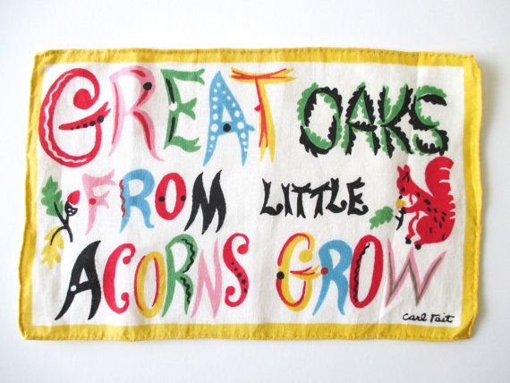
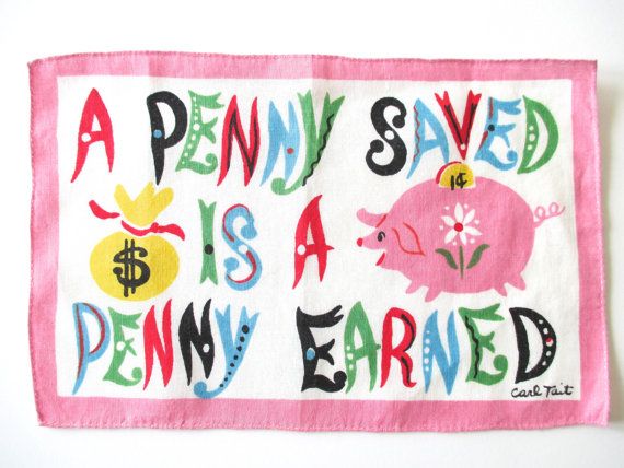
"Mr. Carl Charles Tait, age 93, of LaGrange, GA, died on Wednesday, May 11, 2011, at Doctor’s Hospice in Fayetteville, GA. He was born November 2, 1917, in Old Town, ME, to the late Harry Tremain Tait & Mary Belle Madore Tait....After high school, he served in the United States Army Air Corps from 1942 to 1946. He graduated from New Hampshire School of Arts & Sciences. He was a creative and wonderful artist, with claims to fame such as a large mural that is still proudly displayed in the Greenville/Spartanburg, SC, airport, and Christmas cards distributed by American Artist’s Group. He even designed a line of handkerchiefs that was available exclusively through B. Altman & Company department stores. He also used his artistic talent and innovative spirit while working as an independent contractor for Milliken Corporation, where he traveled around the United States designing showrooms for product displays. "
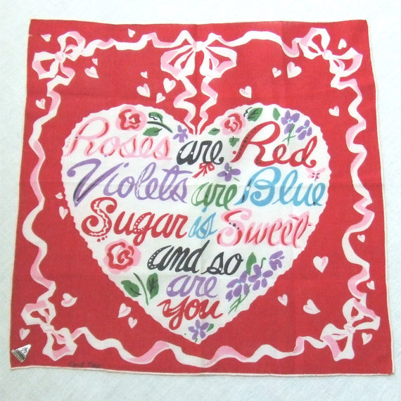
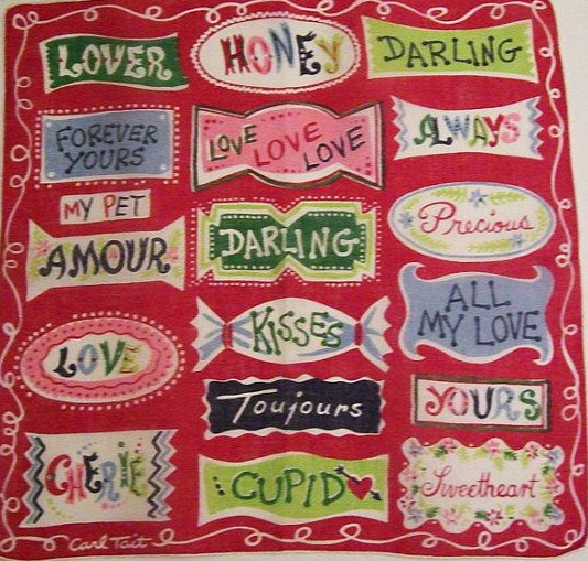
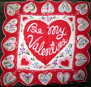
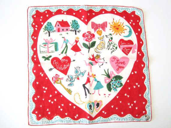
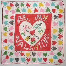
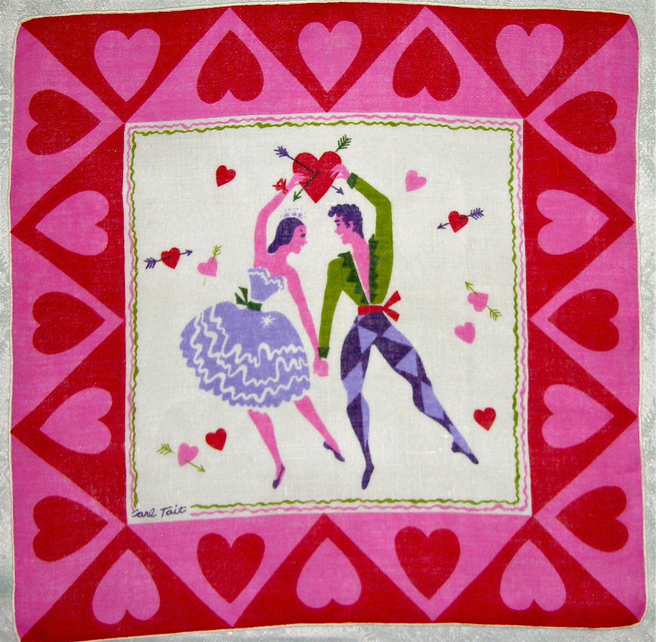
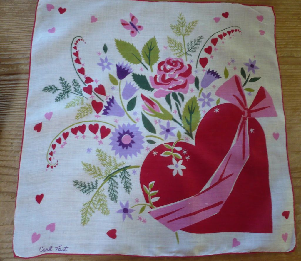
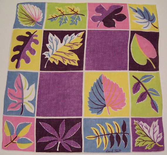
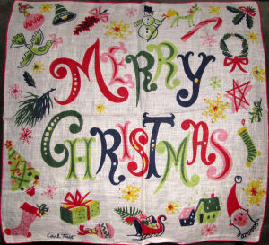
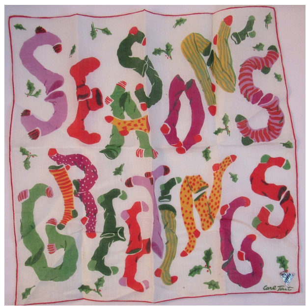
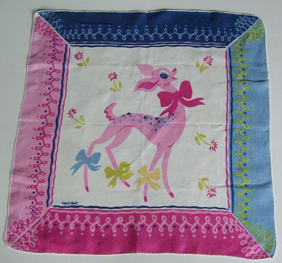
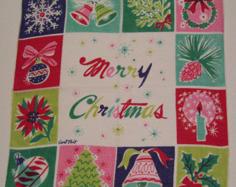
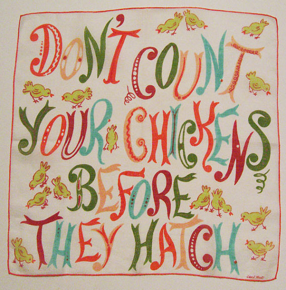
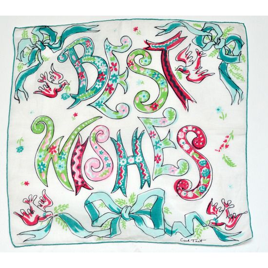
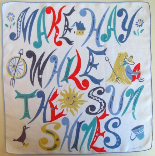
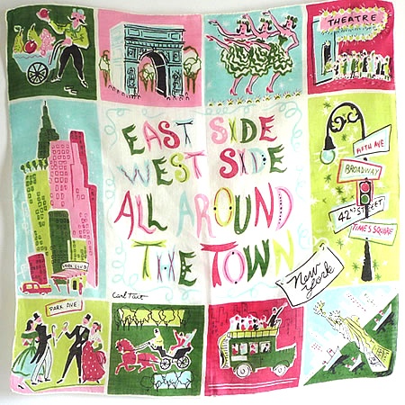
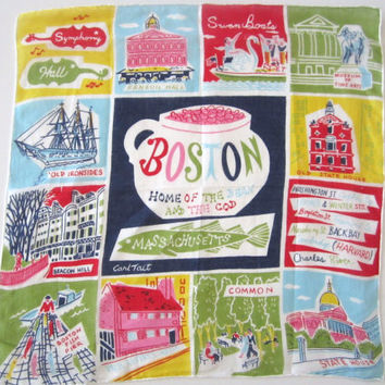
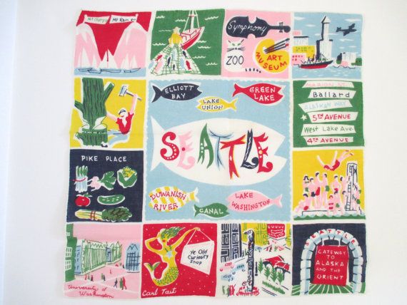
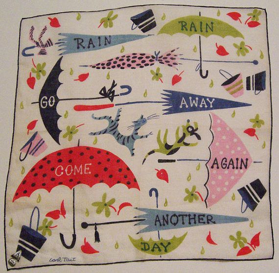
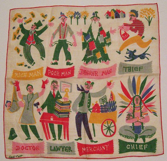
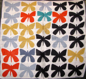
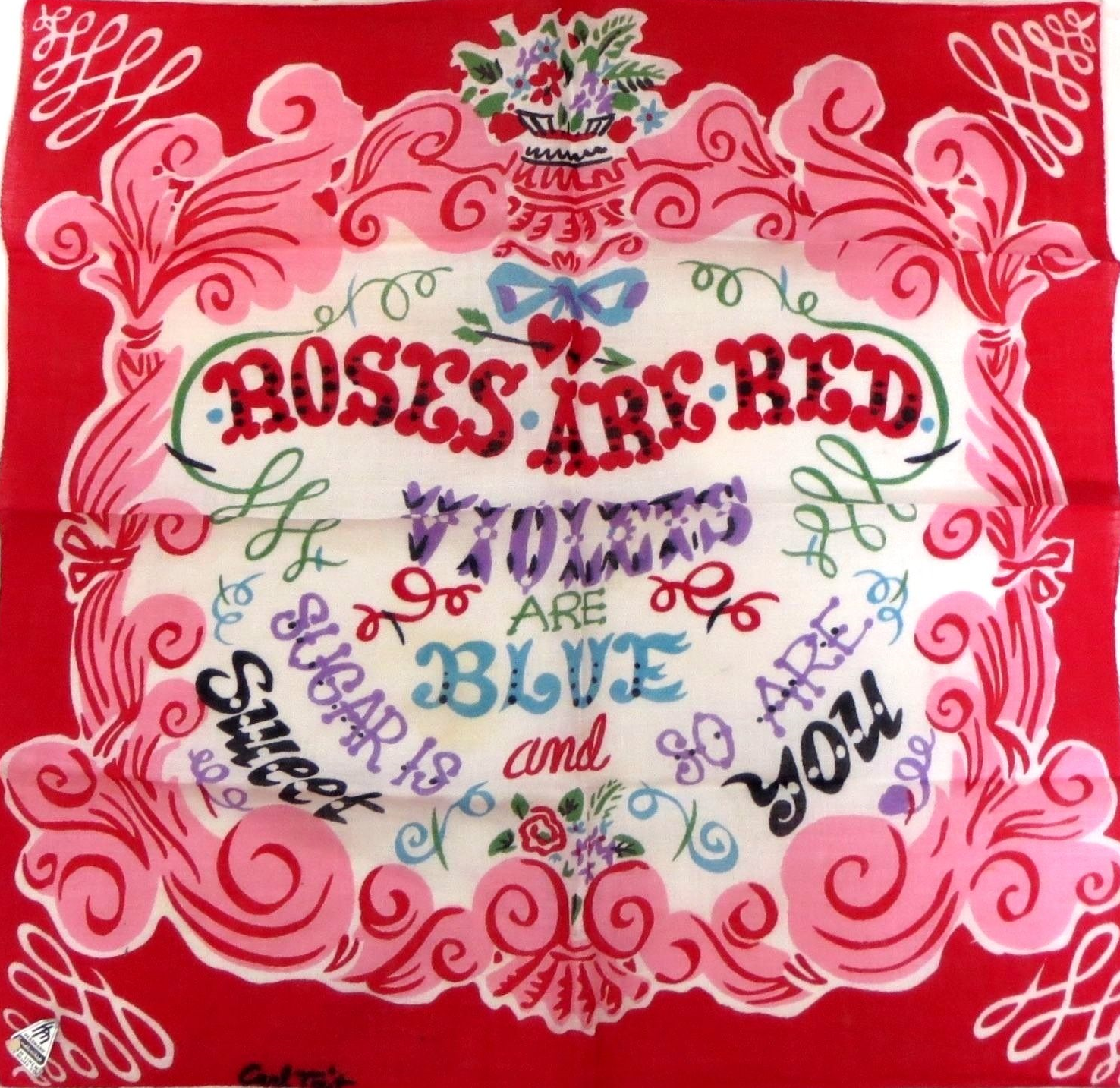
In the context of the time, Tait's exuberant designs, particularly focused on love and Valentines, these hankies explode (I cannot even imagine pulling one of these out of my pocket) with right color, vigorous line and active lettering. In the context of the lead children's book illustrators such as the Provensens, or Mary Blair's wonderful illustration and vision for Disney-- Carl Tait's hankies are in the front row of fabulous. His work centers on valentines, birthday wishes, Christmas, parables calorie counting and souvenir city hankies (Chicago, Seattle, NYC etc.) as hankies or also formatted as a 1x2 screen printed cocktail napkin/ napkin sets.. I have gleaned a collection from the web for your amusement and my delight.