glimmer

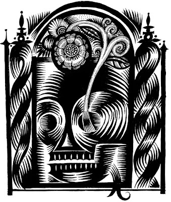
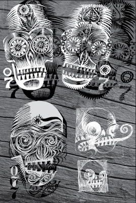
Flippity Flop color, Q. Cassetti, 2011, pen and ink, digitalSo, a new technique is emerging. Not exactly new…but taking these detailled black and white line drawings beyond black and white. I add tone via Photoshop (see yesterday’s image) using postitive and negative aspects of the original line work along with tone added via brush and eraser. Then, the toned piece is the base for the coloring (see above). I am thrilled with the way this is looking. lots of detail, and it is working as a color piece too. So, now onward to working with it. I do not know why Memento Mori images popped back up, but they have and I am looking at Mexican Sugar Skulls again with happiness in my head and pen.

Speaking of pens, do you know about the refillable Copic SP Multiliner pens? There is a wide wide range of widths along with a brush that is permanent. Sweet. Jet Pens have them…. and of course, they have wild and wonderful Japanese office supplies.

I am a bit nuts as a bunch of rushes were plopped inbetween me and the preexisting work that will keep me in my chair until at least 8 tonight. I would like to be able to leave before 7 on a more regular basis. It gets a bit tedious, but books on tape keep me wanting to work to stay with the story (thank goodness!).

Gotta go.

In the cozy forest

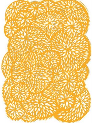
Inspired by papercutting, Q. Cassetti, 2010, pen and inkWe got a load of snow for the last two days. My clients did not. So,being remote only meant that the work kept coming and my employee was home also being remote...but it was less good on my end as he wasn't right here. However, buckets of work done later. Two kids still happy to be home with no reason Not to watch the Olympics and more bread raising on my radiator. I counted well over a dozen deer in the side yard nibbling away at the green stuff burdened by all the wet snow. They were wading through the snow with the little ones close by (snow well over top of them).

I posted a bunch of new SHOES to Zazzle/Artsprojekt. The big news there is that you can customize Keds High Tops and low tops (mens) so the cool factor goes up. I wish they had cooler rubber choices--but I do think some of my work looks pretty "fresh" (not my words, Alex's). It would be great if I could sell a few of these....who knows?

Speaking of cool, on demand fabric... Here is Spoonflower. They have a grid to design to, along with the general on-demand fabulousness such as no minimum order, ecofriendly textile printing, all sorts of fabric choices, weekly fabric design contests, and  $5. swatches to see your work before you get the stuff done. Talk about opportunities for comping or for just getting your illustration out, on a chair and on antiques...and selling through one offs. Am so psyched about this. Need to download this grid to see what I can do with this. Here are the specs>> Race you! There might be something here...really.

I found this other interesting thing that looks like it could be fun to try. Its called "Artisteer", not the best name but they are promoting themselves as a way to create Blogger Templates easily (Blogger is the place I started in this wild journey of blogging and a place I recommend anyone to start...not much to go wrong, easy to manipulate, the "Why not? What if" factor is high). 

Here's another one: Widgetbox. Widgetbox allows you to make personal widgets for your blog/website that is about slides, videos, youtube, Vimeo, twitter, blogfeeds...and assign images etc. Its free for to start...and they have a pro feature if you want more. Seems interesting and worth looking into.

Thats it for the geekdom now. Am surfacing all sorts of interesting things to keep from focusing on death and taxes...though what with my new found understanding of Biga, it all seems to have a different place.

It continues to snow. As I look at these little happy forest scenes, I thought that maybe I should morph to some little houses, candy houses that is in the forest and see if Hansel and Gretel could emerge out of this mix. Rob thinks I should do a series called Grimm: name of the story....and bring my less than happy point of view to some less than happy children's tales. Hansel and Gretel could fit? No?

We were invited to an outdoor (in the snow) cookout at a friend's blacksmith shop...I hope the snow stops...but it seems unlikely....Kitty is charged about it. Alex is sour and sardonic...but I love him nonetheless.Can't hold his being a teenager against him, can we? After all, we were teenagers too.

Monday Morning Update


Kitty and Rob are in Philadelphia for Kitty's portfolio showing to Tyler. I send them both good karma and confidence (as luck is not needed--her work speaks for itself). They called from their hotel enjoying the time together, a nice dinner out, and having a drink (Kitty had water) in the hotel bar. Sounded civilized and very nice for a girl to have with her dad. Alex and I got our work done--and it was early to bed for both of us. I rushed into the school this morning to get the H1N1 paperwork done so that both offspring could get shots tomorrow (or at least I hope).

Holiday wrapping continues. I hope to get some packages in the mail today. There is a lot of work for the major client--and it may keep me from job#2 for a while. I ordered holiday cards from simplecard.com--one for Alex to use, and a picture postcard for me to send to family. What is great about simplecard.com is that they are in the business already. Simplecards is part of the Modern Postcard empire--so they know about on demand printing already--and have through a really easy offering, an easy interface and terrific pricing for low quantity cards and postcards, make it so that everyone can have custom everything without breaking the bank. And, as I know Modern Postcard, the color will be good, and the production will also be great. Alex wanted a card to send to his XC friends, so we used a picture of his coach and he scripted some rather insider text that those of us outside the group are clueless to make out. I made up a postcard with a picture of Kitty and Alex from their costume party this spring. Good picture of both, and thats what we all love and want from our friends...and family. So, delighted to have an option to the fraktur card I made with psprint.com (another great resource for quantities over 50. I have ordered print materials for my clients as I believe in their quality/price value. I have ordered postcards, printed greeting cards (all sizes), and stickers from them. I cannot recommend them enough.

Oh, look. Here is the Richard Meyers team from Skaneatlas,NY to install storm windows on 11 windows on this big house. I forsee a warm winter, a tax credit and two busy people today. More later.

Mums


The day is almost done, and I feel horrible that I havent put up a post yet. However, now is the time. Spent a bit of time with Chad Grohman on IM with him giving me a teensy tutorial on how to take my inked drawings into illustrator as vectors without having to use the magic instant tracing tool that gives the images a ton of chatter etc. This method isnt perfect, but as you use huge files to create work paths from and then exporting those work paths to illustrator--gives you more points and more of chance for the image to be slightly smoother. This is very cool, and Chad was/is a prince to have spent the time patiently getting me to better understand this interesting process. Its great to spend a little typing time with Chad as his energy and sharp mind are inspiring..nothing gets past him. Plus, he has this wider life view that seems to open up the windows and let the cool air in. He has a good sense about what is important, and what isn't. He is another reason I am happy I am doing the Hartford MFA right now. And, there are about another solid 50 reasons why as well...but today,Chad gets the gold ring.


I am enjoying making these patterns (above) just for the sake of making more patterns inspired by Indian painting styles for their vegetation. There are a few more techniques that they use that I need to get comfortable with too, as they take me places beyond the illustrations at hand. To be honest, these sketch processes spin pictures (soon to be more real, more environmental than before) and patterns that could be applied to a lot of things. These vegetative patterns would be great on high end papergoods (like Caspari) --plates, napkins, towels etc. Perhaps the merchandising trip would work. Maybe I should just chase down Caspari and Cranes and see how one can submit designs for consideration. I also really want to begin to internalize an Indian inspired palette beyond curry and orange...but dirty light blues, pinks, mauves, tans etc.Its not a mainstream palette that I find beautiful and very sophisticated. As an aside, we had dinner last night at friends of my in laws, both language professors from Cornell. One of the professors' expertise is in Sri Lankan languages..and their lovely house was laden with books, hindu carvings and magical persian miniatures. Amazing what those miniaturists could pack into a tight two inch square. Makes my eyes hurt.


Working on peacocks like I had mentioned in previous post. The Baha'i use a peacock as their symbol and have spoken of the broad symbolic appeal. They say on their website:


The peacock is an ancient symbol found in many cultures throughout the world. The richness of meanings attributed to it matches the ornate beauty of its plumage. The peacock is often depicted in Hindu mythology as a steed of the gods and is considered sacred. It is associated with Japanese and Chinese goddesses of mercy. In the Buddhist tradition, the peacock’s ability to eat poisonous snakes can be understood as a symbol of the transmutation of evil into good. In some Islamic traditions, it has been portrayed as the greeter at the gates of paradise. In ancient Persian texts the peacock represented eternal life. The early Christians praised the many “eyes” in its feathers as signs of the all-seeing God. Though for later Christians the peacock came to be regarded as a symbol of vanity, they found its usefulness in the idea that just as the beautiful peacock considers its own feet ugly humans should take note and lament their own imperfections no matter how great their worldly glory.


Later depictions of the peacock continued to attribute to it spiritual significance. In his poem, The Marriage of Heaven and Hell, the mystic poet William Blake wrote: “The pride of the peacock is the glory of God.” Given its enduring symbolism, the peacock was seen as an appropriate decoration by Shoghi Effendi, the Guardian of the Bahá’í Faith, who used it as a motif at various Bahá’í settings.


In his Spiritual Couplets, the famous Sufi poet Maulana Jalalu-'D-Din Muhammad Rumi tells the following tale:


A sage went out to till his field, and saw a peacock busily engaged in destroying his own plumage with his beak. At seeing this insane self-destruction the sage could not refrain himself, but cried out to the peacock to forbear from mutilating himself and spoiling his beauty in so wanton a manner. The peacock then explained to him that the bright plumage which he admired so much was a fruitful source of danger to its unfortunate owner, as it led to his being constantly pursued by hunters, whom he had no strength to contend against; and he had accordingly decided on ridding himself of it with his own beak, and making himself so ugly that no hunter would in future care to molest him. The poet proceeds to point out that worldly cleverness and accomplishments and wealth endanger man's spiritual life, like the peacock's plumage; but, nevertheless, they are appointed for our probation, and without such trials there can be no virtue.


Masnavi e Ma’navi, Book V, Story III (E. H. Whinfield, tr.)


so get ready. They are coming. Plus, they will maybe be figures in our Genesis story.I was musing over the possible spreads and am getting excited over the entire project as I will have to work at a bunch of images I have little confidence in doing. Nothing a few zillion gallons of Noodler's Heart of Darkness"> won't hurt.


Speaking of paper goods....I am going to have a party with a big guest list in the next month or so. I was taken, at the wedding in the field last month, that the caterer had paper plates, plastic flatware and cups that was all going into the compost pile. I loved it...and still do. So, in my Mrs. Party Planner mode, I googled away for compostable, affordable paper, plastic and cups and this is what I found>> The plates are all made of a biocompostable fiber from Bagasse, a form of sugar cane. The flatware is made from 80% non GMO corn starch resin and 20%"biodegradable fillers". The cups and glasses are polylactic acid (PLA), which is derived from corn grown in the USA. So, we can have paper and compost it versus dumping it to have it act as more landfill. I am thrilled about this source and hope you are too!


I am still reeling from the sheer energy of these High School runners. If they could bottle the vibrancy, the focused power, the zone these guys get into, it would the the fountain of youth. Plus, the way they look, young Davids, oblivious of how they look, their look, their passion, dumbfounds me. No folks, no one is in middle school any more. If only they weren't so clueless (forgetting my dinner! what me, holding on to this one?,forgetting whats in their lockers etc.)--they would be the final level of cheribim on earth. But, they are flawed angels.


The exterminator came to check out the bees in between the walls in the kitchen. They have been entering and exiting a hole under the windowsill...and we really do need to solve it because if you don't, they end up somewhere else (perhaps swarming over you while you sleep) and can be very unpleasant. We will wait to see what happens.


The cat is lying on my wacom. Holy territory. I think this cat wants to fly a bit. What do you think?

overcast Tuesday


The House of Health was delightful. Had the opportunity to watch the eight man mens shell turn around right in front of me...quite a graceful maneuver, but a maneuver none the less. All mens teams were out and the women too...a big race must be happening soon....The Head of the Charles? Big Red was looking good...streamlined and in shape...so we can only wish the hometown favorites the best. I am increasing the resistance and speed gradually and watching the heart meter so see movement there...and I am feeling terrific.

Work is good. We are tying up a lot of loose strings. Released a big illustration (4'x5') to an interesting fabricator....3-Form yesterday. 3 Form is a company that can embed illustration or objects into a polyester resin building material that can be used as dividers or art or any vertical material. It can also be poured as thick as well over an inch (we were shown examples of staircases made of this stuff). So imagine an illustrated staircase....or office dividers or hospital waiting room dividers with illustration or paintings reading as the key element. The work is either directly output onto film, which allows a lot of transparency, or fabric (which is what we are doing) which provides us whites and opacity. The sheet size is 4'x10' so we could gang run both the group picture of a dog/cat/horse and a sign for the Baker Institute for Animal Health. The technical specs were simple and part of the process is a sampling of the imagery in 8"x8" squares--to check color, fit. output. We should see that in a week or so.

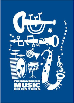
Tburg Music Boosters are using their new graphic/illustration for notecards, a banner and tee shirt. We are moving mechanicals out today for the banner and notecard. Quickquick turnaround.

Wrapping up a poster, a quarterly calendar, and a series of sketches for Steuben today. Glimmerglass on the board this afternoon. So moving and grooving. Need to get some bills out too!

Mandy is here...with all sorts of little things to do. This is great...as is the celebrated mason and visionary, Dare Daniels--to pour a small slab. Moving in the kitchen yard.

More later. Work awaits!

More stuff.


I was wandering around the web and found these cool Ackerman pens at Comic Artist Supplies. The Ackerman pens have this bladder system (like the old refillable fountain pens with a lever that one raises to fill a bladder, in place of a refillable cartridge) that you can fill with paint or ink. There are three types: a brush (with replaceable tips) a nib and a crow quill version of the pen. It eliminates the tedious dip,dip,dip thing. Seems like something worth trying as the cartridges seem to burn out with my pens, and I can use the divine Star Matte Black full time in this guise. There is also a brushpen in the Manga supplies at Comic Art Supplies-- the Tria Brushpen--also with a refillable ink reservoir that work with a Tria ink, Metallic ink or an Aqua ink. Need to look into that.

Great story on NPR this morning about the anniversary presentation of Music for 18 Musicians by Steve Reich performed by students and faculty of the Great Valley State University--now available from Inova, I love Steve Reich--his clean, trancelike music and sounds--and the state it can take you to--floating somewhere between here and there--a netherland of sound--that holds you in a place that imagination cannot take you away from but is very much here and now. iTunes rates this as a 4.5 stars --and the reviews confirm my thinking. I think this is a must buy. Steve Reich, in an interview on American Public Media's site with Gabrielle Zukerman said this about 18 Musicians:

So “Music for Eighteen Musicians” happened. We were living across the street, believe it or not, in a loft building on Warrant Street. We had the top floor. I rented four spinets, which I kept set up in a large room in there. And I guess about every two, three weeks we rehearsed for a period of two years.

I wrote the piece in sketches in my notebook. I was working with multi-track tape, playing things against each other and then putting down what I needed to put down. And then I transferred it out in parts without the main score. On the parts would be: “Look at Russ here,” or “Bob nods.” Essential information!

The piece was written so that a conductor would not be necessary. Now to do that you must substitute, if you have eighteen people playing, something else has got to take the place of that. The conductorial responsibilities were delegated to the vibraphone player who, every time he played, it was a cue to, “Get ready, here we [gong] go,” and everybody changes.

That was an idea I took directly from Balinese and African music, where the drummers--as you know--will make the [call]. Everybody knows, when these guys start going fast, you go with them. In African music there are what they call “changing patterns.” Very simple patterns that sort of stick out because they’re so simple. That means, “Get ready, and off we go!” Everybody changes on a dime to something else.

Then there were soft-edge changes, based on the human breath, which is a big part of “Music for Eighteen Musicians.” Pulses that are played by the bass clarinets. To people who don’t know what they are, they think they’re sort of electronic frogs or something. It’s bass clarinets played very rasping with a microphone shoved way down into the bell almost. And it’s a very characteristic sound in the piece.

NPR did a great interview with some of the musicians who spoke to the technical aspects of physically making this music--using Sol Lewitt-y type of direction (with illustrations of how the musicians should situate themselves relative to each other to the direction to do 4-8 or this sort of repetition--making the musician an active participant in the presentation and the actual music). Reich spoke about his inspiration around this trancelike, non precise music which dovetailled nicely with what the musicians spoke of. And the aspect of the spiritual plane, the trance, the suspension that this music provides for the musicians was something else surfaced....which I loved hearing as the recordings do this--imagine being within the tangible sound--it must be amazing.

Whomped out a lot of cooking and baking after dropping K and A and friend off at the 7:45 ski bus this a.m. 2 big plates of lemon/cranberry scones, some oatmeal/peanut butter/chocolate bars, and a gigantic pot of chicken chili which I modified (spicier than usual) with a sprinkling of chipotle pepper powder. A sprinkling is enough. Plans are a foot to attempt the Mount Everest of Super Bowl dining--chicken wings--this p.m. Super Bowl is a culinary event here as many of us know nothing about the sport...so a reason to eat homemade junk food is reason enough to celebrate. Sort of a pre-fat Tuesday event. We will see how this goes. I think the trick is hot fat...and I am getting skills with this with the recent eggplant parm boom that has been occurring here. We will see.

Must go as things need to get pulled out of the oven NOW!

Wet Paint, Saint Paul, Minnesota

Discovered that Wet Paint has more than just the Pentel Pocket Brush pen (and cartridges). I like Wet Paint cause they have stuff that Blick, Utrecht and ASW (Art Supply Warehouse) do not have. None of them really rock with the graphic stuff. And guess what? Buried in the subcategories, Wet Paint has a lot of this cool stuff--like manga and cartoon paint (black, white, grey and the basics), same thing with cartoonists ink (I assume black is what its about...load on the carbon?), all sorts of british dip pens and nibs, manga and cartoon boards (with or without photoblue printed windows, grids or layout formats all under the subcategory in Paper as Comics). I cannot wait the Graphix Introductory Kit (duoshade drawing board kit)--a wonderful item of exotica that this novice is on the edge of her seat about. What? You ask, is this miraculous thing? Well, let's let the pros from Wet Paint tell us:

... this is an often requested product: Duoshade drawing board by Grafix. These drawing papers are processed with two invisible tones (dot & line patterns) that are made visible by applying the developers with a brush or pen. Its like having hidden screen tones right in the paper!

This kit includes three 3-ply bristol boards and one sheet of vellum, all 8.5x11; developers; illustrated information and pattern chart with complete directions for using Grafix shading mediums.

Can you imagine? OH. My. god. Can you say fun? Probably more toxic than anything we can imagine---second hand smoke? Turpentine? all those goodies you need to do screenprinting? But a barrel of monkeys more fun too. (can you guess-- I have one on order!). I also got some of the preprinted board, manga ink and some red Herbin (closeout) ink cartridges to put in a rotring for added partying.

Wet Paint, Inc.
Artists' Materials & Framing
1684 Grand Avenue
Saint Paul, MN 55105
651.698.6431

I am ready to go!!

Dreams


I know, I know. You are tired about hearing this--but did I extol the virtues of Dr. Martin's Black Star Matte Ink recently? It is amazing. Lays down matte and thick...and is just pure sex as it is luscious and rich and....well. I am in love over and over with this ink and the cheap brushes (only the best) to help me work through my issues with my mortality in my monteval all media field sketch books (another find!). I am slugging away with pictures of spirits and had a mini epiphany. As I was looking at the images in Graven--I noticed that the planes of the wings are really just big ole shapes with some linear detail worked in to say "feathers" or "nose and eyes". I figure I should do the same thing. Big planes and maybe create the line work on trace...scan it in and reverse it out of the image. Fast and good. Plus, gives me a chance to work bigger, bolder, and god forbid..more graphic...which, honestly, I have been shying from as it is too easy to do. Cheap trick, I guess. But, nonetheless...it is part of the progression of images and imagery. I was thinking about how this work is furthered beyond manifesting it in other forms (like embroidery, glass etc.)--How does one develop the sketches beyond what is there? Deal with more fears? Like, how do I get over being afraid of color? Or should I embrace my fear of color and stick with more black and white as this pool is something I like to swim in? Is it medium? Technique? Or should I embrace my fear of paint...in the same way? Should I forget all of that and deal with content (which is really interesting) and take a dozen images further--really developing them...running parallel with developing product/fabric/patterns/? Or should I work on a body of images that progress with some sort of personal story? I need to think. And more importantly, I need to keep the work coming.

Two new projects flew in through the window yesterday. Quickies. But..hey. Keeps us busy. The Steuben project has been moved up--and will be shown to someone tomorrow beginning the chain of presentations to sell the job. Am keeping my fingers crossed on this one. Feels like another working Sunday this weekend with the work and the short deadlines--

Got the work to Society of Illustrators LA. Need to get the Print and CA work figured out and done too. Deadlines are more than a month away...but I am likely to flake on this and it would be nice to get something in.

Purple sky this morning has blown through to give us cold, blue skies and an amazing whippy wind which is taking limbs and trees down. Promising a bit of snow...but not much.

Fired up the cricket (Jotul 620) for the second time last night. A gem. I am pleased we have this little woodstove as it will take the sting out of the future new kitchen (which in this 1848 house was the original kitchen...complete with a deep fireplace with iron firebacks, original cranes and iron cooking devices). Our existing kitchen is a 1940s remodel of the old servant's dining room and pantry. It serves as the family entrance of the house now...a crossroads that I happen to cook out of (on an old, early 1950s electric stove that looks like a car and works like a charm...it has convinced me that I don't mind working on an electric stove ), kids do their homework...etc. The current kitchen is going to be converted back into a space that doubles as an entry and passage along with a pantry for the future new (old) kitchen. Plans are afoot for us to get a wood cookstove (as an add...not as the sole cooking tool) for this new passage to provide heat, to cook on and if needed to work as a water heater as a nice add to the house and as a fallback for all of us should we lose power (which really does happen). I like the idea and the challenge of learning to cook on a woodstove...seems somehow cool...even if its soup. I like the added heating option. And the emergency thing I love too. There are too many people (and some of them older) who need support...and this will be a big help. Now, all I need to do is convince the boss that I also want a series of Honda generators...that might take some doing.

But, girls can dream can't they?

Music Notation Resource

I was working on a project (a freebie) for the Trumansburg Music Boosters. The Boosters are a group of parents who help the music program financially and physically (feeding and preparing lunch for 1500 students for events etc)--and in return, they help fund music related expenses and programs. I figured versus me serving piles of sandwiches, my time would be better spent doing what I do--graphic design and illustration. Thus, teeshirts and logotypes. To get to my point, I was needing musical notation and many of the free sites (Dafont for example) did not have anything that really worked. I did discover that Mtthew Hindson, a composer working in Australia did..and HOW. So, if you need this sort of thing, I highly recommend this resource>>

All sorts of whatnot


This fish is work in progress for Steuben for a project that may be 6-12 skus with the need for 6-12 illustrations relating to nature, animals etc. on a hexagonal shape. What seems to be emerging is the work that I am doing in black and white is splashing into this more formal/reduction style and this fish is an example of where it could go. As clear glass is colorless, the engraving or monairing process renders black and white cleanly. To get a grey, thin texture must happen for it to be successful. The trout will be in water (white) with maybe some cattails, and the fish will be glass (shiny). I am hoping this project happens (albeit it is always in a crunch situation and not much development time) as I am learning a lot about the process, what style of illustration works and working one color is cool and interesting and has "legs" in the work and in logo work for the design business. I am liking what I see and want to share the progress with you.

There is a slight possibility some of my dog images may be used in a waiting room --big scale. Would do some new images in color for a horse, a llama, a beagle, a lab and a cat which may morph into the Baker Annual Report for this year. It would be cool if these pictures could be used as murals or a hook for this waiting space. Great recognition and would really look original. Crossed fingers.

Packing and parceling today. Prep for our trip (LA) along with the charging of phones, ipods, computers etc. for the day on the plane Reference materials and project lists are printed so some work can be focused. Should be fun. R. set up my new artograph superprism opaque projector which promises to be a lot of fun in the new year. Money is in hand. Extra bags of dog and cat food acquired and ready to go.
The weather is in the high or low sixties out there...so what to take to wear is a little dumbfounding...so I need to go and figure this out.

More later>>

Deep cold


This is the kind of cold that is lacking in humidity. The kind that produces whispery white snow filled with ice that you can hear as it hits your windows. Its been Miami prep today along with work. Packing, putting away, buying food, writing schedules with phone numbers etc. I made 4 quiches (one for a French Club event, one for our grandmother, and two for teeny A and his snacking) and lunch for our construction crew. The site is a bit frightening with all of the cement getting moved away before the new porch happens. Slow, slow progress.

Good news. The Baker Institute for Animal Health Annual Report (2007) won a silver metal in the Annual Report category of the CASE (Council for Advancement and Support of Education) competition. My client was ecstatic as this is truly something in the eyes of her peers, colleagues, and the broad university. This was her first big print job that she had ever managed--and so she was not really expecting this--We are delighted for her and for us. There may be some good PR for this recognition. She had a tremendous time at Eukanuba in Long Beach--the west coast version of the Westminster at Madison Square Gardens...and had some very insane breed related displays and presentations.

Did I tell you about our new scanner? The company has a little money to move before the end of the year so we got a new scanner to replace the tired old thing that we have been using for years. I was always bothered and sad with our small scanner and decided we should get a large format ( 12.5" x 18") with a transparency head. We got the Epson 1000XL and its a beaut. Lovely that it is one swipe with the big notebook...no juking around--with nice software that is easy to use to modify the scan before it's done.

I was thinking about remains and "the departed". Seems a bit obsessive, but its interesting to toss around as I mill through my laps at the House of Health. Consider, when you are dead, your body is done and your spirit has departed--your brain has shut down--all the memories, all the chemistry, all the ideas that were stimulated by electrical pulses, genetics, chemistry and stuff--go away. When you take the thinking part away from the body, I can understand that. But taking the thinking away from the spirit is a new idea. So, that life spirit is divorced from human intelligence. Is there a spiritual intelligence or intuition? Once the spirit has been blasted away from the dead weight of the remains, the memories, ideas and earthly intelligence also either go dormant or become part of that remains. Makes sense, but a new thought for me. So what is the characteristic of the spirit? Does it just come down to good and evil? Positive energy? Does the life spirit even have a will of it's own as there is no brain to drive it? Or are there aspects of one's human intelligence and spirit that goes with the departing force?


We leave before lunch tomorrow--so I could be bouncing in the ocean by 3:30, reading trashy novels and thinking higher thoughts like the 6 black cloaked women that always stood by the corpse during the time after the service and before the burial as part of the puritan traditions. Was reading about the Puritan religion and beliefs along with the theological turmoil that was stirring up the colonists at the Massachusetts Bay Colony that threatened the ability of this group to stay together.
I love the idea of the 6 black cloaked women, flanked by candles with their "good gloves" and golden rings to honor the death--very Edward Gorey but puritan and not the victoriana that he popularized and referenced.

More from sunnier climes>>

Hot on the trail

Pricing out labels for promotion (to put little death heads on) and 4" round vinyl stickers to bundle with the Memento Mori cards and discovered that JakPrints have great prices on all the stickers, and this new concern, www.ezclickprint.com for a 4" vinyl circle(weatherproof die cut). EZclick sells 250 1 color stickers for $186. which seems reasonable...and then I can pretend I am a skateboard company or local band or coffee shop--doing that guerilla sticker thing. Even take some to Huntington beach, CA and sticking mine with the real guys.

new resource

While I was surfing around, I discovered that the publisher, Dorling Kindersley, a publisher known for their simple and elegant books for kids sometimes and for adults sometimes have a photo resource they are beta testing for possible reference and definitely for stock. Their signature type of image is often an animal or creature with a good expression or pose silhouetted on a white page. Their layouts are simple and strong and allow the gesture or expression to really shine through. We have all loved the Eyewitness books and videotapes as they communicate well, are well written and can hold the imagination of kids that are more interested in television than static boring things...like books. Imagine having that as a resource for all of us.

Got it!!


Lulu book in my hands. Now the amendments happen. The blacks are really nice and rich (probably as it is designed for the all text books)...almost matte. The tones hold up if they happen in photoshop. If there are tones created in InDesign--they are a soft black but certainly not the specific tones that are in the art. I am glad I did this sample as it shows me which crossovers work, what truly is the "active area", and an opportunity to check the sizes of things. Overall, it looks great, but I need to size down several of the images, plan in more black pages (in the next book), more linework and diversity of images, Plans in place to run the job twice the next time as a sample...one as a full color black and white, the other in this black and white mode. Another plan is to create a sample book using a variety of images, crops, placements, type and size to really understand the medium better. Even with clean inked drawings, because this is digital output --there is a tiny jagginess visible (if you really scrutinize) which might go with the territory and may work better with pictures or images that are not so stark and singular as black and white line work.

Don't get me wrong. I am thrilled with all of this. Just need to better understand all of this.

Extolling my tools


As you all know, when it comes to art supplies I can get a little crazy. When I love something, I really love it--and make these mini proclamations to myself such as " I will use these tools until I die", or " I wil never change from these tools". These are always idle threats because (as I always forget) there is something better or different on the horizon, or (god forbid), I change. I was just declaring true love to the new group of tools and thought I should be a little more out about my love and devotion to the current infatuation.

First off, the Pentel Pocket Brush Pen. I bought my first one as a whim at Cornelissen & Son (in London>>see to the right for link). Cornelissen is reason to go to London. It is a panelled store, all painted in a great matte black, with turnings and shelves and niches filled with predominantly things to paint with and/or do book binding with. Pharmacopia type jars line the room at the top of the casework filled with pigments--and the complete spectrum in every color, hue and saturation is there. I had to buy something...and this little pen seemed the ticket. First, it was not too expensive. Second, it was a portable brush. Third, it has and uses cartridges. I worked with it in my moleskines and it was a nice think to block in blacks. However the minute I started working with my second infatuation, the world stopped. I gasped. It was perfect. Nice matte blacks. Solids like you wouldnt believe and oh, no doing it a second time. Now, I burn through at least a cartridge a day and have 2 brush pens in my Captain Kangaroo pockets ready to go. Only place to get these brushes and cartridges is through "Wet Paint" (http://www.wetpaintart.com". All you need is a credit card and you will be blissful too.

Second infatuation: the Canson Montval Field All Media Book. Utrecht (one of the few who carry it) says:

"This Canson montval all-media book is bound with extra-wide rings so the pages lie flat. This black hard-cover sketchbook contains all-purpose 90 lb sized, cold Presseded, acid-free paper. 50 sheets.

An Excellent surface for watercolor, pencil, pen and charcoal."

Its the cold press...see. Terrific hand. Rich. Not too bumpy. And it takes the ink like no ones business. Plus as it is 90 lb paper, you can torture it with pencil and eraser forever. Only downside is not to torture the ink with an eraser too much (just a little, and only a white one) as the ink will muddy and or erase off (which can be good). It is so nice, doing work on the backside of the paper is not a problem. Only problem might be that you do something good on both sides and then you want to frame each one. So, new strategy is to work on the front with images, back with stuff having to do with patterns, frames, borders, typography as they are okay to have on the back of something...as you might not frame that stuff.

The thin Shaedler pens or the thin Pitt Pens have great longeviety and complement this set. I also love the Pilot V-5 (a staple from Staples or your corner mongo-pharmacy--as its pretty commonplace).

This is the stuff that is making me hum these days.

solid blacks


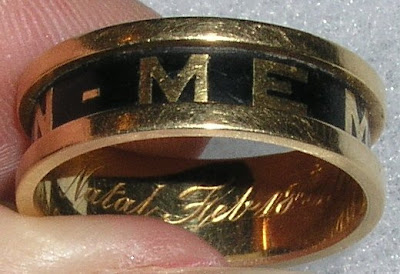
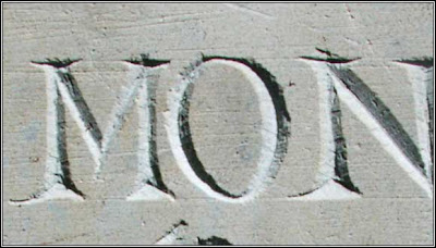
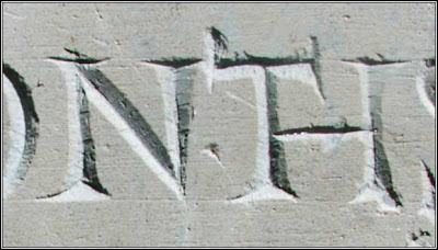
Scanning around in the world of Memento Mori and have found some great type samples I will use as my model for some of the lettering I plan on messing around with in the psychotic Book of Kells mode. I like the naive thicks and thins...and think I may try to not just render the forms, but look at adding the incision to the forms. We'll see. The nice thing about the words MEMENTO MORI is that I will not have to design 11 letters but 7...and as M and N are derivative, and I and T are relateed...it knocks things down...albeit, there might be a ligature or one of those funny letters that ascend? The gravestones commonly show the word "Ye" as a Y with the e nested in the V of the letter Y. Very cute.

Also am planning to cut a bunch of silhouettes and shapes with some nice black paper R surfaced in out neatening and throwing during the weekend. I am also trying out some big ink shapes that I will bring into photoshop/illustrator and cut into digitally. The nice thing that happens there...is the "hand" still exists...not so perfect--a bit wobbly, so the digification is not so apparent... I also plan to work on some line art and merge it with the cut silhouettes as there might be something there as well (red and blackware from Greece as a prod or advertising art of the late 50s and 60s...). Just a thought.

The double portrait logotype will finish up today. Done. May work on a new typographic mark for Glass Lab...a portable glass studio that is going to start travelling the world for art shows--simple applications like teeshirts and a hand out rack style card.

Got my holiday cards (I am selling) back from PSPrint. Color was a little brighter than what I had anticipated (but really not to the detriment of the illustration along with snappy red envelopes I am going to package them with. Got some pale blue envelopes for the dog holiday card (thinking of selling) and orange ones to go with the "High on Life" skull card I am planning on producing. The holiday cards are being sold in sets of 6 for $9...or $8.50. The dog cards will be more (they are bigger)--probably around $2.25 each or sets of 6 for $12. High on life card will be $2. each. All for the Art Trail party.

Also, will need to get the work to the SPCA show later this week. I think we are on to something with these clip frames with images that are full bleed. And the checque to the State of the Art Gallery for the Art Trail intro show. Biz-ee.

Need to go wake the kinder up>> the day awaits>

Ain't life strange?


My eyes are shutting due to the illustration party I threw last night, all by my lonesome. Really energizing time with Whitney--and I am off on a new tangent that somehow is frightening but the right thing as I depart the land of the ORANGE. The kick in the booty is taking advantage of the wealth of my sketchbooks, the new vector point of view and the merging of textures--both hand drawn and photoshop manipulated photos. I am on a whole new tangent. This accordion folded project was an impressive project--everyone rose to the occasion-- and the work had some magic in it..matter of fact, for some, it was the best work they ever had done. In 24 hours, there were fresh ideas--some of them progressive, narrative stories, some of them moments in time, others experimental using the xerox, and xerox tricks to move the work somewhere. Next step is 8-12 new images (this is for NYC), expressing a personal "look book" which could be anything from a progression of work, a work process/methodology, or random topics...it can be comprised of sketches and/or finished work, and/or inspiration or writing etc. etc. The work needs to be delivered as a Lulu book>

Lulu (or Blurb)is a network of on demand printers that can deliver black and white or color books(hardbound, perfect or wire bound)--also comic book (newsprint) books either as a one off or more. Relatively quickly turn around. Provided as a pdf (Adobe InDesign)--etc.Not only will Lulu create the books, but they also will market etc. Whitney showed us 4-5 different books her students created--and the color is acceptable quality color--and definitely "real". One of Whitney's students created a screenprinted dust jacket and screenprinted vellum pages that were tipped into the books that were created by Lulu. Another student embellished the book by enclosing it in a custom envelope with art letterpressed on the envelope along with reinforced holes with a ribbon binding/bow. This really looks like fun for me. I am thinking of a book of random images with recipes from the Luckystone Kitchens with nice quotes from the past year from the blog. Maybe a wrap cover from the epson...Or maybe a bird book with quotations..? There are 22 bird images...which with quotes etc...could easily do 32pps or a little more.

Whitney's books were 3 student books (one a children's book, one a recipe book, the other an art book) along with a book of personal photographs with derivative typeface (by Whitney) recapping the french month she spent last year and a book of student work from MICA of the Katrina work done for the Wendy Popp illustration initiative for Katrina. Very polished and refined. Nice typography--a museum catalog at a discount. Inspiring. These students have the world at their fingertips. Think of all the opportunities with the bookmaking.

Now, my notebooks make more sense. I am jazzed about them again. My work is not ridiculous and the notebooks stuff does not have to be held to the chest (at least not as tightly) as there ia wealth of personal scrap work right there. Now, how to build a few bodies of work--with and without color. The vector time has been worth it. And what about printing/engraving/ etc. How does this filter in? I am leaving Syracuse with questions. No answers. I would say worth the past two weeks of work. This will keep me pushing until Round Two begins.

We had a talk by Roger DeMuth. He is a lot like people I know. He is a Mr Make It-He can bookbind, garden, illustrate, comp, print on a letterpress, illustrate etc. No shortage of energy and talk. He merchandises his work--and is conscious of all of that...(reminder, need to go to the Merchandising/Licensing Show @ the Javits to understand what all that is about). His work is very antiquitites inspired, typographic conventions inspired, in the world of the original "MacKenzie Childs"--with pattern, color, William Morris etc. all folded into a children's book whimsical style. His energy is infectious. He is prolific and is probably an inspiration to the undergraduates. I have a bunch of notes.

Our opening was semi quiet. SU did a nice job...but tranquil with only 5 of us graduating. It is def. that next year's class will not have the SUArt Galleries or the Lubin House as they are both scheduled for rennovations. John will need to get creative with this.

Tomorrow, more work on the future book...drawings. And, the packing of the work (and moving to the hotel room. We have a dinner and then farewell.

I think I have had enough. I am wasted....and lost. I think I got my money's worth this session.

A reminder to me, I need to talk a bit about Whitney's sketching out of the possible feel and what's fixed for ICON 5 in NYC>

More later.

Art supply heads up

Rotring Art Pens (wonderful) are normally less than $20 a pop...around $17.99 or so. ASW has them for $12.99--a significant price break from the rest of them. Check em out at http://www.aswexpress.com.

I bought my cartridges and piston converter for my Artpen via Ebay. Significant savings there too.