Tuesday musings.


I'm multitasking these days. Last week, I opened a Squarespace.com account to migrate my blog from Blogspot to a more flexible format that I can grab the entire blog over...and have it in a more controlled way. So, I am messing around with this site--learning all the new tricks, the WYSIWYG tools...and without being the Dreamweaver queen. I learned how to migrate my tweets last night along with one by one, moving my links over. Take a look>> a work in progress but something that I will move to on January first. Blogspot has been great and I highly recommend it to someone who wants to fiddle with a blog with no commitments--but I feel now I need to better grab ahold of my content (1750 entries), my images and maybe fuse it with my illustration and graphic work. I work better in a simple format that I can control--but that I can keep fresh and interesting. Erich had heard about Squarespace from his tech podcasts (which I should do as well)--and it was praise all around. I must admit, with the easy interface (very intuitive), married with a strong tutorial/support section and an affordable price all makes Squarespace very appealing.

I met with my friend today about his enterprise we spoke about yesterday. He had quite a few viable names with a few I want to hug...they are so great. He highly recommended the Small Farmer's Journalas a philosophical place to go re localvore culture, local farming and the integrated life/farm/animals/cycle and stream. He also recommended I read some books from Wendell Berry particularly The Unsettling of America: Culture and Agriculture. San Francisco: Sierra Club, 1977; Avon Books, 1978; Sierra Club, 1986; and the more poetic, Jayber Crow. Washington, D.C.: Counterpoint, 2000. Seems like I have my work cut out.

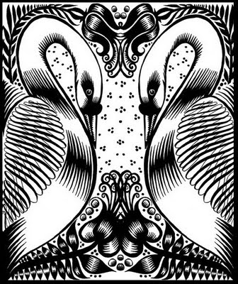
Time is flying..hey, theres an illo there!


Overcast, feels like rain. David Burke and Tim Reep are in the side yard rebuilding the pump house. The floors are being finished in the back room and in the new powder room we are putting into the apartment by Mr. Ungleich who is doing a remarkable job of matching colors and microsanding (I am sure he would not call what is doing as microsanding-- but he is very precise and accurate). Chet, the Lawnmower man is here doing the once over. And, I have 22 Ithaca College architectural history students coming for less than an hour for a first floor walk through and a exterior tour of the house.

Had a great meeting with my Cornell client who is up to her eyeballs in work, new aspects of her job and aspects of her personal life expanding. We are working on an annual report which we are deliberately making less expensive in price and to some degree looks...moving from a glossy presesntation in full color to uncoated paper with two color inking (combined inks to create a range of colors from black to mahogany, to warm grey to pink combining screens to pull the most color out of the two. This is almost "depression era" production--the whole "I dont care how much it costs, just make it look cheap" headset of the early to mid eighties. That was the rage then...and since then, between four color getting cheaper and expectations that most jobs print 4 color, this whole high quality cheap job approach has slipped off of most designers radar screens. So, we gotta roll on this one...Its going to be about a 50 pp book.

We also had a bit of an issue here in our little Hamlet with the HS Yearbook last year. There were some major logistical screwups that resulted in some of the students who had paid and gotten their forms in, not getting their books. So I got my back up and complained...about the loss of the books (Kitty was one such student), the big price of the piece (cancelling out a large portion of the student body) and relevancy of the preexisting process and method for production. Guess who is helping with the yearbook this year? You got it.... But, the hope is to produce a book that more folks can access by producing both hard and softbound copies via Lulu--using real live computer programs (InDesign) versus some cobbled up Yearbook magic, and even if need be, for those students who really do not want to buy a hard book; they can download a pdf and burn on a cd. So, everyone can have one (more democratic); we dont have to place orders for them (you can order online); lead times go from 2 months to 3 weeks (shorter lead times so more opportunity to cover the spring); and you can have a choice of binding etc. Plus, as it's print on demand and will not need printing plates, the cost per book goes down dramatically from $50. per book to (based on b+w) to less than $20.

Will tell you all about the non Christmas Holiday card. My client had a genius idea that might turn out to be fun. I am struggling with learning live paint to pull this off as the approach is perfect for this work. Additionally, I will be bringing work into painter to render in pastel/chalks as an option. Gotta go work.

The students are right around the corner (1/2 hr away!) Yikes!

on fire


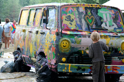
They shouldn't have let me get on the bus. Absolutely shouldn't. They should have kept me locked in the car with my black dog, with both our noses up against the window, waiting for the good people to come back and drive us around and then back to our house and the room where we work, the room we eat in and the room we sleep in. But they were not so smart.

So, I got on the bus to New York with team Hartford. And now, a week later, I cannot breathe. I am on fire. First off, I am loving my little doodles at breakfast in watercolor. The sheer loveliness of the paint, how it blends--how opaque I can get it, how thin I can get it. Right now, I am working on a dumb little picture of pretzels, swirls of mustard, hearts and mossy green dots (sounds like a wrapping paper for either Germans or beer drinkers or both) just to try out different colors in these new Maimeri Blu paints (which are as advertised, extrodinary...pigment in a pan format)--just need to get a tube of white gouache to complete the bill. I am loving them so much, they may just go to Miami for the fun of it. I could do these doodles all day long. Instead, I write and try to keep my head down and get the work done as these tempting diversions beckon. I am loving my ladies with butterflies. They need to be taken to the next level. I need to do at least eight more for the body of work. I need to print them out and color them/tint them per My Mentor's suggestion (which I try to try). Then, just out of the blue, I decided to work on K's portrait which I have been posting the progress. I am loving what is happening, the color, the look and feel, the graphic quality and simplicity. I am aiming for three (at least) by San francisco...and then there will be a mini body of work to look at. Really have a chance to flex my muscles.

Work awaits. The day has been short and everyone has been having fire drills with the emergency jobs. Urg.

Reinforced Black

Before I flake on this and not pass this on...here is a brand new idea that is worth sharing with all of you. If you are working on an illustration in either Adobe Photoshop or Adobe Illustrator, think a little before you start work. Think about how this piece will be reproduced. If you are inevitably going to print a flat four color process palette, consider creating a "reinforced black" (which means in place of just a single hit of black, you run color directly under the black you are using...giving the black areas full color coverage under the black which results in a deeper, darker, richer black. Mix up a special black for this use:

"When you want an area of solid black within a document, 100% black (K) will not result in a solid, saturated black. You should use rich black, which is made by mixing other colors of ink with black ink to produce a much darker, deeper black on press than can be achieved by using black ink alone. To create rich black on pieces printed by a printer that prints strictly process, your CMYK calibration values must be 50% Cyan (C), 40% Magenta (M), 40% Yellow (Y), and 100% Black (K)."

And, it really works. Gorgeous.

But, if you are just working with output from your epson--and planning on framing the piece--this is inconsequential. But if you are ever planning on printing the piece, this reinforced black is a "secret sauce".