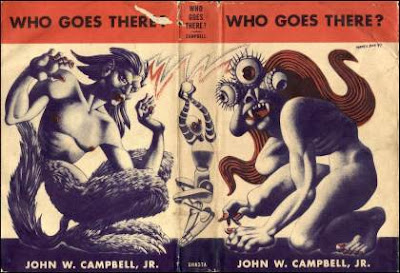
 Advent Day Twenty, Q. Cassetti, 2011, pen and inkKitty and Rob come home from New York City today. I had a nice chat with Kitty about her relief in gettting the semester done and the fever done. She has had a flubug. We are looking forward to her time here.
Alex, Elly and I had a little time yesterday evening with Alex playing music from his computer featuring an artist Boniver…and dancing in a very cute and funny way. We are nosing the applications along…with hopefully some closure in the next week. Wouldnt that be amazing?
Tucker is here trying to make a little money for the next semester. He is stacking wood, raking etc. with such happiness bringing lots of chit chat and a big appetite (so going to the store is going to be central to the holidays). Mandy just poked her head in…to say hi. She will be here tomorrow—so there will have to be a big, inexpensive lunch (like pancakes?).
I bought a bunch of synthetic, cheap round brushes this Sunday at AC Moore. I was beginning to do some fill work with ink (not the wonderful Pentel Pocket Brush Pen) and found that the watercolor, sable brushes I have were way too wiggly, too long, too fluid…and what I wanted was something a bit stiffer, bit shorter and in a few sizes to do the big stuff and try to do the pointy stuff too. So, I bought these brushes and discovered (at least with these “Majestic” Royal and Langnickel) there is a range of play/ stiffness in acrylic brushes. And you know, I think I can work it out from here. I tried two of them out this morning to pretty good success with my most favorite, rich carbon inks, Dr Marten’s Black Star matte ink. However, this is not the most fluid…so I may try using Noodlers this evening just to see what the difference might be. Either way, ink on Moleskine watercolor paper is divine. Love how the ink just works with this lovely rich paper.
 Another nice thing to muse over is this remarkable book I discovered, The Liber Floridus. What is the Liber Floridus? The site says: “The Liber Floridus (”Book of Flowers”) is an encyclopedia compiled in the early twelfth century by Lambert, canon of the Church of Our Lady in St Omer. The Ghent University Library possesses the autograph of this work, i.e. the actual copy scribed by the author himself. Illustrated autographs of twelfth-century encyclopedias are so rare that this manuscript is now protected by the Flemish Community’s Decree on the acquisition and protection of rare or exceptional movable patrimony.”
A medieval encylopedia! There are some great architecture pix that I plan on learning from, in addition to some insane lettering (above). I am taken with a few styling things…the way the line is handled…So you probably will hear more about this Belgian book, The Liber Floridus.


