

I am busy with learning WordPress. I am kind of excited about that as the opportunities are broad and there is a whole lot to this program/ approach. Tons of plug ins, tons of extras (like a calendaring unit that can derive info from either an Apple iCalendar calendar or a Google G-Calendar). Very fluid stuff...only one hitch, which is once one picks a template, you really do not have a ton of room to change except if you want to get into the CSS and monkey around (not my forte..yet)--but hey...once you just go for it, the work arounds with imagery, type, and the few elements that you have to work with--is still better than Blogspot, and not much more difficult. And, did I mention that it is very cost effective too?
Not much bandwidth for anything else beyond the day to day expectations that cross my desk as a designer/illustrator. I am working on some vector silver teapots to fiddle with reflection and study grays as a way of keeping on, keeping on...but my attention span and those things that normally resonate with me, seem to bounce off, versus sink in to make me pick up a pen and draw. But I believe a little more time and focus will help. Somehow just keeping up with the workload and life (as it is) is enough for me. Sad, but true.
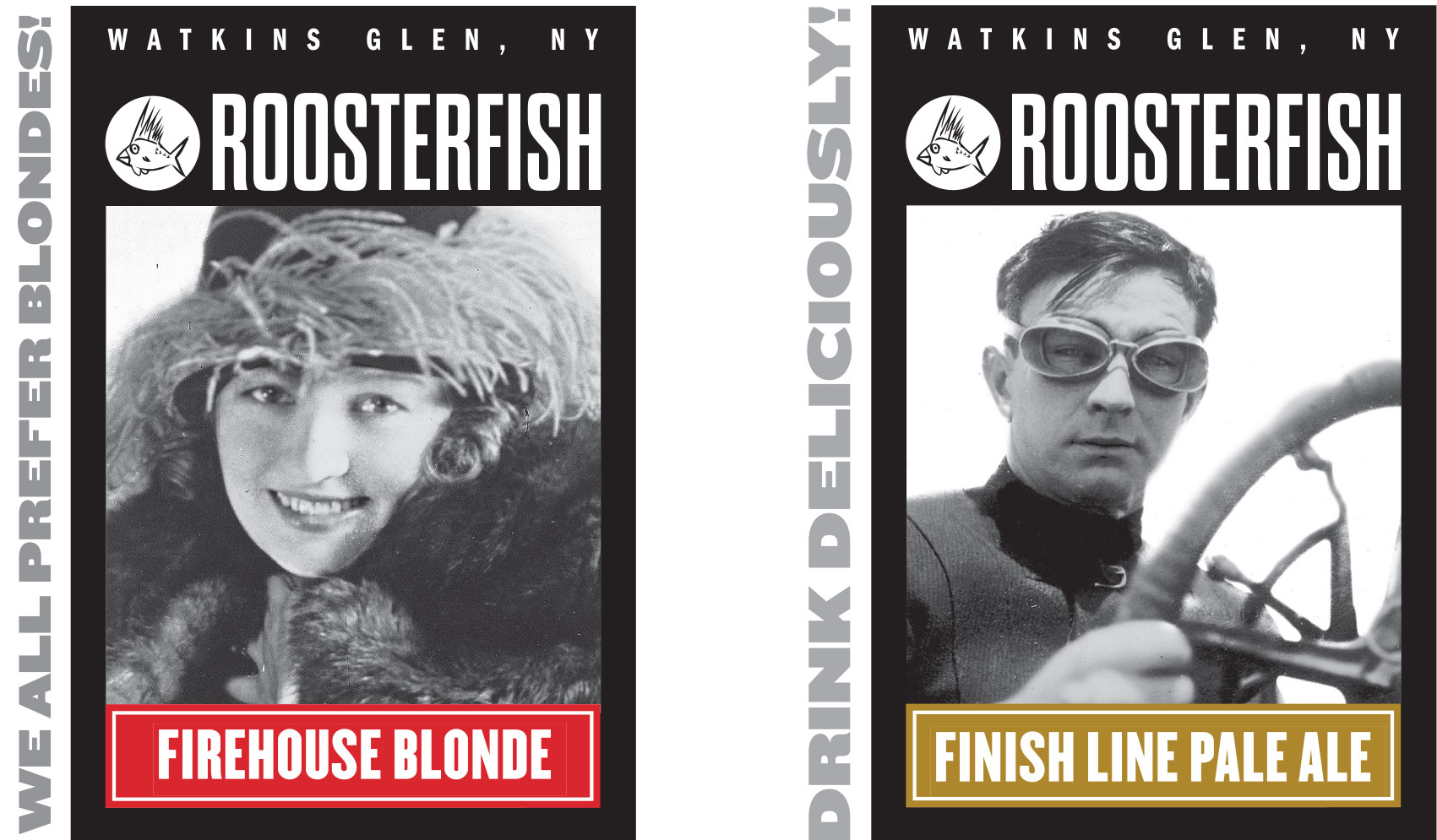
My beer labels are out for Roosterfish...and though the labels are nice, the carrier and six pack graphics are really nice (black type on kraft with the six pack having the added white for sparkle). The Blonde has changed from a pin up girl, to that of a silent film star (movies made in Ithaca, with the stars vacationing in Watkins). And the former " Dog Tooth Pale Ale" has changed to Finish Line Pale Ale to celebrate a new change to the formulation, but also to celebrate the history of racing in Watkins Glen. So, more local pride, more loving our history, and embracing it. The cases are very sassy with more little "go team go" phrases that yours truly shoehorned into the layout. I like it...very bold, very woodtype-y. Hopefully, we will be rounding back on more work with this small brewery. Should be fun.
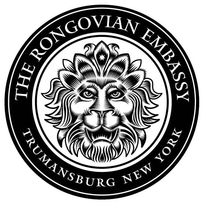
Working on some iterations for the future new Rongo. The Rongo has a tradition of lions heads as part of their brand, so I have revisited, inspired by the original.... interestingly, the head does not reverse well (white image on black field) so I had to redraw it to have it read well reversed (the issues were particularly with the eyes and mouth where it has to be right reading and not "what's black is white and white is black" thinking. We are busy finding things to put this mark on...and I am busy creating some other heraldic type stuff for the Embassy proper. Should be effective when done.
So, this short note is a chance to say "hi". I am still bumping along...though not at 100% firepower though I had glimmers of it last night laughing hysterically with my dear dear daughter as we trolled shopgoodwill.com in the Barbie section and also commemorative plates. A hoot and a holler was heard from above. May we hear it again, real soon.