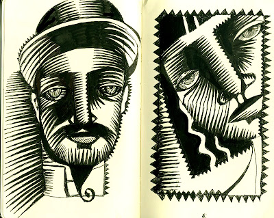
It's finally here!

Spring has sprung. We have greenery for the daffodils with all the snowdrops up and blooming. The big pot of chili is going over to Peter Pan with all sorts of angst and time constraints parked on the side. Tonight is the dress rehearsal with make-up and the like...with opening night on Friday.
Shady and her dear gal pal, Lucy--have just come in after twisting and shouting in something stinky like poop. My mother-in- law saw a little bear in the backyard yesterday..so maybe its bear skat. Extra stinky!
Tons to talk about. No time right now.
Palmer Pen Method
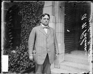
Meet Mr. A. N. Palmer:
A. N. Palmer, handwriting expert, standing outdoors
Chicago Daily News negatives collection, DN-0056081. Courtesy of the Chicago Historical Society. SUMMARY: Half-length portrait of A. N. Palmer, handwriting expert, standing outside a building in Chicago, Illinois. Mr. Palmer developed a new method of handwriting that was adopted by the board of education for instruction in Chicago schools. NOTES: This photonegative taken by a Chicago Daily News photographer may have been published in the newspaper. SOURCE: American Memory, Library of Congress. TAGS: palmer handwriting chicago 1910
Can you say grumpy? I would be too. The Palmer Pen Method is torture and this dude definitely looks like he lives in the world of black and white....with perfect loops to match!
More on Mr. Palmer's Vision through his publication, The Penman>>
and a great website on archaic pen nibs, calligraphic supplies et cetera>>
Live from the land of the obtuse!
What is NOT to love?
Why is it called "Noodler's"? "Noodler's Ink"? The ink with the catfish on the label symbolizes a southern sport that attempts to equalize the struggle between man and animal in the quest for a sense of fair play...and thus a fair price. 100% made in the USA from cap to glass to ink and bottled with care by Nathan Tardif in Massachusetts.
Noodler's Black ink is waterproof and fraud proof and cannot be altered on a check or envelope by rain or bleach/ammonia. It consists of over 97% water content, rinse or simply rub off lucite/celluloid/acrylic/ebonite pens. If dried in the bottle it can be reconstituted with tap water, but once on cellulose paper it will stay on as a bulldog biting the leg of the enemy despite rain/soaking and the soaps of a check forger. One word of caution - if mixed with conventional ink the fraud proof ink WILL REVERT TO CONVENTIONAL INK and all those properties will be lost. It is a delicate formula best left alone if one wants the features to remain constant.
After extensive testing, the Noodler's formula resembles 1950s Skrip and Quink ink - no feathering and a good safe ink for all of your pens. Thus an ink one can use on the newspaper crossword puzzle, most recycled smooth papers, and even card board and industrial brown paper, rice paper and tissue thin papers from the far east. Feathering has been virtually eliminated (unless you use paper towel or blotting type materials!)
Pens

...to go with ink. As I had mentioned previously, I am into live ink. Runny, push it around ink. The real thing. And the dip pen thing is tedious and takes too much thinking and planning to do...plus, it is uncomfortable to use ink/inkwell next to the pile of papers, books and crap on my desk wedged between the keyboard, wacom pad and a hot cup of coffee. You get the idea. Russell Cobb, one of the english illustrators, when asked which pen he uses, brightly said Rotring as if it is the only pen in the Universe. Seems good. They have 3 calligraphic versions and two "Art Pen" versions (Extra Fine and Fine). They have a bouncy, flexible nib which can give you line variation--and you can either work cartridge or ink converter....(which with the Noodlers could be the ticket). I priced it out all over the place and Jerry's had the best price. Ebay has the calligraphy pens, but not at any significant savings. I am picking up the phone today to see if I can get one to come my way. You, poor dogs, will get to hear about this tedium.
Jerry's Artarama's Rotring Art Pens>>
More on Russell Cobb (I promise I will talk about him as he is a very cool, thinking individual)>>
IF: I SPY (with my.....)
Oklahoma Party a seeming success
After 4 sheetpizzas were consumed with one 5 gallon container of ice cream, numerous bags of chips and junk, 3 packages of twizzlers and no end of Jolly Rancher candies devoured along with the endless plates of mom-provided baked goods--the party for 60 Charles O. Dickerson High School's cast, crew and pit band was acknowledged (at least by Kitty) as a success during our post party wrap-up. We had a room with sofas and strobe lights with a "plug your ipod into these speakers" place that Kitty referred to as the "Rave Room". The front living room was where another group gathered and then the dining room featured the groaning board of processed food, white flour and white sugar configured into endless carbohydrate laden delights. We had dancing and gathering and eating. Everyone came on time and left on time. The parents came early to pick up the kids and we had a nice time getting to know them. Next year, we are doing it again (if they will have us) along with a space (away from the kids) to congregate with the parents too.
This week is the push for the Russell Doig Middle School's production of Peter Pan. We have the costume, the make up, the rehearsals and on Wednesday, the gigantic pot of chili for the pre-show pot-luck for the students. I am sure there is a push for more baked goods for Sunday's cast party at the Middle School gym. And then, we will be done. At least for that.
Onward!
FreeRange 2005 Bordeaux Selected in Judging!
 Remember FreeRange??
FreeRange 2005 Bordeaux Selected as One of Bordeaux's
Affordable Wines in 2007
Here is some good news:
(excerpted from 3.20.07 Press Release)
Manchester, MA – JuiceBox Wine Company’s 2005 FreeRange Red Bordeaux has been selected as one of the best affordable Bordeaux wines in 2007. The 2005 FreeRange Red Bordeaux was selected in a blind tasting by an independent jury of recognized experts from among hundreds of Bordeaux wines selling for the equivalent of $8 to $25 per bottle. JuiceBox’s 2005 Red Bordeaux is a blend of 60% Merlot, 30% Cabernet Sauvignon and 10% Cabernet Franc and is packaged in an innovative three liter bag-in-box. The2005 FreeRange Red Bordeaux has been added to the 2007 list of “Today’s Bordeaux: 100 Classic, Contemporary, Affordable Wines”.
“We’re thrilled that our Red Bordeaux has been recognized as an outstanding wine and particularly since it was the only boxed wine selected in a blind tasting against hundreds of other bottled wines,” indicated Jonathan Barry, one of JuiceBox Wine Company’s founders. “Not only is this great wine for a great value, but it comes our convenient 4BottleBoxTM, which holds the equivalent of four 750ml bottles of wine and keeps the wine fresh for six weeks after opening,” Barry added.
The 2007 jury for Today’s Bordeaux consisted of Paul Chaconas, Bordeaux Category Director for Total Wines & More, the nation’s largest chain of fine wine stores; Cat Silirie, Wine Director for Boston’s No.9 Park restaurant group; and Mark Oldman, author of the best selling Mark Oldman’s Guide to Outsmarting Wne. The Today’s Bordeaux program is sponsored by the Conseil Interprofessionnel du Vin de Bordeaux (CIVB), which represents more than 10,000 Bordeaux producers and 400 négociants.
JuiceBox’s 2005 FreeRange Red Bordeaux will be showcased along with other Bordeaux wines recognized in Today’s Bordeaux in trade and media tastings in May in Washington, DC, New York City, and Boston.
Isn't this great? Tom and Jonathan are thrilled with with this cudos and the new venues the wine is being showcased in--things are def. on the upswing to all of our delight. It is a great Red Bordeaux, and the packaging stellar in it's design, function and recyclability. Aren't I vain? Curiously, when I was in London, I dragged poor Traci into a grocery store, Sainsbury, to see what was there in the wine world. They did have boxed wines--at a low pricepoint--more like the suitcase wine we see around here. And the packaging did not rock either. Interestingly, a lot of Banrock Station. The look and feel for the wines was very conventional and expected. No Yellow Tail positioning--and the world of the critters didn't exist either. Check out their other press and web recognition at their site>>
Ink

I have been working with fountain pens recently which has been fun and illuminating. The trick for me is the ink. Most fountain pens use cartridges (god knows what kind of ink is in the cartridge) or has a cartridge converter, or in the case of older pens, a bladder system that allows the user to fill the pen with ink of his /her choice. I was using cartridges just for the plain stupidity of it...but found that the blacks were anemic and thin...not the macho black that I strive to use. Now, I am filling the pen with a converter--and have, over the course of the week filled it daily with india ink starting with Koh-i-noor's Encre a Dessin. It works but towards the end of the day, it gets a little techhie and begins to slow up flowing so I find myself grinding the pen into the paper just to keep the pen going. Not good. So, away to the sink for cleaning.
Then, I filled it with the formerly extolled Dr Martin's Black Star Matte. Same deal...the blacks were gorgeous but about 6 hours into the fun, the pen slows down to the point that even grinding it into the paper is ineffective.
This week, my plan is to mix "Quink" which is the seeming standard for fountain pen ink with the Dr. Martins ( half and half) to weight up the blacks a bit more for the Quink, but allow a little more fluidity. I'll let you know what I find. I did discover this new ink I am itching to try-- Noodler's Bulletproof ink Here is a bit on Noodlers (doesn't this sound like the trick?):
The manufacturer also states that Black has lubricating properties for all pistons and converters -- tested to flow smoothly in all types of feeders! Writes very smoothly in a rich dark black color. This ink is all U.S. made and has Archival, Anti-Forgery and Anti- Feathering features. The ink is described as bulletproof by the manufacturer and is waterproof. The ink is specifically designed for fountain pen use. Noodler's is very proud of the qualities their inks provide. Some of these qualities relate to how Noodler's inks interact with the mechanics of your pen. These inks are designed for use with any fountain pen new or vintage. Any brand of ink can attack pen parts because all inks generally are corrosive agents. Noodler's technology has lessened this factor to protect the value of your writing instruments. For example aluminum has been used in many pen brands over the years and still today. Aluminum is relatively unstable with exposure to many ink brands... Noodler's is friendly to aluminum [and other pen materials]. Test your ink and Noodler's with a piece of aluminum foil leave the ink in contact with the foil overnight and see what the results are. You better replace your ink with Noodler's if your ink eats the aluminum foil (vintage & some European inks currently made are conspicuous culprits).
Noodler's fuses with the cellulose in the paper. One down side I have learned is that if you use their Polar Bulletproof, it stays very wet for a long time and that the plain Bulletproof or Near Bulletproof is much better. Sounds like I have to try this? What do you think?
IF: I SPY....
IF: TOTAL(LY) Busy!
Under The Sea
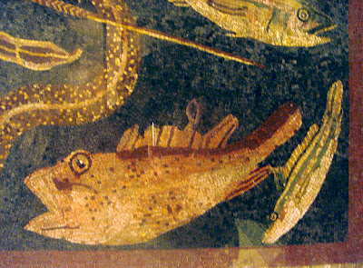
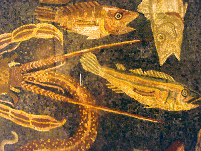
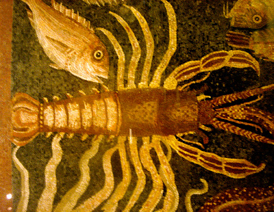
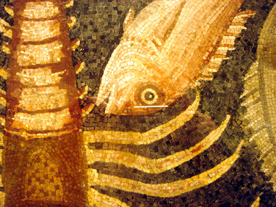
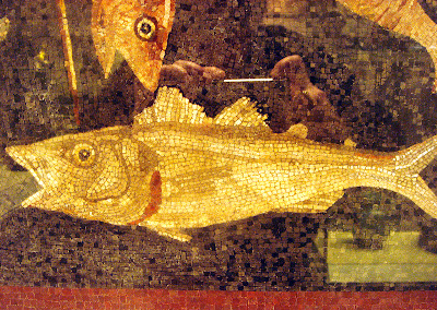
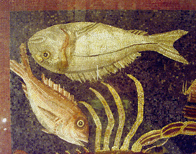
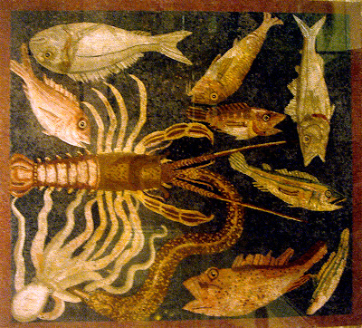
These images are handheld shots of a wonderful tessilated Roman floor at the British Museum. I adore these old floors as the design is always terrific, the images communicate far more than the simple pixels that make up the image--often getting highlights, midtones and darks to a good degree of success. There is a lot to learn there for me. Plus, how can you resist the fish? Reminescent of the fish we saw on Redondo beach at Christmas?!!
Click on the shots as they are bigger than they are shown on the blog>>
Ice Cream and Orange Juice


You all know I love Ice Cream Cones and the illustration of them. I got these images from an orange juice and ice cream stand on Oxford Street in London. I love it that the artist has the cone drinking juice and the oranges eating iced cream. For fun.
L. Cornelissen & Son : Artists' Colormen


L. Cornelissen & Son
Artists' Colormen
105 Great Russell Street
London, WC1B 3RY
Phone 020 7636 1045
Fax 020 7636 3655
website>> www.cornelissen.com
These guys are right down the street (2 blocks or so) from the British Museum. They have their own line of oil paints and a collection of gilding supplies and calligraphic pens/inks the like you don't see here in the U.S. You can download their price list etc. from their website. And yes, they fullfill orders and do a direct mail business. I bought 4 small jars of different gold paints (from pale, tinted silver to more rosy red golds) and a calligraphic ink (permanent) which hopefully will work in my fountain pen. I am loading the fountain pen with india ink--which scares me a little that I might wreck the pen...but without a little risk, forward movement is slow. They had nice sketch books and brushes. They have automatic pens, poster nibs, and the entire line of Mitchell pens that you rarely see these days.
The interior of the store was fitted out with worn black painted wood. Lots of shelves with thin drawers underneath or a solid wall of drawers (as in the wall shown above). They carry these enormous apothecary jars filled with every color of pigment imaginable at the top of all the shelves that wrap the small store. Every package is beautifully wrapped up in paper and put into a carry bag. They also have printed lists (same as the pdfs) that you can get directly from them.
The british have a ton of Pilot pens we dont get here--including a weensie fountain pen called the Pixie. Check em out.
First Day of Spring

Imagine! We have lots of crusty snow with no hope of hellebore, primrose or daffodils. But it is, the first day of spring. The first day of spring can either be the 20th or 21st based on when the vernal equinox is.
Well,here is a new thought. I did a little research yesterday after my bags were lost twice and I experienced all sorts of delays, postponements and hassle by the airlines to find out really what the airlines are obliged to do. Each airline is different...so it is best to check your carrier before you leave and (heres the new idea)--output the information to carry with you on your trip. That gives you the ammo to wave at the customer service or gate person who claims they can't or won't do anything for you. Just getting a voucher to spend the night was like pulling teeth for me. And I overheard some poor fellow who got off a delayed flight and missed his connection (a back water like me). The USAirways representative offered him the discount rate they had at a local hotel. Punto. From what I learned, they were good for meal vouchers, transportation (if the hotel didnt offer it) and a room at the Airlines choice and expense. They hide the information-- but worth looking for it. Here are a few that I could dig up. You get the idea:
Here is the USAirways "Customer Service Plan">>
JetBlue's Customer's Bill of Rights>>
Southwest Airlines Customer Service Commitment>>
United Airline's Customer Service>>
Take a look. Get some output.
More later>>
Party planning

We are having the cast and crew from the Charles O Dickerson High School's production of Oklahoma for pizza and shopping cart junk food late on Friday. We are setting up a dance room, a gathering room and an eating room. Should be fun. I have been goading my kids to have a big party and take advantage of this big house...and they have finally decided to take me up on my offer. Should be sixty or so kids...and a goosey mom suggested we might have drunk party crashers. Dim me. We can push them off the porch or better make them talk to me while I stuff them full of food. I pity the fools (to quote Mr. T.). Should be fine. Tburg has great kids.
Had some nice converations about the ISDP/MA Illustration program at Hartford yesterday. Am very serious about doing the "F" in 2008. It would definitely be a good way to cap off this MA--with better critiques, an opportunity to focus down on the work/the style, and new methods of work...and although it is harder, I think I am ready. Hartford is attracting a wonderful group of students...really talented and quite diverse. Seemingly far more serious about the work, and their work to be specific.Having the entrepeneurial push would be good too.
Gotta go to reschedule some teeth appointments due to overscheduling in the p.m. for Mr. Quarrier.>>
USAirways
finally found my bags!! Yay!!
Satan in the news

Sometimes the media yields a pearl up on these fallow shores. NPR reported that Procter and Gamble won a lawsuit against some Amway dealers who claimed the P&G logo was satanic--
CINCINNATI: The world's largest consumer products company, Procter & Gamble Co., has won a jury award of $19.25 million (€14.5 million) in a civil lawsuit against four former Amway distributors accused of spreading false rumors linking the company to Satanism.
more on this story from the International Herald Tribune>>
The story details the case including "that Amway Corp. distributors revived those rumors in 1995, using a voice mail system to tell thousands of customers that part of Procter & Gamble profits went to Satanic cults". Don't you love it?
There were a bunch of Urban Legends on this from Snopes>>
Wikipedia details the legend>>
The company received unwanted media publicity in the 1980s when an urban legend spread that their previous corporate logo was a satanic symbol. The accusation is based on a particular passage in the Bible, specifically Revelation 12:1, which states: "And there appeared a great wonder in heaven; a woman clothed with the sun, and the moon under her feet, and upon her head a crown of twelve stars." Since P&G's logo consists of a man's face on a moon surrounded by thirteen stars, some have claimed that the logo is a mockery of the heavenly symbol alluded to in the aforementioned verse, and hence the logo is Satanic. Where the beard meets the surrounding circle, a mirror image of 666 can be seen when viewed from inside the logo, and this has been interpreted as the reflected number of the beast, again linked to Satanism. Also, there are two horns like a lamb that are said to represent the false prophet. These interpretations have been denied by company officials, and no evidence linking the company to the Church of Satan or any other occult organization has ever been presented.
As a logo designer...wow. I need to get to work embedding good stuff into my logos...intentionally.
I need to get to work on such important stuff!
More later>>


