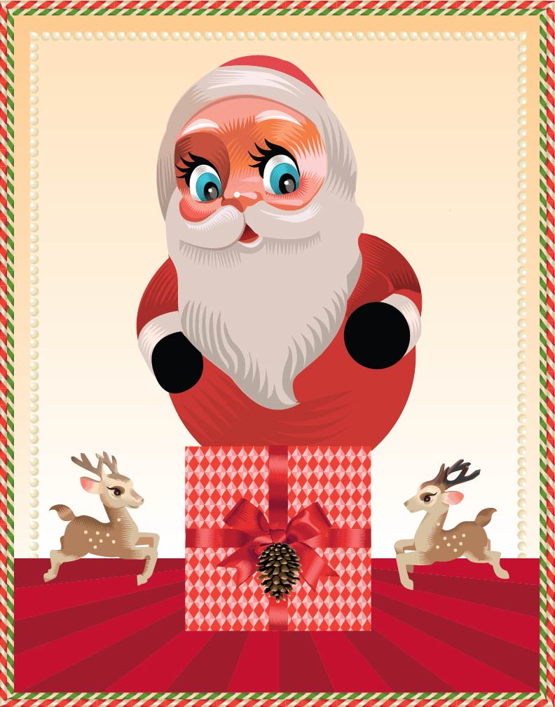
Sugar Coated Advent 2012: Day One

Sugar Coated Advent 2012, Day One, Q. Cassetti 2012Well, its that time of year…and as I have been silent and bumbling around all year trying like hell to get a groove on, keeping on trying, keeping on reading, keeping on waiting to no result. However, after stuffing myself with Kawaii, decoden, Japanese Yokai tales, and making these tiny little  pins that have gone from little studies to outright psychodelia that are being sold now in soon to be two retail establishments— I am now ready to plunge back into the world of letting my illustration push me around a bit. I am pleased to say, that I have found my groove and it is in this candy coated advent calendar journey we will be taking together this month.

I must admit that the original intent of this project was to focus strictly on gingerbread houses—but as I have been working with this concept, I am finding it morphing into something else which I am just going to go with. We will keep the candy keep the pattern, keep the holiday themes but I am going to see where it goes.. There will be gingerbread houses and fantasy. There will be gingerbread men and ladies—but why limit it as the palette can become tedious and germanically tedious/ponderous. I hit a patch yesterday that had me silently squealing with delight and am in a race to find more time to whale on it. Lets just say, 25 days to jump start next year! Yippee!


A charmer

Jean Tuttle is a charmer, an inspiration. She is a lovely person inside and out and an illustrator—and her grace and wit spills into the work happily. I love her professional work. Hope Katz Gibbs writes about her on her “Truly Amazing Women who are changing the world and how you can, too!” site, here> but just getting to know her and see how she brings her sense of fun, imagination and thinking of others into her life with images —weaving them into her day to day. Jean has done the most thoughtful thing and is sharing it with all  of her fans (moi included)—which is that she leaves her dad a picture at the breakfast table every morning featuring their three cats engaged in some cute thing having to do with current family life. The cats raising an alarm that there wasn’t much to eat in the kitchen and that Jean should get to the store is here>> The cats and mice going on vacation>>  Every detail is smart and fun—from the personalities of the individual cats (Charlotte in her Ralph Lauren coat—all fashion forward) to Blackie taking charge), to the little greek chorus of mice who fill in the story, add flourishes to the story (the way Jean does visually) and little cute quips and sidebars. Such loving, sweet images that just make my day (and I am sure Jean’s dad)—that burst with cleverness. It would be great if this impromptu work could suggest a book (which I would be first in line for). I thought you would enjoy Jean, her imagination and how she shares her talent with all of us.

Fatline Experiments, Q .Cassetti, 2011 pen and inkI am still on the fatline project. The notebooks are too small for the line width, so the sketchbook is going up in size to see how this evolves. I spent some time this weekend reading one of my great Fraktur books, Bucks County Fraktur from the Pennsylvania German Society, edited by Cory M. Amsler (1999). I love how the neighborhood, the itinerant schoolmasters, the religious and musical culture were so prescribed, and yet drove this remarkable body of original work. Many of the bookplates and hymnbook covers were done essentially as Pennsylvania German “atta boys” for students that performed or who helped tutor the less strong students. The Birth, Marriage and Death Certificates were a way for these artist teachers to make a little extra money on the side— Many of these itinerant artists were first or second generation German (with German being their main language), bringing over German/Bavarian inspiration and visual language, combined with visual reference being woodcuts (many very primitive). Throw all of that in an active mind in the countryside…churn and see what evolves. Many of these works on paper were created with blank spaces designed into the piece so they could be filled out on the fly as they were peddled from door to door.

Am busy with interesting work on my desktop.  The art folks have their deck. I need to get on the Museum for their projects. There were some nice name progression projects. I am close on a few…the horizon is something I can see.

There is some nice traction around the Library poster (to the right)  and the nice event planned for this Saturday. Heather H. has worked her magic and pulled her props (candy store, lemonade stand), ordered cakes, called musicians. There was talk of theatricals (which I think didn’t make it) but perhaps an impromptu tableau vivant? Two hundred years of books is quite an accomplishment for our little village. There is a lot to toast!

It is dreary and raining though the trees are gold. Gold and grey. The trees are beginning to dump their leaves a bit so that wonderful fall light can dapple and change our environment as the season begins to move into full fledged autumn.

Greater

Grate Face, Q. Cassetti, 2011I am always looking and seeing faces surrounding me. I am sure this is something everyone does—but it is such fun. And its always great to see a good one when you have a point and shoot in your hand. I bought a brand new grater at Maines on Saturday and in the great unpacking of the bags, put it down on our stainless prep table…voila. And now you can have him smile at you this morning.

I am inking on trace today. OOOOH. Love it. Thick trace, the really meaty stuff with layers of india ink is pretty much the max. I was working with photoblue and light vermillion prismas on trace last night with the blue being the preliminary sketch and the vermillion being the firm up. Now the inking.  I am cranking out a stack of these babies for a fun sketch project I am working on. Thus, the photo a day program right now.

I am curious about the trendy, color projections. Do you know if they project out one/two years so that the fabric companies and fashion companies can develop product/collections using these predicted colors?

Nidhi Saxena has a blog on color, patterns and designs>>

Fall and Winter 2011-2012 Color Trends in Fashion>>

Pantone View Color Planner Fall/Winter 2012/2013

“Refocus also examines Colour Movements - tones that are becoming more important, less important or shifting in hue and intensity:

- Lighter blues and navy increase in importance.
- Leathery brown becomes more important as a basic.
- Oxblood grows in popularity as browns, in general, adopt a redder hue.
- Olive becomes stronger.
- Purple and purple hues are still evident.
- Brights have a singular status for winter.
- Camel evolves into cappuccino and creamy hues.
- Yellows become softer and less sporty.
- Reds are becoming more orange.
- Traditional winter darks and berry colors are more mid-toned and less blackened.

So, I guess if we have a color magic ball, this may be able to be interpreted a bit. Yay for Olive becoming stronger. And a redder Oxblood is nice too. Is black out? and Navy in? All ideas are welcome!

 
Rob and Kitty had a great trip to Utica and then to get the doors at Croghan Mills. The millwork is great and David and John are here installing them today!

2011 Pantone Color of the Year: Honeysuckle

Yes folks. The Pantone color of the Year is Honeysuckle! I totally missed turquoise from last year. At least I have time to get with the program this year!

From the Pantone site:

“While the 2010 color of the year, PANTONE 15-5519 Turquoise, served as an escape for many, Honeysuckle emboldens us to face everyday troubles with verve and vigor. A dynamic reddish pink, Honeysuckle is encouraging and uplifting. It elevates our psyche beyond escape, instilling the confidence, courage and spirit to meet the exhaustive challenges that have become part of everyday life. 

“In times of stress, we need something to lift our spirits. Honeysuckle is a captivating, stimulating color that gets the adrenaline going – perfect to ward off the blues,” explains Leatrice Eiseman, executive director of the Pantone Color Institute®. “Honeysuckle derives its positive qualities from a powerful bond to its mother color red, the most physical, viscerally alive hue in the spectrum.” 

Eiseman continues, “The intensity of this festive reddish pink allures and engages. In fact, this color, not the sweet fragrance of the flower blossoms for which it was named, is what attracts hummingbirds to nectar. Honeysuckle may also bring a wave of nostalgia for its associated delicious scent reminiscent of the carefree days of spring and summer.” 

Honeysuckle is guaranteed to produce a healthy glow when worn by both men and women. It’s a striking, eye-catching hue that works well for day and night in women’s apparel, accessories and cosmetics, and in men’s ties, shirts and sportswear. Add a lively flair to interior spaces with Honeysuckle patterned pillows, bedspreads, small appliances and tabletop accessories. Looking for an inexpensive way to perk up your home? Paint a wall in Honeysuckle for a dynamic burst of energy in the family room, kitchen or hallway. “

Pantone goes on to tell us that you can get paint, wedding apparel and yes, a Pantone Visa Card (I mean, why not!). All of this points, for me, that the end of the world is coming. I mean, a Pantone Visa Card? I guess we don’t have enough to do beyond work and the antics of Snookie and the Situation so shopping with our pink card (maybe only buying honeysuckle, energized products?) is there to fill the time!

Day after Advent #1: Phew.

Swanheart, Q. Cassetti, 2010, sharpie, from the second sketch book project

Phew! Another year done! Wrapping and boxing, list making and shopping, cooking and sorting. All done. Phew.

The amazing “feast in a box” (icebox) is the total way to go. I had the stock, gravy, stuffing mix (not the cornbread part), the cake layers, the bread all done. Turkey went in around 9 a.m. I iced the cake, tossed the stuffing and threw a salad and a veggie together so the holiday went without a hitch and the nightmare of carving and creating a mediocre gravy didn’t happen. Yay for me! Yay for kitchen schmarts. Yay for a freezer (if you dont have one, get one..but be clever about how you use it). A freezer is a not forever thing, but a hold until next week, next month thing. And you can have plates and plates of different food that you made yourself (just not concurrently). So, dinner went without a hitch. The glorious pure turkey (freerange, no antibiotics, organobird) did all the things it did to my delight at Thanksgiving. All the food happened at one time as was hot. And, we seated everyone for dinner around 4:45 p.m. to make it an early evening for all of us. It was a nice party. Quiet, but nice.

Then, after the dishes were swept away, I got right into the great boneyard roasting with leeks and onions, celery and onions (with the skins). So, this morning that whole pile of vegetables and brownness got popped into the cauldron on top of the stove to cook away all day into the next round of turkey stock. I just need to click into processing the rest of the food (soups, stews, pies) so we have a weeks worth of dinners on hand (a real vacation). Kitty is ice skating with her friends on their pond. Alex is off making music or trouble with his new friends….

I need to download “Pencil” as my Christmas present from Kitty was a tutorial in this software to make simple little animations. I had a beginner this afternoon around lunchtime, so I need to show good faith and give it a try before she gets home. I recieved some great books on soupmaking and breadmaking, a piece of glass enamelled by Emilio Santini’s wife (a spur by my hubby to get to enameling on glass), some cocktail napkins with my name on them(!), and books on illustrative topics. It was a good Christmas. Not over the top or anything. Pretty simple, but satisfying to all, I hope.

Interior of the Shadyside Presbyterian Church, Pittsburgh, PA froToday I can also be retrospective. Tomorrow, December 27, Rob and I celebrate our 30th anniversary! Who would have guessed! In my case, I am proud of this accomplishment and cannot imagine having a better partnership with anyone other than his wonderful man. We have grown up together. We have gone over quite a few speed bumps in our journey, but bounced along problem solving and pushing each other to be the best we have the ability to be. These are things that when standing in the gold tessellated nave of my church, I could not have imagined…I just knew this was right and good and it has been. Marriage is a toss up, and really for me, it is a test of faith in that gut knowledge that the journey will be enriched and bettered by the other person on the trail with you. It is faith in yourself, your partner and trust that you will continue to have faith, trust and abide by the contract that marriage puts on your relationship. For me, the contract is the piece many do not value. If the contract is broken (the stuff about love and obey, as translated by the partners..)then the whole of the marriage cannot survive completely. Also, I believe that this contract is truly between the partners and the Greater One and if broken, then difficult to get back to a place of trust, of faith, of love. I have been blessed by so much and one of the greatest is my marriage to Rob.

On that note, I am sounding a bit preachy and I apologize. I need to go and get the pencil..and make some lines wiggle for Kitty. More later>>

the good old days of corporate design

Altar Dresden Foil Scrap from Martin Meyer.comOkay. More Dresden Scrap for your eyes and fun. I discovered this cool site that will wholesale this stuff to me…and I am sorely tempted. Just need a project beyond the drooling and salivating I  have being around this paper ephemera. It’s Martin Meyer Imports. Love the stuff. Take a looksee when you have time. They have altars (like this), wings, and all sorts of other great stuff like suns, moons, stars, comets. Combined with a few wonderful retablos, and one could create your own mixed culture folk art.

Today is the Sausage Fest. The pink teeshirts are rolled in a pile. Sausage is cool in the fridge which decided to work today. I bought corn and a melon from Rick along with a request for salsa tomatoes which he happily sold me for less in abundance. So, the trip for the tomato jackpot was just up the hill and not 15 minutes away in the Amish Wonderland. So, the salsa has been cut and prepped for the gang. May the fest begin. There is talk about a holiday Sausage Fest for fun—perhaps with a santa pig?

I have been musing over what I like about Alexander Girard. I guess its the limited palette, simple color treatment, simple imagery more like icons and less like stories. His work almost seem like logos for life, or symbols for living versus a snapshot from a story. Those images can be grouped together to tell a story in pictograms—evoking traditional images from folk art, folk stories, and toys. His work is altogether very happy as I am sure Girard was a joyous man who let his light shine through his work. Upon a bit a of research on his work, I came across this wonderful site on Braniff Airlines and the work/effort+ thinking that went behind the first big change of image that transformed that airline. The Braniff Pages.com shows the predecessor to Jet Blue. Braniff went from a so so airline in Texas (I think) to a look out operation which was thrilling to ride. The airplanes were different colors (whoa!) with new type by Alexander Girard (now available through House Industires):

In 1965, noted New Mexico architect and graphic designer, Alexander Girard, was hired by Jack Tinker to redesign “every aspect” of Braniff. He created the idea to use bright color schemes and ethnic art for Braniff. This was officially called “The End Of The Plain Plane,” and was applied to aircraft, lounges, ticket counters, ground equipment and everything else the “flying public” would view. 

Girard originally wanted each Braniff aircraft painted all one color, with a tiny “BI” logo and name. Braniff advertising and engineering wanted a bigger logo and bigger type, so they modified the designs and colours (adding white wings and tail) based on the Vega scheme Paul R. Braniff had created in the 1930s.

Braniff Introduced Seven Colors: Powder Blue, Medium Blue,Orange, Ochre, Turquoise, Lemon Yellow and beige. (Lavender was also introduced as shown above, but dropped)The colors were proposed by herman miller designer, Alexander Girard, and modified by Braniff In-house departments.”\

The stewardesses were trained to be hospitable at a College developed for them. Combined with the training came a overhaul of food, service and luxury with an infusion (where my relationship with Jet Blue comes in) of fun from color and design, posters and then the actual floor show during the trip. My father would take Braniff during some of his travel during this time and would come back to talk about how the stewardesses would change their uniforms during the trip going from mini to maxi to raindomed bubbleheads in Pucci designer duds.. A real live trip into a Stanley Kubrick universe from his description to an imaginative under ten year old at home. I am still intrigued. This was the time that contract furnishings via Herman Miller and the whole corporate design machine at Corning/IBM/ Cummings Engine was in full swing and fully functional. It was wild, and crazy. It was the sixties when anything was possible. And thanks to Alexander Girard, it became realized.   I am inspired.


Inspired by Girard

The Nativity, Alexander Girard

 Art is only art when it is synonymous with living.               -Alexander Girard

I am going to be Alexander Girard’s red headed stepchild. I mean, I want to be Alexander Girard’s stylistic red headed stepchild. I want to be him so much, and feel that there is enough Girard (1907-1993) DNA (illustration and graphic design DNA, that is) in me, that I cannot suppress it any longer. I do not know why I have been so reluctant to be this stylistic person, but I have. Maybe because its too easy. Waaaay too easy. But others with the same coding do not have the hangups (maybe I had to get over that I can “be all that I can be” versus paint with oils and be Norman Rockwell).

But hey. Look at this angel to the left. I have been there and back. Just need to give myself permission to go more graphic. I can do more graphic. I do it every stinking day for pay. I can do simple. I can do flat planes of color. And the whole negative/positive thing I eat and drink. There is a sheer happiness with his work that has become renewed in me, and want to take inspiration from him, from similar reference and stylistic sources that he did…and see where it goes.  His collection of folk art, toys, and objects were established as part of the Girard Foundation (at the Museum of International Folk Art) which will be a new go to for me. Sanna Annukka , the wonderful English/Finnish illustrator has taken Girard’s work and embraced it and made it hers. Why can’t I?

Toys represent a microcosm of man’s world and dreams. They exhibit fantasy, imagination, humor and love. They are an invaluable record and expression of man’s ingenious unsophisticated imagination.  
-Alexander Girard

I mean, I am there, right? Erzegebirge. Dresden Scrap. Folk art. Lubok/ lubki. Fraktur. Polish Folk art. Mexican folk art. Engravings. Mexican Engravings. Indian art. Hindu folk art. Colonial art. Colonial Gravestones…..my world of influences. Girard is speaking my language, loves the things I love, uses a palette that I am comfortable in. He is a teacher and an inspiration. I need to go with this.

Feathered fun

Images of KamadevaKnocking em down. Alex is done with his exams. Kitty has a little summer bug. Mr. Percival B. White has settled in…with lots of lolling about, sleeping in odd places, cuddling with shoes. Nigel is done this week— he has a little trip planned. Rob is Manager on Duty tonight…so he will be running late.

More pictures of Kamadeva. Love the parrot made up of green sari’ed ladies…or the little cart pulled by a pair of birds.

From Indian Divinity:


Kamadeva, the god of love, is very fair and handsome and the best looking among the gods. He carries a bow made of sugarcane and strung with a line of humming bees. He shoots with his bow the five flower-tipped shafts of desire. RATI (passion)his wife and his friend VASANTA (spring), who selects for him the shaft to be used on the current victim accompanies him. Kamadeva’s vehicle is the parrot.
Lovely, lovely exotica.
Now for a channel change. Jim Reidy told me about this fabulous, free presentation site that one can create truly cool presentations in a distinct, non linear way. Prezi.com—defines itself as a “zoomable interface”. Not only is it cool as a way to go beyond the stupidity of Powerpoint—but as an artist/illustrator/ designer… thinking of this medium as a way to tell a story is very cool. Need to fiddle with it a bit…but the ability to zoom in /out can add focus, and draw the viewer in to a story. Take a look.
One more exclamation on the local level. We have a bulk foods store moving into the former Artisan Cafe space “Good to Go”! I found out about this on 
Facebook as they are vetting their logotype to the group at large…So, another new retailer in our little hamlet.
More later.


Slow Saturday

Northern Lights, Q. Cassetti, 2010, pen and ink/ digitalJust back from Sauders, the Mennonite grocery store in Seneca Falls. It was a beautiful drive with clouds and little peeks of blue sky with gold light casting shadows on the snowy fields and painting the trees dark purple and brown. Beautiful. We bought a cartful of groceries with a lot of flour, butter and the basics. I picked up a package of John Martin Scrapple for my mother-in-law who loves it along with frozen blackberries, dried parsley, teensy potatoes (called creamers) and much more.

They had dried mushrooms (my new add to the mise en place) but Greenstars are better and believe it, cheaper. Mushrooms add so much to any saucy thing--adding so much weight and dimension to the flavor of a sauce. It is amazing, much like the leek, the shift/or add of an ingredient can make so much of a difference.

We have eggplants for Kitty and Alex's favorite eggplant along with all sorts of spices, nuts and add ins. What with the time I have at home, the bottles and cans for cooking have been replaced by single pieces of paper and plastic bags. The whole quantity of our household trash has reduced to a trickle...and the composting and recyclables a bit more weighted.

I have flour for the week. I am making a new recipe in The King Arthur Book--not the Pain Levain, but the Whole Wheat Sourdough which is a bit more complicated (but thats not saying a lot).

I am thinking of calling the Society of Illustrators in New York to find out what it would take to create a digital (maybe even taking it to vector) award for the Student's Show. I would like to do a $1000 prize (max $1500) as this is the place to encourage growth and staying on track. It would have meant the world to me when I was in school, but prizes were not given. I am also thinking of prizes for the first years and a single prize for the second years at Hartford Art School's MFA in illustration. Illustration keeps giving and giving to me, I would like to encourage this small community of lovely people through giving to students who may need applause and praise for excellence and effort. Put this on the list of things to do.

Must go for now. There is some reference to search....for more of these home sweet home pictures. I am developing things and feel I am on the front end of this...

Off to Target later this afternoon for shopping with Alex. Maybe dinner at The Nines...!