Tom Buechner leaves us all.

From the Corning Leader (06/14/2010)
By The Leader Staff, Corning Leader
Posted Jun 14, 2010 @ 12:36 AM
Corning, N.Y. —

Renowned artist Thomas Buechner died Sunday in his home.
According to the biography on his website, Buechner, who was born in New York City in 1926, was the first director of the Corning Museum of Glass from 1950-1960 before becoming the director of the Brooklyn Museum from 1960-1971.
In 1972 Buechner became the president of Steuben Glass, chairman of the Corning Glass Works Foundation and president of the Corning Museum of Glass.
He also helped establish the Rockwell Museum in 1976 and served as its president for 10 years.

In 1985 Buechner became a vice president of Corning Glass Works.

Buechner wrote the glass section for the Encyclopedia Britannica and founded both the Journal of Glass Studies and the New Glass Review.

He also wrote “Norman Rockwell, Artist and Illustrator”, in 1971, and, in 2000, “How I Paint”. His most recent book, “Seeing A Life”, was published by the Arnot Art Museum in Elmira, New York in 2007.
Painting full time since 1986, Buechner was an established portrait, landscape and still life painter. He had many one-man exhibitions in New York City, throughout this country and in Germany and Japan.

Buechner is survived by his wife, Mary, and three children, Bohn Whitaker, Thomas Buechner III and Matthew Buechner.

back in the saddle.


Stephen Huneck
Lend a Helping Hand
Image size: 6" x 7"
Paper size: 8 1/2" x 11"

So, I have been thinking about a lot of stuff. First off, a name for a friend's new business. He has been giving it a lot of thought and has some possibilities--but after having a dose of Vermont and the naming that goes on there, I think this could go further. I am intrigued by the name/word "Vermont" and how that has come to mean pure, good, wholesome, farm grown--excellent, though reading the labels might dissuade you from buying the entire package. However it really works. There is Vermont Butter and Cheese, Vermont Smoke and Cure. There is Vermont Maple Syrup (with no other brand than that). Vermont Cheddar and Vermont Cheese (though Cabot Creamery might be the big owner there). Ben and Jerry's is identified with Vermont. You get the Idea. I was tickled to see that there is a Vermont Mystic Pie Company who is using Stephen Huneck to design and illustrate their packages for pie. The look is distinct and frankly very "Vermont". That is one train of thought. What makes Vermont, Vermonty? What is it about Vermont that embues all of this expectation and promise for pure excellence? Do we even have glimmers of that here?

Then there is the approach with getting a bigger name, a wider reach. What I mean is that if my friend is going to make one thing, but possibly blow that channel out a bit, or have other offerings that complement the product he is focusing on, how do we name that entity that has all that the word "Vermont" offers, and yet keeps it broad enough to embrace more. "Vermont" interestingly is a place, a location, a specificity that adds the novel "localvore" connotation as it is to those who can buy those Vermont brands,something desired, something special. So, place is part of the equation, a locality, a pinpointable place. Could that place be even more local? A farm? a street? a town, a village? a hamlet? That resonates for me as the place is the source, the lodestone from which all this goodness, this thinking, this approach comes from...Of course, it comes from the people, but the product is an outflow from the place. So, a place name makes sense with a describing word that situates it like farm, street, ville or burg, hill or river, stream or bend. That can help our name.

That's the thinking now.

Rob is off to Cooperstown and back for an interesting board meeting. Kitty is nursing a sore throat and Alex is nose to the grindstone. I am looking at my list of dos and redos and know that things are going to crank up. Ahhh. More holiday shopping online as today is Cyber Monday? and we all must spend all of our holiday money online as fast as we can. And did I mention holiday cards! Yikes.

Sunday redux


I apologize for being so silent. It just been too much with the work at hand (endless variations on a similar thing to finally get to the end, plus new stuff with 2-3 hour turn arounds that can really be trying). It really is quite a bit to stay on top of that pony, blog and just get the day to day resolved. I will try to be more communicative this week.
Yesterday (and I will post the pictures later) we visited Durand's Forge, the blacksmith shop and world of Durand Van Doren, an amazing artist, clever and funny person, generous host and remarkable blacksmith. He works outside of Mecklenburg in a few small buildings heated by big woodstoves, with his work, his collections, his inspirations all nailed to the wall or arranged in little story telling vignettes that depict an active brain, a wit and humor that goes with the work. He showed us gates and benches he had done on commission along with enormous groups of chandeliers and lighting for Cornell and other big institutions. But he also had a wrought iron Kissing Booth and Good Luck Bench (made from horseshoes)... There was a lovely named dog house for his little confident Jack Russell, Mick--along with all sorts of personal totems posted on the wall around Mick's abode. Duran had mini forges in the yard to the back of the shop where he teaches blacksmithing...all sorts of machines made of this and that to create small approachable forges. He had a pot of beef stew going on one of them...and kindly offered us this hospitality along with his stories and ideas. He had all sorts of fruit trees (which Kitty identified confidently, thanks to the kindness of Ian and Jackie Merwin's tutorial)) and a real live chestnut (not horse) tree with it's nuts standing proud in the spiky shells.


Durand is a man of many talents. He is a big Trumansburg Rotarian..a giver and there at the chicken barbeques, the golf events, the races, the meetings. He always gives when people need things for auctions and raffles. He also is one of the refs at our only Pro Sport in Ithaca, rollerderby with the SufferJets. He is a remarkable artist--and his world at the studio invites you into his thinking, ideas, and life. If you have a chance, or just an hour, I highly recommend you visit Durand next weekend during the second weekend of Ithaca Art Trail.

We then, visited friends in the Cayutaville area. They have recently built a studio/ house compound--with lovely porches springing off each level to overlook a spectacular valley (which yesterday with the Fall colors was dumbfoundingly beautiful). Their work space was great, and their living space, equally so...with vibrant color on the wall--unexpectedly wonderful, and the beautiful cabinetry and woodwork creating a very happy place to spend all your days. They have a wonderful, happy garden with an enclosure as happy as the parsley framed walkways, energetic nasturtium, a pineapple sage...all poetry...abutting the most perfect chicken coop with tailored black chickens happily chasing each other down one end of their run and back again. Shady Grove was with her best dog girlfriend...and enchanted by the chickens. She didnt know what to make of them. We were so honored to have a chance to visit these lovely kind people in their paradise as well. And, on such a beautiful day--with the evening sky moving from blue to purple with red edges in the sky, to shimmering gold trees. Breathtaking.

And to cap it off, we went to see Julie and Julia at Cinemopolis. Bliss..and a gumdrop to finish a wonderful day of seeing and meeting, color and light, ideas and brilliant work. What a blessing we have .

work in process


I was messing with Double Happiness--and seeing if color helped/hurt. Dunno. Its pretty rubber. While I was solving the world's problems last night(read, I woke up at 3 and my brain clicked on superdrive)I was thinking about illustration, taxes, business, and getting Kitty through this college gambit.There is just so much personal stuff that time will help to resolve, but having the bones of planning and thinking put in place is necessary so that the home team can get what they need out of the experience. Bones. Hmm.

I created about 10 bodies of work--all but doing it. Was thinking about the CF Payne and Gary Kelley project (week one at Hartford this July) which is sort of open as it can be working on your personal work (thesis or otherwise) or a portrait of a literary figure. I am thinking that I bend it a bit (and check with Chris today) and work either on the body of work (Holbein inspired pictures of local friends/kids) or to take a few heads and work with them wearing my Picasso/Braque/Juan Gris hat....with a nod to this great illustrator I admire, Pablo Lobato. I love his charactures and would love to see if I can do a distill like this with my logo/symbol design background. I think it would work? Do you? I am sort of charged up to pursue a decorative approach to portraits...and I am leaning this way and with Chris Payne who is noted for his ability to stretch a face...it might be great. As I write this and look at Pablo's work fresh...I am definitely going to do this. Now, the literary figure...could be Twain because I have been reading about him and have a nice little pile of images to work with. Could be Ben Franklin? Could think about someone more dramatic though...literary literary literary.... I like Dante. But not photos. Back to Twain...you get a bookish, cuter Einstein. Reading about Twain, I find out that he was well over 10 yrs. older than his wife--meeting her after striking a friendship with her brother Charles who was on the "Quaker City" cruise to Europe to do his "grand tour". Twain is a really wonderful writer with wit, snap and a tremendous amount of edgy "tude" that the sweetness of his public writing doesn't communicate.

Finished the first round of edits to the thesis. Will meet with Peter, my editor within the next day or so for the second comb through soon. New waterfall on board today. Haircut too!

Tuesday: split personality


Rob has my car today. The 15 yr old volvo smelled like gas and frankly when we bought it used it had it's issues, and now that it is ancient (or so the world thinks--I think something expensive like a car should last at least 30 years...but that is why i am not an economist or marketeer)---those issues have become overwhelming. Anyway, this is my round about way of trying to explain my little commuter man at the top who is popping up in my sketchbook. I am dating Jim Flora this week, and my love overfloweth.

Its been wild here as Erich is out for the unprojected second week post baby. Its hard for him (the lack of sleep) and the baby somehow doesnt want to cooperate and be perfect. She's hungry and insistent. So, like the radiant suns in our cupboard off the porch, she too is letting those big people know who is ruling that nest. So, to focus the light back on you know who (me), I am doing my job and Erich's job which is tough as the work I send out, comes back to me (flypaper, me) and then back and forth we go. Sometimes its tweaks ("change the dash to an em dash") but more often it's "the graphics didn't "grab" the chairman...on topics like power and such. Power is such a hard thing to depict as electricity, or Power and Glory americana ness such is so obvious. Symbols for power (at least traditional ones) are seeped in mythology and history which the common worker just does not track on. Maybe I should shift my focus to the celebrities of Inked, Dancing with the Stars or American Idol (none of which I watch)...There's power for you. Or that adorable Miss America having no ability to communicate anything other than what she was prepped for...or my favorite, Miss Teen South Carolina, really showing off:

Though, truly, the real power and the real "Miss World", British Idol contestant was Susan Boyle...someone not packaged, not prepped, and real symbol of talent, who blew people out of their chairs... it will be interesting how they package her to match her true talent and power.

Phone is ringing--designer, corrector, editor and receptionist job awaits.

From SF: A bit on Brian Singer and his work.


“Engaging through inspiration”

Brian Singer, graphic designer for Altitude and creator/funder and engine behind the 1000 Journals Project summed up the general feeling in his final words to the group, “You have ideas. If you don’t take the initiative, if you don’t make it happen....you have...right......Nothing”. Brian Singer, also known as “Someguy” knows this to be true as this is his modus operendi for his graphic design and independant project work. Brian Singer does projects to engage the world, or as he terms it broadly, “marketing an environment”-- setting up public conversations in unusual and noteworthy ways. His dog poop project is one such example.

Singer, as a way to engage the community in expressing their distain for George Bush and his administration, established a website (www......com) with photographs of his litttle civic installations. Singer would search for dog poop which seems to be plentiful and a metaphor for his feelings about the former President--and stuck little chrome yellow flags with Bush’s face on them into the fecal matter. Photographs of these vignettes along with downloadable flag graphics were put up on an internet site (www. com) and the community engaged in the discussion. This project along with his art making from the poster and graphic detrius were just the warm up to his current project, !000 Journals.

Singer created a concept over a five year span, to drop a thousand hard bound journals into the environment allowing people to express themselves freely without limits or public expectation. The concept was inspired by the graffiti Singer read in the public bathrooms while he was in college. Singer felt that the expression and messaging in these environments created open ended, anonymous conversations that gave permission to people to express themselves freely. The journals were to take that free expression to another level--having it become part of an individual’s journey, to hand it off or leave it for another, and so on. To create an open environment to communicate and then, in the end, to have these books return for further understanding. There was a system for the these numbered classic Canson sketch books to be scanned and quoted on an independant website whenever possible,

Brian Singer had no end plan. He wanted to get the books out through handing them to friends, leaving them in places, introducing them quietlyto see what would happen. He had no expectations about what was next. He had no expectations for public relations or image building for him. From his modest and self effacing demeanor, his passion was not necessarily for the outcome, but for the process, for the project and for the communication with the world at large. This project is where he put his money and time with no plans at all.

Four years later, thirty of the books have been returned. A documentary film has been created. He has been noted in the media from National Public Radio to television. There is an exhibit on display of a few of the journals that Singer was engaged in helping to design at San Francisco Museum of Modern Art (SFMOMA). Much of the news puts the project first with Brian Singer as the orchestrator and concept artist. I believe this is intentional on his part because for him, that is what is important.

Brian Singer believes that an artist must “engage through inspiration' using personal work, self authorizhip, fine art and professional work. He feels that all four aspects of this engagement must all happen in order to drive better work and thinking and cannot be allowed to languish. Singer lives up to this high expection of private and public voice to nspire us through his actions, words and projects.

I agree with Singer’s four prong approach to one’s work and career. I have repressed personal work, self authoring and fine art to exclusively focus on my professional work as a graphic designer until entering the ISDP programs at Syracuse and The University of Hartford. In hindsight, this is time lost. I believe that in developing personal projects, self authoring and fine art exploration through blogging, the creation and distribution of zines, web creation, on demand printing, drives personal projects, personal expression and a sharpening of a personal message, brand and understanding. To force this self expression beyond the boundaries of a job or a profession allows me to better understand what makes me tick, where my boundaries are, sharpen my communication skills and to delve into ideas. This personal expression has fed my professional work as a designer and has permitted me to better understand my own vision in addition to that of my clients.

Posada and potatoes


I am musing over the Mexican woodcuts and their artists/graphic designers such as the grandddaddy of this group of people, the artist Posada (José Guadalupe Posada (2 February 1852 – 20 January 1913) was a Mexican engraver and illustrator.) and peer, Manuel Manila. In the meanwhile, I am boiling some potatoes with some milk to make a pan of les pommes de terres dauphinoise as my big effort for today. I have taken it way too easy (lying abed entrance by an airport book, People of the Picture by Geraldine Brooks)and am not shifting out of that as interesting thoughts happen when you just forget to think. Thoughts like my thesis, work in general, the concept of the bodies of work and the amusing "luxury" genre and how that has shifted the paradigm for retail, hotel, vacations/cruises...and how I should approach this new shift in my work. I even have a pretty sweet idea for the Baker Institute Annual Report that is green, cheap and really original--inspired by the little I have been learning from the land of Zines. So I plan to float and flitter today and see what emerges from this state because reality is only 15 hours away.

Musing about Gainsborough spurred by Blue Boy


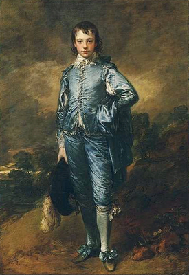
From the Huntington Art Gallery:
Jonathan Buttall: The Blue Boy (c 1770)
Thomas Gainsborough (1727-88)
oil on canvas, 70 5/8 x 48 3/4 inches

The best known painting at the Huntington, Gainsborough's The Blue Boy, portrays Jonathan Buttall, the son of a successful hardware merchant, who was a close friend of the artist. The work was executed during Gainsborough's extended stay in Bath before he finally settled in London in 1774.

The artist has dressed the young man in a costume dating from about 140 years before the portrait was painted. This type of costume was familiar through the portraits of the great Flemish painter, Anthony van Dyck (1559-1641), who was resident in England during the early 17th century. Gainsborough greatly admired the work of Van Dyck and seems to have conceived The Blue Boy as an act of homage to that master.

The cool thing about this painting is that Gainsborough used this painting to showcase his ability to paint something more than what he was being hired to paint (the ladies in the white dresses a bit off center with very sketchy backgrounds and to my thinking, some fairly simple and quiet lighting solutions. This was a piece to raise the bar and say, "hey, I can do this too!".

Wiki illuminates an aspect of the story:
It was often rumored that Gainsborough painted the portrait in response to rival Joshua Reynolds,who had once written:

It ought, in my opinion, to be indispensably observed, that the masses of light in a picture be always of a warm, mellow colour, yellow, red, or the green colours be kept almost entirely out of these masses, and be used only to support or set off these warm colours; and for this purpose, a small proportion of cold colour will be sufficient. Let this conduct be reversed: let the light be cold, and the surrounding colour warm, as we often see in the works of the Roman and Florentine painters, and it will be out of the power of art, even in the hands of Rubens and Titian, to make a picture splendid and harmonious.

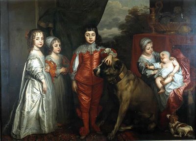
The children of King Charles I of England in 1637 by Van Dyck. From left: Mary, James - unbreeched at four, Charles, Elizabeth and Anne.

So, Blue Boy was a sample. And what a sample to observe up close, the way the satin is rendered in all manner of color and brushwork. I wonder if it helped to move his work with the clientele? I wonder if it made his peers gasp! and applaud his ability to shift his work this way.

My great surprise, my gasp is that this is the same Gainsborough painted one of my favorite English paintings--Mr and Mrs. Andrews. This painting was early in his career allowing him to showcase his love and abilities with the landscape. This painting depicts a pair of newly weds and the property that Mr. Andrews owned cojoined with then new property that became his upon his marriage to the fair Frances Carter of Ballingdon House. It was painted in November, a time of harvest and visual plenty which perhaps linked to the marriage and it's wealth (?).

I love Gainsborough's children's bookie exaggeration, the use of color and placement on the canvas. This picture flopped would make a perfect bookjacket cover for an english romp--I love the "whatch looking at" face that Mrs. Andrews calmly presents to us, and the relaxed manner of the man of the household. The dog is asking for something to do. And the Missus is thinking, "goodness, I wish I could get some shoes that fit, these tiny things pinch". Plus, she is painting a picture on her lap. Have you ever been able to do that without a hard surface underneath? The National Gallery site suggests the painting would have been a placeholder for the baby to come. Huh..?

These are the Gainsborough's I love...less the court paintings (which as a category, I adore...but I am easily humored). These little english tales as rendered by a storyteller painter in a spare english palette of pinks and blues. This is the England of literature and private, spare romance. This is the sweet England of the happy rich who revel in " a longish walk", who hunt and love their dogs, and cultivated ladies--who as articulated by Jane Austen (50 years earlier--but true to the english essence) in her book Pride and Prejudice on the accomplishments of ladies:

``It is amazing to me,'' said Bingley, ``how young ladies can have patience to be so very accomplished as they all are.''

``All young ladies accomplished! My dear Charles, what do you mean?''

``Yes all of them, I think. They all paint tables, cover screens, and net purses. I scarcely know any one who cannot do all this, and I am sure I never heard a young lady spoken of for the first time, without being informed that she was very accomplished.''

``Your list of the common extent of accomplishments,'' said Darcy, ``has too much truth. The word is applied to many a woman who deserves it no otherwise than by netting a purse, or covering a skreen. But I am very far from agreeing with you in your estimation of ladies in general. I cannot boast of knowing more than half a dozen, in the whole range of my acquaintance, that are really accomplished.''

``Nor I, I am sure,'' said Miss Bingley.

``Then,'' observed Elizabeth, ``you must comprehend a great deal in your idea of an accomplished women.''

``Yes; I do comprehend a great deal in it.''

``Oh! certainly,'' cried his faithful assistant, ``no one can be really esteemed accomplished, who does not greatly surpass what is usually met with. A woman must have a thorough knowledge of music, singing, drawing, dancing, and the modern languages, to deserve the word; and besides all this, she must possess a certain something in her air and manner of walking, the tone of her voice, her address and expressions, or the word will be but half deserved.''

``All this she must possess,'' added Darcy, ``and to all this she must yet add something more substantial, in the improvement of her mind by extensive reading.''

``I am no longer surprised at your knowing only six accomplished women. I rather wonder now at your knowing any.''

This is the climate of English perfection these storybook paintings can be derivative of...the character studies, the manners and cultivation of the quiet, country wealthy that charms me as they link so much to the world of Jane Austen, Mrs. Gaskill (Wives and Daughters). The stories
as depicted by Gainsborough are more informed by the world he lived in (he married an illegitimate daughter of a member of the aristocracy who settled 200 pounds per annum on her at her marriage). In the context of Jane Austen, 100 pounds per year was what Mr. Bingley had settled on him in Pride and Prejudice. He could live well without working and support a wife, his sisters in a large manor house. So, Gainsborough didn't need to paint to pay the bills--and with that, it gave him the entree to that upper crust world that many of his portraits of the Royals portray.

Interesting to think about. And, don't quit the day job confirmation--either that, or marry well.
I need to go and work on my accomplishments. Walking with a certain air, today? or should I cover screens and net bags?

Mr and Mrs Andrews

about 1750

National Gallery of Art, London


John Plampin.
About 1753-4.
Oil on canvas.
National Gallery, London, UK