IF: [Homer's] Opinion


Thus has Homer proved his opinion of our poor sex—that the love of beauty is our most prevailing passion. It really grieves me to think that there certainly must be reason for the insignificant opinion the greatest men have of women—at least I fear there must.—But I don’t in fact believe it—thank God!

Frances Burney (1752–1840), British author

Know Exhibition


"Know" featured at this year's Gen Art Vanguard Fair is going to happen real soon. Mark Murphy, Murphy Fine Art Editions is working hard to post information prior to the show dates of December 4th through the 7th. Syracuse Alumni, Don Kilpatrick is one of the artists in this show. To find out more, here it is from Mark Murphy's Scribble 08 Blog>>

> Image is Don Kilpatrick's entry for the Know show.

processing

Lots of things come out of the time we spend together as a group with the Hartford Limited Residency MFA in Illustration program listening, talking, and gathering all that is thrown our way. There were some very strong messages sent out to those of us who could hear them (as an aside, I am a believer that we all hear different things as we are all on different paths and as in the game of telephone--it is all in the translation, and that is why it is good we all talk so much amongst ourselves). Some I picked up were:

> Do your own thing and sell it. To quote Murray who is often quoted by Dennis Detrick "Imagine it, Draw it, Sell it". Exactly. To that, Zina Saunders is dead on with her New York portraits and her wonderfully funny political work. Also, Cheryl Philips charge to be a licensor (make that old work live again...imagine and research the market, marry it to the work and sell it). And, in creating that work, protect yourself through registration. Even Brodner and Ciardello were on that same track. Either it's age or time or both, it works for me. Take risks. The bigger the risk, the bigger the payout. work on what you like/love. There will be a home for it.

My case in point was the work I did around Memento Mori at the advent of my fiftieth birthday. Yes, it was obsessive. Yes, it was me going totally off the tracks. Yes, there was reading and odd thinking that became pictures, but I did it for me to understand what I was thinking about and as a way to process the idea and information in a way that I could fully integrate that concept of memory, remembrance, mortality and death. But guess what? I have sold illustrations from that collections of neurotic images along with having applied as a tattoo to a friend, sold mini books on the idea and used it as a personal brand for the short term. I did the work for me, about me and it was saleable and done. I have a feeling this work will give in the land of licensing as well. So, pursue your neurosis, your dreams, your nightmares, your ideas to the places you can take them...and there will be a home in the marketplace for them. This is a bit different than editorial work or art directed work. When it's done, its a different thing. You may do some tweaks--but not much more than that.

> Register your work. Protect yourself. It is beyond creativity. This is business. To that point, I was doing my daily web wandering and got the the Copyright Office page. On the eCo Online Page they are pitching why filing your work online is great(which totally works for me)>>

> Lower filing fee of $35 for a basic claim (for online filings only)
> Fastest processing time
> Online status tracking
> secure payment by credit or debit card, electronic check, or Copyright Office deposit account
>the ability to upload certain categories of deposits directly into eCO as electronic files

It seems (we can hope) to be pretty staight forward along with all sorts of FAQs, tutorials either in powerpoint or pdfs. So, within the next few weeks, we are reading and getting going on this. I can get girl Friday, Ms. Amanda to help me with the scans etc. and we can get ourselves up to date so we can systematize this as we move forward. I was thinking that we should tie the upload with the payment of our Quarterly taxes as a way of getting real and having Barbara come at be and push me to get real. Love that.

I have just begun to get a bit deeper with this content and my head is beginning to spin. Here is what's nice though, it's in layman's English so that it is perceivable...just tough going...(reading out loud for understanding as a way to go..?)but worth it. Take a look. Join me in this fun!

Stocking up


Leo and Diane Dillon

Well, thanks to Joe Ciardello and others, I ordered up a stack of Arches 140 Hot Press and a fist of tubes of watercolor (per the palette recommended by the ever amazing painter, Dennis Nolan). I was stunned and drooling after I had a chance to hold Ciardello's beautiful illustrations--with the paper being luscious and had great hand...a great surface that takes the ink. I also loved his hand ripped/deckled edges that I think could be part of my illustration... taking the hand drawn thing further making it toothier. I had to get some...no choice. I also got some watercolor frisket as well as I adore the little graphic characters that the Dillons use...and the graphic illustration from the Illustration House (at left) that really got me charged up to try this approach. I love the simplicity and whimsey of this image and how all the parts are really working. Breathlessly inspiring.

Doug Andersen nipped at my heels suggesting scratchboard and watercolors, hand tinting prints etc and you know, I am going to take the challenge along with scratchboard (and a technique that Chad Grohman is going to explain to me having to do with a fake woodcut approach). I also dialed up a holiday card with various inserts for this year versus stacks of prints for everyone. Probably prints for clients...but not the entire list as the supplies are not cheap and I want to say hi to a lot of people. So, the list gets parsed--the Hi list and the print/gift list. More letters the better...but with a little thinking around them. Plus, the postage is pricy on the big prints...so change is in order. And, appropriate too given the state of the state of the state.

Speaking of inspiring--this image is a knockout from the Dillons. I love how Will Bradley it is...the line work, the sheer texture of the plants below (along with the demon who is hidden), and then the simple figures who draw your eye. I am very taken with this, the color, the composition, and the linear forest (remember this Q.) used to build the image and set an environment for the story. Lots to see here.

Rob was so kind while we were in Fort Lauderdale, pulling off the street and allowing me to scramble around the car to take snapshots of the wonderful plants and palms that spring up in every patch of dirt in front of everything. So, I have great resources along with my new used books from Alibris on Indian Painting. Am getting charged up again.

Gotta go, work awaits.

making sense of life

“Writing is making sense of life. You work your whole life and perhaps you've made sense of one small area.”
Nadine Gordimer

Murray
was quoting Dorothy Parker last week--about her vision of writing (the process) and writing (the finished piece) which was intriguing for me to think about two things. Read a bit about what writers say about their work, their craft, their vision, their final opus. And then, see how it applies to illustration, graphic design, and how I speak to myself and to my world. Additionally, the quote he cited (which I dogged today and could not find) was all about the final work being important but how some of us wallow and thrill in the actual making/doing to get there. For me, it is the entire package--not just the thumbnailing to admire and then the final frozen moment of wonder when the illustration is done, and we can all admire it. I love the sharpening of the blue pencil, the loading my sailor brush pen with glorious, glorious Borealis black ink, the patting of the paper, the tracing and filling, the scanning and the correcting. The whole process is very happy, very relaxing and a form of meditation for me. It is me, talking to me...listening to the radiators hissing, Shady Grove scratching and enjoying the day as it is. Then, the pleasure is in the final work after the tweaking and cleaning, changing and modifying. So, I get a double dip. And, surprisingly, not everyone laps up every part of the illustration process. So artists create, plow through the making and enjoy the final piece. I cannot even begin to try to live in those shoes. The whole thing for me is so luscious and lovely, I cannot even begin to imagine the loss of pleasure in the doing just for a wonderful end piece.

What a wonderful thing Murray gave to us in citing that sharp witted Dorothy Parker and making me think. Another reason why he is so adoreable.

Hartford Art School: Vin DiFate Crit


In NYC last week, we had a really great crit with Vin DiFate who had meaningful and valuable things to say about each piece so that not only did the artist take something away, but those of us in the room who need to listen and learn did too. Vin and Murray were gentle and yet directive--and I know I got a lot from the review. Additionally, Vin took a bit of time to talk about composition showing images and how they were composed, talking about the relationships of the objects, and how the composition made the image. I loved his chat about the Arnolfini Wedding...and how it worked as a design. Imagine, it made me think! Some of the fuzzy pictures above are details of fellow student's work (forgive me, this is all hand held, point and shoot photography)>>Top: Jackie Decker, Second from Top: Anthony Accardo, Third from Top Ron Spears and Final: Chuck Primeau.

Celebrity Solstice: Friends and Frosty Fun


Top group is the most important. They are the spine and soul of the Hot Glass Stage on the newest ship for Celebrity, the Solstice. They are (from left to right) Steve Gibbs, Lewis Olsen, Carl Siglin and Annette Sheppard. Look for more on them.

Second from top is a cross section of part of the Solstice with the Martini Bar at the bottom and all the people and light. I like this image as its decorative (as in decorative illustration) and yet gives some verve of the moment.

Third image is a broad look at the Grand Epernay, designed by Adam Tihany. The jewel studded (or seemingly so) ceiling is baroque in it's expression and feel. The color (blue this day) changes throughout the room's uses.

Fourth image shows detail of the Martini Bar which has the ability to ice up quite thickly (think Zamboni and ice hockey games) having a chilly surface to place your drink. Things could get very dangerous this way.

Fifth image shows a pull back of the same Martini Bar. Like the vibe of this one too.

For more images, visit my Flickr site>>

Up in Blue


I like it that the word blue has taken on meanings these days. Very hip…or maybe just that I have been a consumer of the blue brands in the past few days. JetBlue, BlueStudio, et cetera having to do with skies or seas. Regardless, I like blue despite that fact that most clients want blue logos so they can take fewer risks and to some degree, fit in when standing out is more the place we should want them to be.

We got up early and are on JetBlue winging our way back to white (snow) in Syracuse which we should have the pleasure of encountering around noon thirty today. We spent an evening in Fort Lauderdale in the Courtyard by Marriott across the street from the National Swimming Hall of Fame (a very prime example of Post Modern architecture which R. surmises is an Architectonica design given it’s lovely whimsy and crappy construction—a winning and yet recognizable style). Abutting the National Swimming Hall of Fame is the Fort Lauderdale Swimming Club with many pools cordoned off for lap swimming that could easily accommodate hundreds of swimmers going back and forth finding either sport or focus in that lovely repetition of strokes, walls and markings on the pool.

We did a walk on the beach to see the rosy sunset, and to our surprise, there was the Celebrity Solstice going out for a bit of a spin for the evening. I took pictures of the palm trees (many and varied), the palm fronds and of course many green coconuts which seemed to be quite abundant on the beach. We passed a tree that we always qualify as a bird tree. You can have bird trees anywhere…and this bird tree was thunderous with the chirping and singing that emanated from its leafy branches. We caught a glance at boat tailed grackles (identified over the phone by Princess Kitty) who were happily gobbling up the fruit and beckoning their friends to come and join them. We saw pelicans and parrots –who cawed raucously as they flew by. I love the flora and fauna that seem to be so regular in South Florida. Granted, I love the flora and fauna regardless of where we go, but what with brilliant purple foliage and exotic birds, South Florida has much of the world by the tail.

We also walked down the River Walk in Fort Lauderdale which is a lovely park that follows the river. The river activity is wild with these enormous yachts and sea taxis steaming down the water, maneuvering some quick turns and narrow spaces as equally large yachts lined either side of the aqueous street, parked and waiting. The River walk was lined with a great selection of palms and plants one might see up north in shopping malls or tropical plant stores –great purple leaves, some polka dotted bright pink or green leaves, frosty blue round palm leaves etc. River Walk is very Fort Lauderdale and well worth the visit.

R took me to a wonderful place for dinner, the 15th Street Fisheries. There is an upstairs with fancier menus and downstairs, more bar and casual food. There is outside sitting and inside. But, beyond the yummy sandwiches with seafood, they have cut holes in the floor of the restaurant which is suspended over the river, and there right in front of you are scads of fish—flounder and other fish, in a silvery dance in the illuminated green water. They had pictures of people on the outside of the building feeding buckets of fish/chum to these enormous, big jawed tarpons. Primordial fish. One definitely felt on the top of the food chain as I glanced down at the frisky flounder and then at my hot plate filled with dinner. The 15thStreet Fisheries is situated in a boatyard, so we got an eyeful of all sorts of Boston Whalers—center console, ocean going etc. Loved it.

Onward to home. Onward to our dear ones who need us. K had a series of interviews with art schools over the weekend at SUNY Purchase (which she quickly labeled as a prison for art), and had negative responses to her work with Fine Arts departments (which she thought was where she was interested) with input such as “do you want to be an illustrator and do things like Hallmark Cards or Children’s books?”). So, poor K got the first taste of the Fine Arts sneer at illustration. It was a bit of a shock, tip of the lash for her as she didn’t see it coming. She is quite disheartened as am I as her work is beautiful, genuinely good, and as she is just on the front end of this process, it is (as we all know) hard to scrape yourself off the floor, sew your ego back in place, pick up the portfolio and proceed. But, we will get her all put back together again. A. seems lonely—and needs some hugging. Shady Grove is mope-y so she will need time hugging us and taking a deep doggy deep breath.

This coming weekend is a baby shower we are doing with friends…so I will need to engage in this. We have Christmas to start focusing on, Thanksgiving to plan along with the writing of our papers for Hartford and getting back on track with the project work. Need to check on ski bus before it is too late. And of course, it’s the last quarter of the year, so the business needs a bit of TLC along with the steady stream of work we have the opportunity to do. So, back to the whirl at Two Camp Street.

Winter awaits in Syracuse.

More later>>

Standing Still and Moving Forward


Our cruise was not really cruising. We went out a bit and then sat…with the stabilizers and motors on to keep us in one place. Even a big boat drifts, which gave the impression we were moving when really, the skyline of Miami stayed pretty much in the same place all day. It was a beautiful puffy cloud day, with clouds that would shame baroque painters all sculpted, grey and gold, cream and white, paynes gray and blue. With the breeze blowing, it was a perfect moment.

Steve Gibbs, Annette Sheppard, Lewis Olsen (note rave about Lew at Art Basel Miami last December), and Kurt all put on some amazing glass demonstrations throughout the day from making an enormous conch shell to a delicate, orange footed vase with bits and applied decoration to an off hand, blue crab with wit and gesture. They drew good crowds of people—many coming back for each show—with cheering and questions and real curiousity about the medium and the making. I like that, medium and the making—save that idea for later. The set up for the show is on the 15th floor of the ship. The tippy top, next to the lawn club where Celebrity’s Richard Fain insisted there would be grass…and there was. So, glass and grass. There was an overspill of people..which may suggest a slightly different programming for the future vessels (next one to launch next year. The Solstice is the first of five of this class of ship…and the glass show goes with this class. I was very proud of the home team from the Museum of Glass. They gave a good presentation with solid messages that linked the vision of the Solstice to that of the Museum.

I did a bit of hopping around and chatting with people yesterday. I walked the shops which could be tweaked to my thinking insofar as product mix. Celebrity knows their customers…but the low end tees and visors flanking conservative high end necklaces and bracelets along with a liquor store seemed to be the mix. Not many paperbacks, nor mid range art objects to reinforce the art experience this ship offers. I think they may be missing some easy money. But hey, thankfully I do not run the universe.

I had a nice chat with the person who runs their art enterprise. Solstice has a new vendor for art—a gallery that has Dale Chihuly glass and drawings, some interesting glass artists represented, painters, digital artists and some encaustic works (works in wax). They are a bit flashy, but the real deal –and new, contemporary practicing artists. It was disconcerting to me in our former cruising experience to see tons of Leroy Neimans and painters of that ilk showcased along with uncertified, real Rembrandt and Chagall prints/etchings etc. It seemed like art that was good for you, not necessarily art that spoke to you, that you want to live with, that makes you happy. This new gallery seems to understand this and appeals to a wide range of people without dumbing the assortment down—respectfully showing work that is affordable for collectors, easy to get into, and guides that person to select something to remember their trip that has artistic integrity and merit which matches with their experience aboard the Solstice.

We got off the ship after meeting a bit with the team, and ended up in Fort Lauderdale which is very small townish, nice with beautiful beaches, great tropical plants and trees (took a bunch of reference for my garden of Eden work), with pink sidewalks, parrots flying and screeching, bird trees filled with birds eating plump fruit. We walked down the beach and saw the Solstice steaming out of Port Everglades with another load of guest for another two night tour to sharpen up the staff prior to their first paying gig, thanksgiving week. She was elegant and to our happiness and delight, we saw the hot glass glory hole on the 15th floor at a distance...the brightest light on the ship. And to my thinking, the Museum is a bright light for this new class of ships. We are very excited about the future.

Pepper on the Port Side


I got to Fort Lauderdale with time to spare and got off the plane to balmy,hot and humid weather that only South Florida can produce. There on the horizon, in the Port of the Everglades was the gigantic, shiny, white Celebrity Solstice, our treat for the next two nights and three days. We rushed around to get pressure bracelets, sun screen and lightweight shorts prior to embarking on the ship. Once on board, the whole pace and pitch changed. First off, the Solstice is a remarkable vessel. You can read about it…but to experience it is another thing. We were shown to our room ( a cozy space with duvets and cotton bedding, iTV, and a balcony overlooking the sea. The bathrooms are bigger, and nicely appointed, there are plugs where you need them, nice bedside lights and side tables. As always, the storage and closets are beautifully thought out, with places for shoes, hanging space, a flip down for your suitcase—everything to make travelling easier and fun.

We toured the ship from the AquaSpa with tiled steam rooms with reclining benches (images in the next post) with tiled floral patterns—large scale. We admired the hot pink beauty salon, the natural products boutique, the amazing gym with equipment galore and plenty of it. I treated myself to a facial which was a wonderful experience, allowing your brain to turn off and float on a pink cloud—while a lovely girl massaged by arms as well as putting masks and gels on my face with a lovely aromatic, herbal smell. The massage table was heated and calming. I can see how one could get into this treat. My only criticism is being called “dearie” by a waifish Irish girl. But it was endearing in a way too.

There is a pool outside with high tech cabanas integrated into a series of tent structures. There is also an indoor pool with big basket chairs for at least two, with drapery and a light waterfall on the backwall that changes color above a water installation (also on the outside) with water and color play by Wet, the same group in California that created a water event for the Museum of Glass as well as tour de force fountains in resorts and entertainment centers throughout the world. And, despite my words which could sound just this side of over the top, its not. It is beautiful and memorable. I love the outside showers and foot showers which had photographs of feet above them to “sign” the activity. Lots of teak…everywhere. I adore it. And they are not shy using lots of it with linen, canvas and the homerun color combination (cobalt blue and white).

The dining spaces are beautiful and not overtly glitzy—just nice—with different food pods versus the amazingly long lines that we experienced on the Century. There is the traditional food enhanced by lots of fruit and vegetables with an asian offering (and an asian breakfast), and a brazillian offering as well (which is very Miami and very fab). The desserts are small with lots of ice cream offered on every level. And there are always lines for the confections. There is the large Adam Tihany dining space called the Grand Epernay which is very swanky with white leatherette chairs, white table cloths, lots of drapery and sparkly lights. It is tasteful—but big living in a sort of Las Vegas aesthetic. I originally thought the Grand Epernay was more about chandeliers--at least that was the first impression, but upon the second visit,the sparkly ceiling felt like a crown for the new Queen of the Celebrity line, chock full of sparkle and reflection, light and texture..a diamond encrusted topper to go with the dining experience.

There are several special dining rooms that you need to be invited to partake of (I am assuming that these are for the big time cruisers, and VIPS on their cruises)—or maybe just for this inaugural cruise. There is the Tuscan grille, a steakhouse, Silk Harvest, Asian Fusion, Blu (part of the AquaClass suites, clean cuisine), Murano, described as having a classic and modern Continental Cuisine along with iced cream and pastry shops, a creperie, coffee bars, bars, and burgers. Tihany designed many of these spaces which are whimsical, interesting colorways, use of dark woods with silver highlights, interesting draperies and patterns. There are bars everywhere you turn…with the best being a Martini Bar that actually freezes with ice on the top to keep everything nice and chill along with trenches dug down through the bar chocked full of ice with bottles of flavored vodkas nestled in. I am disappointed, however, that there is no significant watermelon carving that we experienced on the Century. We were amused by our museum friends who are members of the Solstice Crew that the pepper is always put on the port side. Why? We asked—well…just because. It’s a Celebrity thing.

We had dinner last night with all of the Corning Museum representatives and fun glass team at the large Grand Epernay dining room. It was delicious and not too much. We were offered sea bass or lamb, a beautiful salad or a seafood bisque (hold the cream), and tiny little pastries good for a bite or two. There must have been well over a dozen of us around the table with lots of laughter and talk. I don’t know how I got to be so lucky, but I sat with Carl and Lewis Olsen (see blog) who are part of the team who knew the ropes to how to do things on the ship as they ordered one of everything while they told me of their one plate rule. Only one plate…no second go rounds etc. They are wild men…who go to the discos and clubs and have a lovely time along with long days demonstrating glassmaking, making huge shells and vases, mugs and candlesticks. It was great fun.

Prior to dinner, we had the treat to go to the Naming Ceremony in the Solstice Theater. There were bagpipes and scotch drummers with the swinging of the drumsticks and carrying of flags. There was a string quartet. Singing of the Greek and American anthem. Speechifying and recognition of all the people who made this happen.

And, interestingly enough, the description and presentation of the ship’s Godmother, a tradition of bringing good luck to the ship. Celebrity selected Professor Sharon L. Smith, a biological oceanographer who studies ecosystems and zooplankton, the biggest source of protein in the oceans. Sharon served 15 years at the Brookhaven National Laboratory. In 11993, she joined the University of Miami’s Rosenstiel School of Marine and Atmospheric Science as professor of marine biology and fisheries. In addition to her professional achievements, Sharon has conquered cancer twice.

Godmother Smith spoke movingly about her delight in being honored by her being the Godmother of this magnificent ship and broke into tears over the collaboration of Celebrity and the National Cancer Society to generate over a hundred thousand dollars to pay for mammograms for needy women. She is a remarkable woman who is a perfect fit with a company who live what they believe.

There was a ribbon cutting with acrobats a la Cirque Du Soleil bringing the ribbon in through the top of the theatre with all sorts of twisting and flipping in painted costumes, bringing it to Chairman Richard Fein and Sharon Smith to cut. At the cutting, the blue magnum bottle made by the Corning Museum of Glass team, was smashed against the hull of the ship.

After dinner, R and I went to look at the retail areas and bumped into the Steuben Glass pieces—with several he had designed and one that I provided an illustration for. We introduced ourselves to the staff manning that gallery and offered to sign any piece we had designed if they sold anything over the weekend. It was fun to see these sweet girls light up as we talked about some of the pieces they have, which ones sell better than others…and tell them little tales about the glass.

I could go on and on…and will, but need to sign off with my schedule of being Mrs. Cassetti is encroaching. I need to meet R. at the hot glass stage and onwards to another appointment. Dinner with a team from Celebrity and maybe some carousing with our fellow glass folks.

More later>>

Day Four: HAS: NYC

Yesterday was chock a block--and for me, all in, the most thought provoking time during our encampment in New York. We started the day with Zina Saunders, who is an electric person, filled with passion, intelligence, wit and artistry. She lives her life weaving her thoughts, her amazing perceptions and insights with her art with a seeming endless fount of energy and spirit. Can you imagine, I was blown off my cotton-pickin' chair and found her speech riveting, inspirational, and insightful.

I have a new hero in my pantheon of heros.

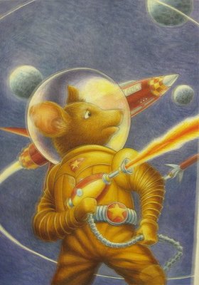
Zina stood up, and in her upfront, no frills way, detailed how she came to illustration through her father, the late, Norman Saunders, known for his pulp and sci-fi illustration. Zina was influenced by her father to get into the business and still paints in details and concepts that are homage to his work and humor (a nice example was in the Calamity Sarah picture she shows on Drawger, Sarah Palin is holding the reins of the bucking bronco between her teeth--referencing Zina's memory of the delight her father had in western movies when the cowboy was riding a horse, guns a blazin' with the reins of the horse in his teeth. This, Norman Saunders declared, was something the cowboy would only do once as he would no longer have any teeth after the first go round). And, as Zina has herself, made a career of illustration--doing everything from licensing jobs (books about Sponge Bob, Blues Clues and Dora the Explorer), she has transcended illustration and has fused it with her curiosity of life, the people she lives with in that small town called Manhattan, her energy and her passion to grow and develop completely as a person, an artist and a spirit.

She is a witty and opinionated person who not only says laugh out loud funny stuff, but she uses her lithe and willowy person to accentuate and to some degree, illustrate the commentary, her tales, her insights. She is a complete package with her public speaking. She also is not afraid to teach and share, talking about her transition from a pure traditional media person to all digital with the making of custom brushes, and her desire to paint just as she had before in a new environment, using healthier materials abut with the same vision, same brain and same hands as she had in the more conventional methods. Zina takes up challenges whether it be the white lie to a client that yes indeed, she had done thus and so type of work in thus and so type of media to the current challenge laid down by Nancy Stahl on the Drawger site, challenging the women to do political work. This, Zina Saunders picked up with a zeal that manifested itself in the most amazing collection of images about John McCain and Caribou Barbie--their relationship and all the funny juxtapositions that occurred_ during the short campaign. Zina really found a groove with this--allowing her room to joke and yet bring her formidable talent and skills as an illustrator to deliver the goods. You should really check it out She would often, during this time, get up at three in the morning to create her illustration (she is fast) and have a low res jpg in the mailboxes of the major papers by early morning before the editors even had their coffee. From this resulted phone calls and requests for high res jpgs of the same files...and she was off to the races. She got in front of being tweaked and pinched by the art directors due to the freshness of the art..the Now-ness...and in so doing, created a wonderful body of work which should spin all sorts of other projects.

This entrepeneurial spirit manifested in this political work stemmed from her independent work on the unknown New York and on a women bicycle messenger from Zimbabwe. Zina independently started making pictures of the men who had these wonderful hybrid bikes she used to admire growing up on 104th Street. These vehicles are remarkable, strange, contraptions which, it turns out has a following, a club of people who make and ride them. Zina got friendly with one guy, did an illustration of him a week later and then presented him with the work. One picture a week, a new guy, a new bike--burgeoning to a collection of images that include people that raise bees in the city, raise racing pigeons etc. Wonderful people with passion gave to Zina and she, in turn, gave back to them, and to us, enriching her vision and ours, of the world, of Manhattan. And, this work has been picked up and printed...so once again, her passion and vision has driven a body of work which has had a payout for all of us.

Something to remember and think about.

We had Joe Ciardello speak about his work, his engagement in fusing his interest in music with that of illustration. His work is beautiful and inspiring in his use of line and color--muscular despite it's seeming delicacy. He works on a hot press watercolor paper I need to get my hands on as it took the water and paint beautifully. He too, is developing personal work which is becoming paying work with his aspirations for the near future being around some personal publishing work much like Zina's new book from Blurb of the McCain Palin project, The Party's Over.

We had Cheryl Phelps come and talk about licensing, her quick chat about it (you can have her coach you), the complexities of the deal and contracts, how to "find the bachelors", how do develop a portfolio with templates for the market segment you want to focus your illustrations for, and the ways to get your work out there from tradeshows, publications, advertising etc. With her matter of fact discussion, her depth of knowledge and her gentle humor, it was very exciting and for me, a definite opportunity as I know about markets and market driven work, the bodies of work I currently do, throw off illustrations and patterns, and I know how to present ideas in a format to sell. I know how to comp a product. I know production methods. I know how to put a tradeshow together. I can sell. And, aligned with my desire to create alternative cash streams that can spin the green stuff, this fits in perfectly. So, def on the trip to Surtex..and more.

We then went down to the Illustration House to see the work and hear Walt Reed and his son Roger tell us about the work, the up and coming auction and their insights about the work and artists they represent. I had a chance to spend a little time with Walt to ask him about how he got into this business that he virtually created. Walt is an illustrator, who, while he was in Westport, CT was part of the illustration whirl,meeing with friends, going to parties, mixing with some of the phenomenal talent that filled the editorial and magazine pages of the time. He said that at the time, at one of the Westport Art Club meetings one of the members stood up and informed the group that they should all go home and destroy their archives of work as their families would be taxed on the work (as a part of their estates) at a very high level. And many illustrators took his word immediately. Walt had been (as many illustrators do today) swapped illustrations with his friends so he offered to take the pictures off these worried illustrators at that time. From that moment, he was in the business. It moved from Connecticut to New York in several locations to the place they are today on 25th Street. Walt and Roger were part of the unfolding of the Rockwell forgery that was in the press in the last year or so and were the people to inform the family of it's illegitimacy. After he told the family, the family went looking for original and as the story unfolded, they found it hidden in the attic (if my mind serves me, it was hidden because of a divorce or some other split in the family). When asked where illustration was going, and what was going to be in his gallery in ten years, Walt seemed unsure. He mourns the moment of painting--seemingly not recognizing digital media as an option. I find it curious as illustration, as it was practiced in the 50s through the 80s really does not exist in the same places. It is purchased and infused into other aspects of our lives. It is not dead. Illustration doesn't sell Cream of Wheat in an idealized way any more...but to my pleasure, Washington Mutual and their heavy advertising (with illustration) in the New Yorker points to something happening--maybe for novelty or maybe for the illlustrative context of the publication. Maybe what is old will become new...like the chicness of pinhole cameras (Bill K. cited the interest at Pratt), and turntables (like Mr.A's interest in that and "vinyl"). Who knows? The greening of the wold makes used and old, new and fab. We can hope...but not wait.

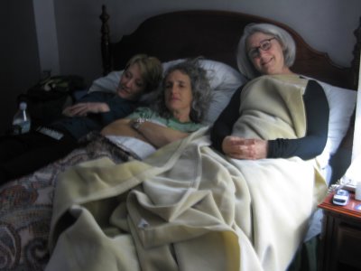
my roommates from Left to Right:
Jackie Decker, Lori Ann Levy Holm, Linda Tajirian all looking at Grey's Anatomy on TV.
Lotsa laughs with this crew.

HAS:Day Three

"If I had my life to live, I'd live over a delicatessen."

"How would you keep them down on the farm once they've seen the farm?"

Two opening quips from Arnold Roth who led our meetings today. These quotes were attributed to Abe Burrows, commedy writer. He led us in a merry chase quoting all sorts of funny people, introducing us to Humbug, the magazine, Poor Arnold's Almanac, and some terrific english images (Princess Di and Camilla Parker Bowles for examples). He had a wide ranging career from replacing PG Wodehouse with an english publication to spreads in the New Yorker. He pretty much has had free rein throughout his career (57 years of freelance) with his work, opinions and approaches even down to a cute story of how he pushed back Hugh Heffner about details in his History of Sex series he did for Playboy.

We then had a great presentation by Daniel Abraham on copyright based law, why it is important, roughly how to do it, and what the levels of registration represents--wheither legal bills and fees or just fess for the illustrations covered. It made me very paranoid, but Mr. Abraham saliently suggested that these forms and submissions should happen on a regular basis--maybe having the quarterly tax day also be registration day...?

The afternoon was a crit of a selection of all of our images from the photohoot yesterday afternoon. It was wonderful the imagery we had all produced. There were hoots and catcalls from the audience along with captions for each one. The work was pretty amazing and refreshing in the simplicity of the light, the incamera composition and the approach each group took with their models.

When we were out getting lunch, we bought some holiday presents at Pylones, a store I saw in London with tons of color and decorative films laid on everything from toasters and sippy cups, to yoyos, whisks, and brushes, pens and trivets, wallets and key chains. Color galore. Very fun and exciting. I bought things for clients and others...inspiring for all of us who illustrate.

I showed the sketch work I am doing to my thesis advisor who recommended I keep going. Would I consider trying scratchboard? Tinting with watercolor? Tinting with other paint? Work with some figures. It was all good and moving. Positive feedback about the work from him, my mentor and others who were interested in looking at the deck. Now all I have to do is keep going.

HAS: Day Two: NYC/ Brooklyn


We used hopstop to figure out how to get over to the Pratt Institute neighborhood for a day with Ted and Betsy Lewin and the photographer, Bill Kontzias. We were cycled through in groups of 9--with a walk through Pratt, time with Bill with a brief, very brief overview of shooting images and how it relates to art and illustrations, and time with Ted Lewin and Murray doing a series of quick shots using different lighting with classmates as models (with hats). I was reluctant about this and the travel but it turned out to be a wonderful experience on a perfect fall day with the subway being really nice, clean and nonthreatening these days (and I was thanking my stars with my subway time when we lived here to take the fear away). The Lewins were charming and hospitable, opening their beautiful brownstone to us from their basement aparment for Bill K to present his slides to tromping through their house to the tippy top to Ted's studio for the shoot. Betsy took us to Pratt, which was impressive, beautiful, clean and very happy to see their show at the library and then some little side trips to see sculpture she loves, the Italian Courtyard, and the amazing steam plant (can you say the home of steam punk...very "Brazil" with turbines all shiny and red, all sorts of iluminated dials and meters, a wall of some pretty scary, frankensteiny switches all on two levels with a catwalk above which a stupendous, golden light fixture which sang with praise for electricity and power.


Bill Kontzias, a photographer and teacher at Pratt, took us through the development of the use of the camera from camera obsura to the current camera we use today--showing it's influence in art and evolving into illustration. His insights were wonderful and made many of us sad that he couldn't spend more time with us going through the development of the image, the storytelling, the light. His wisdom and knowledge really resonated with me. I love it that he stated the the Lens does the drawing and the light does the painting of the image. He spoke so briefly about the types of shadows on a face...from the butterfly under the nose to something called a loop light, which was used to great artistry in the Mona Lisa--which shifts the shadow from the butterfly shape off to the left or right, and in so doing, focuses the light on the eyes, softens the cheeks, really adds to drawing the face. He waxed eloquently on how Michelangelo really "got it" relative to lighting and perspective which Konzias linked in many of his examples through to the same concepts with Thomas Eakins rowers and the medical class images. He showed us some pretty mind blowing perspective studies that Eakins did (beyond art...) along with pointing out the contour and edge lighting that took Eakins paintings beyond that of normal photographs. He showed us original Eakins study shots, which in their own rights were modern, elegant and for me, more relaxed and "real" than Eakins beautiful but stiff representations of people. One could live in the space that his photos rendered..but maybe not so much in the painting. Kontzias also cited that a camera is a a tool for photographers and illustrators--and that tool was something that could see beyond that the artist could percieve at the time. Just hearing this took the stigma out from working from and with photography. Its been done since Vermeer...so whats all this about cheating and stuff. What a head job was done on me in school. Once again, its the final picture that matters.

It was fun working with Ted and Murray working with a bouncecard and a single source light with a gel on it. Some examples are posted for fun. We had a nice lunch at a Thai restaurant with all 36 or us broken into tables which the nice staff took in stride as we kind of overwhelmed the place...It was really good, affordable and got us charged to get back on the subway to get back to town. We are sitting here in our room with our feet up...talking away, checking mail and seeing what is up. Some of the group are going to see a show, some to the Society for sketching and the two of us who are happy for a bit of nonteam, quiet time.

More later.

HAS: Day One: NYC

Great speakers at the Society, Steve Brodner and Leo and Diane Dillon. The Society looks terrific under the new direction of an old business associate, Anelle Miller who has cleaned the place up, put flowers and decor in the right place, who transformed the womens room into a nice place versus a bad bar and grill restroom. The place seems spotless, with show graphics, illustrations hung straight, and plumb, and with the staff def chop chop. She has transformed the place and really deserves kudos for the hard work in making the society more of a snappy place (the worn holes in the shredded carpet were gone. Yhe big room we were in was comfortable, big and well suited for our lectures in the morning and the crit in the afternoon.

Steve Brodner was as always, salient, smart and insightful. I throughly enjoyed his insight about the recent events. His work is extrodinary, transcending Thomas Nast--with wit and bite that really communicates not only in his print work but now the new "Naked Campaign" videos he has done with the New Yorker Magazine. What really worked for me was his talking about the idea of creating a niche, your own job and then backing into it. He had decided that he was going to take this approach and it has worked from assignments covering political campaigns, to this new venture with the New Yorker. He is entrepenurial in his work--getting it out through the print and electronic media--thinking and learning as he goes. He also shared his approach to work/teaching:
1. Read for Essence
2. Sketch
3. Form a Sentence > establish his metaphor
--whats my statement
--think about staging hierarchy
4. Composition
5. Finish

Every pictures needs to mean something. "There are no casual notes in Mozart." He also is pretty fluid in his use of media from drawing with a paintbrush to pen and ink, to watercolor and so one. His influenced are mainly Steadmann("angst"), and Hirshfield ("elegance"). Brodner is a thought leader beyond his niche. We are lucky to have him walking this planet.

I am so jazzed by Leo and Diane Dillon. I have always loved their work...but what makes them tick, their philosophy and interplay is amazing. They learned to work together out of their competitive nature. The fought and fought until they came up with a working method where one person would work on a sketch and pass it to the other and back and forth until it is realized. Then a tight pencil needs to happen, then a color comp and then a final. The Dillons have three artists in their family> Leo, Diane and then, the third artist, The Dillons. In taking away the ego, the me--as Leo said "You've given yourself away if your style is yourself". Once they have given that up, the media, the rendering, the sheer pride in the final image and it's pristine quality takes a far more significant role. So, we saw woodcuts, we saw crewel work, stained glass windows, wooden panels, paint on acetate, pastels, airbrush. One image more striking than the next with a surprise for me in the woodcuts (one inspired by Will Bradley that really called to me) and in the new children's book on Jazz (very graphic, referencing Tom Purvis to some degree, Milton Avery etc.)that pushes me to try more graphic things too. I know I can do this, I have just held off going there. They also had a body of work centered around crythosethia..making objects up out of other objects. They also are prime great layout guys from not denying gutters in their pictures, to changing borders throughout the book to changing an element like flowers throughout the publication. T hey also like to like mini stories within a children's book with wordless stories that little children can "read" along with the parents. They are the pair I hope to focus on my paper.

Must go to check email> Its been great. I showed my mentor my work...I need to keep going.. need to try hots and cools> and keep making pictures to see where it goes.

Hopefully, we will have indian food tonight with the gals and a few invited boyfriends.

On the bus

Had a nice time with old college friends in town with their twin sons
I'm tow (college tours to see Cornell, Syracuse and Ithaca College).
They were all great, the kids were charmers.And we all had a nice time
with pancakes on the lake, pizza in Tburg and tours of the house and
the Taughnnock falls overlook.

I am packed for NY as well as the bumper trip to Miami. This bumper is
a treat as it is the naming cruise for the first of Celebrity's newest
class of ships, The Solstice. We are going with a contingency from the
Corning Museum of Glass to see the ship live along with witnessing the
newest outpost of hot glass demonstrations ,atop these new ships.

So I have it covered for snow and sun.The week with Hartford should be
fun and not too over the top as frankly I feel a bit rundown and
tired. We will be seeing a top flight group of illustrators from Steve
Brodner, Zina Saunders, Leo and Diane Dillon, Arnold Roth, Peter
deSeve to name a few. There is a crit of our illustrations for Vin
diFate. Wears also going to Brooklyn to have a photography workshop
with Ted and Betsy Lewin. There will be a visit to Illustration House.
We meet at the Society. So it's illustration, illustration,
illustration!

It's tight on the bus with everyone chattering away on their cell
phones--a veritable babelmobile!

More later--

rush rush

Now is the sorting and culling. The. cleaning and picking bits out, sorting the types of things from my bags. One shirt not two. Underwear. Camera and cables. Earphones. Phone and plugins. Done Done Done. Get those rechargeable batteries charged. Minime charged. Do I need this tiny tube of toothpaste? or do I have too few/many pens. Flash drives to drive the universe. It's as if I am going to Patagonia for a lifetime...and not to NYC for 4 days. Jeez...Need to dig out the bag and load in the q-uniform. High quniform, low quinform. Night quinform, day quniform. Umbrella? What kind of coat? Less is more. It will be warmer than I would anticipate. Must make this quick as there are bags to find, laundry to do, money to get and so on. Which color? Black overall, It think. More tomorrow or later today. This is the best I can do.