
Interesting! What do you think!
another summer day

First off, I apologize for no recent images...this sticky, funkybone imac will not let me upgrade it's operating system and is very touchy when I try to upload pictures...essentially winking out during an upload. So, the pictures and links will happen tomorrow when I am back in a more computer stable environment. Please forgive.
Another beautiful day. No clouds. Hot and humid (not my first choice). Have been in and out of the water all day. Visited the Corning Museum of Glass (http://www.cmog.org) yesterday to see the "Glass of the Maharajahs" show. This glass is glass furniture, chandeliers, and even prayer rugs developed by English cut glass companies for the Indian markets. Sparklie, Shiny...colorful. Cut glass chairs with solid rhinestone fabric upolstering the cushion. A sparkling fly whisk. Cut glass tables with gold.Glitzy. And Big stuff. Not my taste but amazing none the less.
My friend, Tina, curated a new installation of work in the Contemporary galleries @ CMoG. Wonderful work. Some of it kinetic, some of it political, some of it tranquil and beautiful. Big stuff, tiny stuff. Very thought provoking and inspiring. Worth the trip to see what new brains and hands are creating. Corning, New York.
Grassroots starts this week in the hamlet of Rongovia. The campers are beginning to line up. The shaggy ones are beginning to arrive. There is a festive, almost holiday atmosphere amongst the villagers. YeeHaw!
Blue Cut Glass Table:
F. & C. Osler, 1880-1885.
H. 75 cm., Diameter 43.6 cm.
Collection of The Corning Museum of Glass (2005.2.11).
scary..more thinking
Might have a contract in the offing. A client suggested this based on the little thises and thats I have been illustrating for them over the past month or so. It really is a question of how one structures it and establishes walls, doors and windows in it so there is room to move when it the contract has been met and to recap our client, to allow for more income per project to happen in the right situations. This is the first agreement for me with illustration and I am kind of pleased, and to be honest, surprised, that this sort of work (spot illustrations) have such a value for this company that they would be thinking a longer term solution than a onesie-twosie. The nice thing about illustrations (particularly these small, semi-fast ones) is that there is not a big time committment, I can work out details 4-5 different ways to move the design along, the final is black and white line drawings with a shaded one for finalization and that there are no typos!
I am looking forward to the next month when we have a teacher talking to us about the business of illustation. I want to pick his brains about contracts, royalties, "percentage of businesses", and how to think about structuring these negotiations so that I get the most out of each job possible--so it feels more like a balanced transaction. I have been giving away the store with graphics, to some degree, I think it is necessary as the globalization of MSWord and MSPowerpoint has given every individual a chance to think they are graphic designers. And, if those folks are not visually saavy (which, unfortunately many are at all levels of companies)--then what is the need for good kerning, strong grids and layouts and a sequential way of thinking of image, brand and look/feel. Sometimes, a future graphic client needs a little introduction on what we do as designers and how we think a little differently before they begin to place a value on it.
With illustration, yes...MSWord has a "fabulous" (?) selection of clip art and one can add pictures to emphasize the bad graphics (yes, Lucille, you can color your type with rainbows, dimensionalize it and then, drop a shadow!--and that's just the headline!!)--with illustration, there is a point of difference still--and many people will admit to not knowing one end of the pencil from the other when it comes to drawing.
I wonder if there is still a drawing test with either bambi or a pirate to get into art school? I am going to google that right now!
More rain today. Our trumpet vine has decided to take over the universe. I quake in fear.
it's in the air
 I was chatting with my accountant yesterday about our financial situation, where we are, where we will be by the end of the year with lots of random questions (on my part) to try and suss out any of the fun surprises that sometimes pop up at the end of the year that manifest themselves in "finding" money, that "pit of the stomach" thing and more. You are probably familiar with those sensations. I am "surprised" on a regular basis, and find that this preventative chitchat can at least prepare me if not ameliorate the causes.
And, as we often do, we started talking about how we are feeling about our place on this spinning orb. My accountant is a "take no prisoners", take charge woman who has pulled herself up by her bootstraps and has carved out an interesting and entrepeneurial place for herself. She reads voraciously. She consults psychics. She is a member of the town council in her little village. She made bread for a living when she was a farmer hippie mama. She is a grandma. Interesting person who has gotten around. I was saying that I was feeling very untethered and unsettled. Somehow feeling as if time is passing by in this beautiful place and I couldn't quite get a hook into it. I mentioned that it wasn't that we were bored or not busy-- and she agreed with all of these things..and couldn't fathom this feeling of randomness. No sense of traction--no sense of moving forward--with things in resolution or resolved. Is it the world we are living in? The path isn't clear. Is it our inability to make change happen except on a very local and granular level? Is it that change and positive energy is reduced now? Is it where the moon is? Does religion come into this?
I find thinking about making pictures, reading semi trashy books, and hanging out with my little fam is the closest I get to getting a hook into all of this and getting some sort of anchor. Am I the only one feeling this way? Are you?
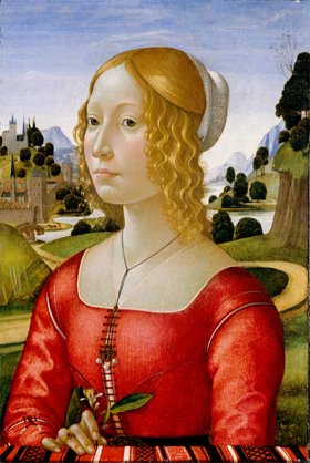
Image is Ghirlandaio
Raining Cats and Dogs
 It has been raining cats and dogs. Our cats (2 warm grey cats that match) sit on the porch to watch the rain and the hosta. All the barn swallows know they are there and signal to each other their whereabouts. Then the dive bombing begins. The cats are unruffled by this experience acknowedging their superiority. Then, the cats take to sitting under our large light green hosta (which blooms in September with flowers as large as easter lilies and far, far more fragrant) waiting for their prey.
Waiting and tapping their tails. Silent and still fuzzy statues. The inevitable happens. Dinner is served.
body of work
Small revelation in the dark and rainy night. One of the phrases we keep hearing during our time with the crowd from Syracuse is "body of work". A body of work is a large group of illustration or pieces...without any width or depth--essentially, a way to prove ability and a style (I guess?). With a body of work, an illustrator is an illustrator. Ready for business. So, why can't an illustrator have a body of work to express a different point of view, a different technique or style? Why wouldn't an illustrator have a few bodies of work to best show width and depth and a choice for the client (if a working relationship is established)?
You could have a line art portfolio, a vector portfolio, a painting portfolio, a frisky logo portfolio--to expand reach and opportunity. Not a big idea...but something to ponder as I am having some fun returning to my calligraphic roots...and would llike to do some spec stuff--some illlustrations, some pattern design...and this could evolve into a select calligraphic illustration body of work worth showing.
a nice day to draw

We had a mini sketch crawl in Tburg on Saturday. We had 18 participants from a 91 year old artist to some of the middle school set.
Everyone drew parts of Main Street--and in the later afternoon, we posted the pictures on the Bank's window for everyone to see what had transpired. It was great. We had line drawings, watercolors and pastels. We had pictures of streetscapes, of the inside of the local diner, of the local hardware store. And! Everyone had fun! So, we will do this again. I must admit I was quite skeptical, but it all happened--and was very positive and energizing. There is lots of interest here as the local visual artists feel left out of the community arts vibe. This is an easy group to develop ideas for.
Yes, there was a double header on Saturday. We won the first game! A. got a couple of hits, caught a ball in the outfield and ran in a few runs.
Sunday, I spent the better part of the day drawing angels (no demons). A calligraphic one worked out nicely. As soon as I get the tissues back, I will post one for your review.
bloomin' roses

Need to focus on roses in tiny tight spaces this weekend. Client needs one and they are a bit short for time. So, hello Wiener Verkstatte! Hello, Mr Wonderful, Koloman Moser. What a guy! He is a big pattern guy who can draw like an angel. He understands pattern and weaves it in whenever he can. He can work full color and is probably better with a limited palette of 2 or so flat color. Tiny spots are no problem for this guy. He did architecture, paintings, silverware and jewelry. He designed fashion and fabric and furniture. Only problem was there wasn't a lot of interest (read money) in the work. So he left his co-conspirator, Josef Hoffman (Whoa, what a designer!) and let another guy be the co-director of the Verkstatte. Check him out.
I have a book and will give you the title so you can look for it. Hope the skies are high and the roses blooming (no beetles, thank you!) for your weekend. We have baseball! and other volunteer stuff in perfect T'burg.
Shear madness
Back to poor Shadow dog. She had dreadlocks and snarls and a face she couldn't see out of. We had tried a bunch of canine beauty salons--and they were booked weeks out. So, I went to the local "we have everything agricultural" store and bought the middle of the road horse shears. Our pal Amanda, Kitty and Alex went to town. Now Shady is a black velvet dog who is a little shook up...looking for reassurance that she is the same girl that was in the mirror yesterday afternoon. And there is a big black pile of fur that some bird or nesting creature might like for their nests.
More illustration (paying) work streamed across the desk yesterday. We will see how that evolves. Have to do 7 thumbnail ideas for Monday.
Its beautiful,cool and clear here.
"Keep your head in the game!"
Man, oh man! Practices, extra practices, games, double headers, away games, home games--no hit, no score, nice catch, no more. Games! Upbeat, hat throwing, "get your head in the game" games. Hit the School! Put some wood on it. Our technique is very special. Walk and Steal. We get walked and then we steal every base...including home! Rain games, and blazing cloudless day games. Poor black Shady, hiding under the bench games. And, when the ball is out of bounds...guess who it hits-- Shady dog! And nary a sign of pain or distress. And speaking of Shady, it sounds like the American Revolution outside our 4th of July house...and she sleeps. I wonder what she dreams about? My guess-- rabbits!

more baseball

I am doing more on the baseball images so that I can hold my head (partially) up with the up and coming show. I love costume and how it relates to sports. The armor or body protection in sports is really kabuki (hockey, lacrosse, baseball catchers and umpires)--so an umpire may be in the mix in the next few weeks.
I found some really great and really inexpensive frames at Target, the most wonderful and designcentric store in the world...maybe, not the world, but my tiny world as it stands today. Big fat black, nice ogees..We'll see how they work. The Nielsen Bainbridge frames are nice and inexpensive too (http://www.dickblick.com).
Have been on the road for the past two days visiting my clients and trying out my new laptop--working out the kinks of the system.
a mini sidebar
no. not a sidecar. a sidebar. I have a new electronic toy...I am now on theispot.com. This took a lot of intellectual thising and thating to rationalize why I want to be there--but now I am. Visit me...and let me know if the work stands up. You can click on it in the column to the right. I think this needs work, but its a beginning...and as beginnings--I am not ashamed. Actually, the interesting thing about this ispot exercise, is that it has forced me to look at my mini "body of work" and see what works and doesn't. Where there are holes and where there is weakness. I must say that a year ago today--I was a dumb graphic designer depressed with the state of design. Now, I am a little less dumb graphic designer thinking that the world might hold some wonderful and unexpected opportunities and surprises. I guess the journey is working!
work in progress

Working on this tentative goose. Am trying laying in flat flat tone and then focusing on the head (and eye!). Background needs some work. Thinking of laying some vector bugs or something to jazz this up. Like where it's going... but not there yet. Maybe put a big hat on it? or have a fairy riding it?
looking at you

I love this stuff!
 I grew up in Pittsburgh--and didn't know such wonderful art existed until I visited and then moved to Upstate New York. All the ice cream companies create these wonderful signs--generally screenprinted on diecut metal of ice cream cones. They are generally pretty graphic, with each iteration of the idea of soft or hard ice cream coming out different depending on the age of the sign or the maker of the ice cream. Most people think of a dark brown, almost eggplant brown package with condensed letters in the most subtle silver--H E R S H E Y--but I flash to ruffly pink ice cream topping a pointy cone made of rust, brown and cream with a glorious blue rectangle saying the same thing. As we drive by these beacons of frosty deliciousness...I try not to wreck the car trying to study the picture. I have wanted to do a small picture...and this is the beginning. Do you like what crazy Gary Baseman does with ice cream cones? I do!
up up up

Need to do some new baseball pix for Syracuse. I did some last summer and they are not so terrific...so...we move on. This is the beginning of one. Scortcher here this weekend. Yes, we had a ton of Cornell Chicken!
Cornell Chicken
 In the spirit of summer, I am sharing a great recipe for Cornell Chicken for you to try. Cornell Chicken was developed by Cornell University to promote chicken eating in Upstate New York. If you live around here, every fire department, boy scout troop, baseball team, eighth grade class, fine arts conservatory etc. uses the big chicken barbeque (specifically Cornell Chicken) to raise money. So, it's kind of in our blood. And, as a transplant to this area, it is fabulous and always a surprise because its always so delicious! At the fundraisers, it is often served with another local favorite, salt potatoes with butter and loads of salt, and beans. Forget the beans and potatoes--go for the bird!
Cornell Chicken Marinade
1 egg
1 cup vegetable oil
2 cups cider vinegar (I have substituted fresh lemon juice and its !!)
3 tablespoons salt
1 tablespoon poultry seasoning
1 teaspoon ground black pepper
Put egg and oil in blender, blend to emulsify (the blender is key)- it will have the consistancy of mayonnaise. (Note that if there is any water at all in the blender, this will not happen.) Add vinegar, continuing to blend. Add seasonings and blend until dispersed throughout. Marinate chicken for at least three hours and up to 24. Grill as usual - may also use the marinade as a basting sauce. I put the chicken in a ziplock bag--and then its ready to go with a minimal amount of fuss.
You can use boneless breasts or chicken parts. I have also used boneless chicken thighs to positive results. It's just plain delicious.
The picture is a chicken from Mr Wonderful, Milton Avery.Love the color, the blockiness and the feet!
Friday again?
 Whoa. Time has gotten out of hand. Much goings on here. Working on some stuff for a premium crystal company. Some pattern design, some big 3D ideas--Christmas(the dreaded December holiday), animals and some "nostalgic" derived ideas...illustration focused. Should be fun. Have been looking at the work of Milton Avery, poster design in general and asian art. Love Mr. Avery. Big blocky ideas and very beautiful, almost Vuillard type compositions and use of texture/pattern.
  He is referred to as the American Matisse, but the whimsy of Matisse's cut paper work--and the total two dimensional approach doesnt really align well with Avery. Mr. Avery will work in these lovely flat areas, dropping in pattern, working the shape as a shape--but rendering each shape as a beautiful object (versus Matisse's almost manic cutting jobs...take a look at how the shapes are chopped out...laid on top of other shapes...adobe illustrator would have been his new tool of choice!)--and sometimes whimsically dropping in a shadow on top of a shoe or something. You could group ole Tom Purvis (British poster designer--did a lot of work for the British Rail System), Matisse, and Mr. Avery together and do a for real compare and contrast and it might be really interesting.
