Freeranger

I've been elusive about a fun project I have been doing with my brother, Tombo and his friend, Jonathan. We have been working on an entire look and feel for a start-up company, FreeRange,committed to bringing the premium wine in Bag in Box (BIB) format.Tombo and Jonathan will travel the world to bring a superior wine for the best price in a package that will keep the last glass as good as the first (which is what the BIB format can do). They are working with a big winery in France who is able to source wines from all over the world and is very interested in developing wines that will work with the US palette.

It has been a wild, quick ride--but we have a beautiful spectrum of wine that looks as good as it tastes. The boys rolled out the wine in Las Vegas to lots of interested buyers...so it is looking a lot closer to reality time. They love the offering, the look and graphics and the high quality wine. We are rolling! More as we go.

California Quail (in progress)

This California Quail in in the works. Not quite there yet...needs more work. This is one of a collection of birds I plan on doing during my stay at Syracuse...a pelican, maybe a kingfisher,a quail...some little birds. I am so inspired by Audubon--his strong design sense, his ability to alter the bird's gesture to really enliven the frame of the image, his strong patterning and ability to break the bird out into bold and simple shapes. A new bird has launched today in Las Vegas, a freerange bird! More on that tomorrow!

This bird was created in Adobe Illustrator CS2.

Small features


More sketches from looking at Byzantine pictures. They really crowd the features of the face into the center of the head, stretch and thin the nose, stylize the chiroscuro, and make the gestures wooden. Tiny little mouths.No teeth, ever. Lots of hair for the boys. Poor Mary. Always with some sort of headdress with these almost typographic folds. Her clothes are always made of the same material...sheet metal. Often times, her Byzantine clothes are ruby red with embroidered stars on the head, shoulders. Love the inset lettering shown in these icons.

Cheer up! It's Daylight Savings Time!

This sketch is some of the work around my picture I want to do of Saint Francis of Assisi...the same guy as San Francisco (part of the Syracuse University MA challenge: "Do a picture of San Francisco") You got it.... The plan for my San Francisco is that he will have california birds around him (as St. Francis is often shown with the birds and animals that he would tame them by his presence). A second Saint Francis might suggest that he is shown with a skull (dig!). Another Saint Francis of Assisi story talks about the "Floating Palace". Story goes that he once gave his clothes to a poor soldier whom he met on the road, and that night dreamed of a palace floating in the air, adorned with military banners. At first he took this to be God's command to follow a soldier's career, but a voice told him that his vision signified "that which shall be spiritually wrought"...Maybe downtown or the skyline or the golden gate bridge in place of the floating palace? Under consideration as well.
After looking at all those fabulously dour byzantine saints, I started with this drawing. Not even close to where we need to go...but entertaining insofar as the long, attenuated faces that the byzantine style demands. No long faces here though. This guy just needs to have a little lunch and look forward to the daffodils. It can't be this bad all the time....SPRING FORWARD. Brilliant light today.

Book referenced: "Hall's Dictionary of Subjects and Symbols in Art",©James Hall, 1974, Introduction © Kenneth Clark, published by John Murray, London, England.

Map of Rongovia

So, as you can see, Rongovia does exist. We have an Embassy replete with Rongovian fare and drinks. As we are on the local wine trails, there are many interesting things to drink as well. The Rongovians like music, too. Sometimes it can be a little shaggy, sometimes a little indie...but best of all, its just around the corner. Check out their web site to see what's happening this weekend. http://www.rongo.com

Detail of the map of Rongovia from a mural at the Rongovian Embassy to the United States, Main Street, Trumansburg, NY.

Bring on the Byzantine!

Beginning to do some research into byzantine art...icons, bas reliefs, tile work. Its all pretty formulaic, down to where the highlights go, how to render them, specified stances and poses, specific saints and holy people. Look at this sweetheart to the left--He is Saint George. No damned dragon. But what a wistful boy he is...with his moody eyes, and dreamy gesture. Good thing there isnt any dragon--those teeny hands might have trouble handling a weapon, let alone a fork and knife. There is absolutely nothing that is fierce in this gentle being. I love the shape of the actual icon...the way the gold interfaces with the jaggy and messed up wood. Fine and crude together. Really works.

The byzantine fabric is all rectilinear--absolutely having nothing to do with the actual folds. And the craziness around knees and elbows, almost creating little halos around the joints. NUTS! And of course, the halos that could injure. Can you imagine bumping into your pal, another saint, and if you didn't zig when the other guy zagged...what a black eye you could give each other...just with the halos. Forget the fabric. Ouch! If only the halos were tablesaw blades? They have some nice little devices in circle to the left and right of the head that they use to hold words, symbols or in one case, little bitty angels.

Not many smiles amongst this grim crowd. And the eyes verge on the dreaded manga.

Was given a beautiful book for Christmas from my friend,Groons-- "A Brush with God, an Icon Workbook" by Peter Pearson. Am busy devouring that. Also some cool sites--one from http://www.skete.com--a monestary with iconographers working in the medium and style. The greek site, www.culture.gr has some beautiful, historic examples with good descriptions of the piece along with detail on the symbology. The Greek Orthodox Archdiocese of America have a wide range of icons to see...but check out the Three Hierachs with their patterns and robes...Does it get any better that that? (the hierch on the right looks a tad cranky though).

Man, do I dig this stuff.

Image at the top is from the Hellenic Ministry of Culture website. Image at the bottom is from the Greek Orthodox Archdiocese of America website (www.goarch.org)--icon gallery/clip art page.

Observe the time!

This thing is somehow going to get incorporated into a San Francisco picture. This quote is from the bible and is posted on a church in China town...somehow admonishing its boys to move on...time's a wastin'--I guess?
Somehow seems appropriate with the onset of Daylight Savings Time!

Kudos for a client!

I have a client (who also happens to be my brother) who, if he had gotten a silly ole BFA instead of a JD, MBA--he could have been a great designer (and still may become one)--. We are working on a project together and he is letting me do "my thing" with great insight and input from him...and he listens to me rant and rave and say random things....and then thanks me for it. He went out last night and bought the font I have been using (not cheap!) so that his written communications could match up with the graphic and packaging work we are doing together. I have pushed and pulled almost all of my clients to do this...and it has been the rare one who will go the distance and buy the font. And my brother did it without even a prompt! You GO!

Rant


Okay. So, what is wrong with illustrators learning something about production methods? In that, I mean output and printing. If we go with the premise that the difference between fine art--ART-- and illustration--TRADE-- is that illustration is reproduced then, isn't reproduction part of the education of a well rounded illustrator?

Last summer, we were shown some pretty bright paintings for a children's book. It had tons of color--particularly cobalt blue and very juicy oranges. We were then shown the printed piece. Total mud. Brown. Brown orange, brown blue. No depth. No layers. No nothing. As it was 4 color process, all the snap had gone out of the art. I asked the illustrator whether he saw the proofs or had any engagement in the printing process, and he pushed it off to the publisher. Not his problem. He makes pictures. If he had any engagement in that process, or knew that many of the colors he selected just plain don't reproduce, he could have developed the images better for the final reproduction. Reproduction...the difference between art and trade.

He could have also specified spot color (an extra color) on a touch plate in a match color to give the blues that punch. But, to his mind, that was the publisher's issue. And, to take that further, lets think about what drives the publisher. The publisher wants to reproduce a book as efficiently (read, cheaply) as possible--so extra colors, a second set of proofs to the illustrator just adds to the cost...and probably from his vantage point, noise only a dog can hear. Plus, it then becomes a right big pain in his head... But, that level of fineness and detail takes the illustration and delivers it as accurately as possible to the end customer, the reader...and makes the reproduction truly reflect the original art

This issue was blown off during our discussions in San Francisco as "the publisher's problem". I agree, it is the most important thing to make beautiful images, to spend the time and energy to really uncover the image that matches the words, and impressions that the writer delivers. Or even just plain to make amazing images...forget the writer. But I believe that is only half of the problem. If you cannot print these images that time, energy and thought has been lavished on--what good is it? Aren't you then only talking to yourself?

Your thoughts?

more sketches


Did I tell you how wonderful Faber-Castell's Pitt Pens are? They are first off : 1) India ink. So, on tissue...you get nice, thick blacks. They have 2) a brush pen...which gives me thicks and thins...all in one pen...without the bother of ink (hello stained hands, hello--wet pocketbook and backpack), and lots of line flexibility. They have great Black...but some cool colors too. Not a wide range, but you can pick a pretty "off" palette and be fairly happy with the selection. Give em a try. Utrecht, Dick Blick have them...by the singleton...not just the sets.

Getting started

My muse and husband, Rob suggested that I have a blog as it would force me to post work, and show a sketch a day. No biggie with the sketch and come to think of it, no biggie with Blogger doing most of the design work for me...So I figured I will give it a whirl.

I am a designer who is in the joyous throes of mid-career education. In addition to having a small design company, I am pursing a MA in Illlustration (a truly random decision) from Syracuse University. Its a great program as you can get as much or as little as you want from it...Time commitment is great--2 weeks in the summer on campus at Syracuse, a week in the fall in NYC, a week in Spring (San Francisco this year), back to Syracuse, back to NYC, and in the spring somewhere TBD...and one more summer in Syracuse...and you are done. The people are unbelievable--the teachers and the teaching students. Talent abounds--and most people are open and very sharing and encouraging. I am making pictures to my heart's content--and actually surprising myself that there is stuff "in there"--that has been looking for a way out. So, the design work is better-- and the illustration work is actually coming along.

Back from a week of illustration, illustration, fun and friends in San Francisco with the Syracuse ISDP (Independent Study Degree Program). Syracuse brought in a wonderful collection of illustrators who inspired us to try new techniques, new ideas and thoughts.

We had an amazing visit with Jane Eisenstat and her daughter, Bunny Carter in her Palo Alto house. Floor to ceiling, left to right, every wall and surface were covered with illustration from NC Wyeth time on to the present. Jane regaled us with stories of each picture as she narrated by pulling large cardboard boxes out from under her beds, or out of drawers of drawers of flat files. Jane's energy and tales from her childhood through her marriage--were knit with illustrations, illustration and art--Bunny, her daughter, also an illustrator and educator also wrote an engaging book about the Red Rose Girls (probably inspired by her parents' collection of the Red Rose Girls' work) and now one on Cecilia Beaux. Bunny's vision and insight on these interesting women, the research she engaged in--and the possibility of the Red Rose Girls' story reaching a wider audience was exciting.

We visited Vivienne Fleisher and Ward Schumaker in their house--with an inspired show and tell of their work, their travels, their pets within their house (their books, their art, their spaces).

We saw Robert Hunt, Jim Pearson, Dugald Sturmer, Steve Johnson and Lous Fancher, Barron Storey, Owen Smith, Kazu Sano,
John Mattos, Yan Nascimbene, Enrico Casavosa, Ronnie Del Carmen. More tomorrow.

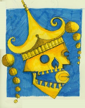
(the sketch above is an idea for our SF homework...inspired by China town and all the visual stuff happening there...combined with the factoid that the fortune cookie actually is a SF invention...not that of the Chinese...)...

All images on this blog are the exclusive property and copyrighted by Q. Cassetti unless otherwise noted.