Case Study:
Estee Lauder, Origins Natural Resources, New York, NY
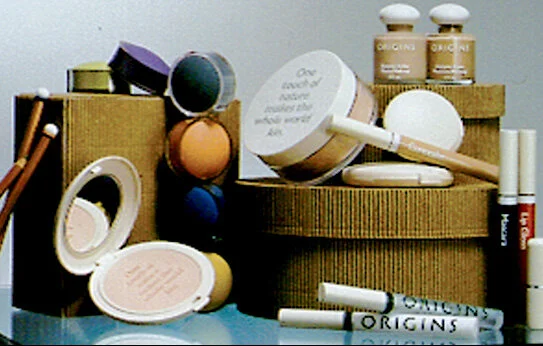
I was the Design Director for Estee Lauder assigned to develop Origins Natural Resources, a division of the Estee Lauder Companies. I had the distinct honor to work directly with Leonard and Evelyn Lauder as well as their son, William from day one in the development of logo, branding elements, packaging, and ancillary products to complement the products within the department stores but also in our standalone stores. I worked on all aspects of the brand that directly touched the client from the counter treatments, the store interiors, the “guide’s” uniform and look, counter signage, and store display guidelines. This was a very fast project (less than 4 months from start to opening our first counter)—but very rewarding being on the front end of luxury “eco-chic”. We developed a font (Origins) with Paul Shaw. We developed a custom recycled paper with the French Paper Company. We experimented with using traditional high end packaging solutions with a natural twist. I am pleased that the look and feel is still part of Origin’s visual DNA 30 years later—and that they continue to develop and grow.